A point of pride for many film buffs is a knowledge and love of aspect ratios. You can often hear their excited gasps of delight in any cinema showing the new, pristinely presented Wes Anderson, or see them stomp off to see the management if the local multiplex isn’t projecting a Coen Brothers film in quite the correct ratio. Yet with all the various incarnations of image sizes over the years, it’s easy to get lost or confused. Never fear – if you’ve ever wondered about the difference between Academy Ratio and CinemaScope, or why the hell your TV is shaped the way it is, Empire can make it all crystal clear…
The Basics

The essential idea behind aspect ratios is pretty simple. You’ll usually see them referred to as two numbers, separated by a colon. For instance, 4:3. Or 1.33:1. In each of these cases, the first number refers to the width of the screen, and the second to the height. So for every 4 inches (or centimetres, if you’re feeling continental) in width, there will be 3 in height.
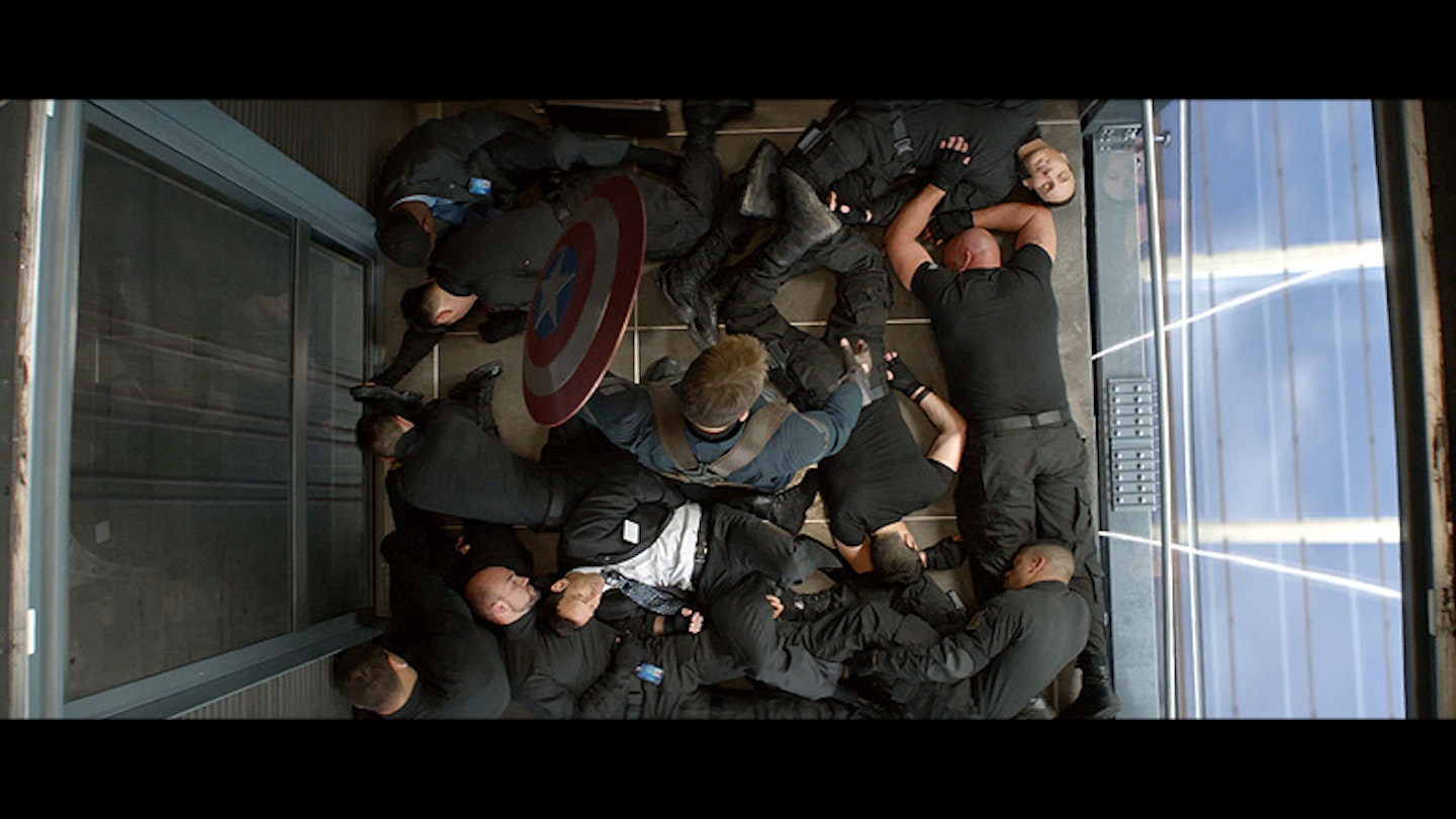
If your mental arithmetic is particularly quick, you’ll have noticed that 4:3 is the same as 1.33:1. It’s pretty much a stylistic quirk whether you’d rather express the ratio in whole numbers (4:3) or always have the second number as a 1 (1.33:1). The latter is probably more common nowadays, and as such, you’ll often see a number with no colon. Captain America: The Winter Soldier, for instance, has an aspect ratio of 2.35. That just means the writer is lazy, and can’t be arsed to type “:1” afterwards.
In The Beginning...
Over a century ago, the very first films were projected in the ratio mentioned above: 4:3. On your standard perforated film strip, this meant the image was four perforations high. With the advent of sound (which was soon incorporated on the same film strip, rather than on a separate gramophone record), this shifted slightly to incorporate the audio information. Thus film’s original dimensions (1.33:1) were changed slightly to 1.37:1. This was the ratio officially approved by the Academy of Motion Picture Arts and Sciences (i.e. the Oscar people) in 1932, and so became known as the Academy Ratio.
This ratio ruled in Hollywood for the next twenty years. Its most famous incarnation is undoubtedly Citizen Kane, with Welles’ extraordinary visual experimentation and pioneering techniques all captured in the Academy Ratio.
If you go fullscreen, you'll notice the black bars, or pillarboxes, at the sides of that clip. They’re important…
Go Wide
In the 1950s, TV became ever more popular, and film studios got nervous. Some predicted the death of cinema, and it seemed like something had to be done to drag punters back towards the silver screen. Enter (through a very accommodating doorway) widescreen.
In 1952, Cinerama was unveiled, boasting a hitherto unheard of 2.59:1 aspect ratio. Well, “unheard of” isn’t quite true: in 1927, a system called Polyvision was developed, boasting the absurdly wide aspect ratio of 4:1. It necessitated three 1.33 films being projected side by side, and was devised exclusively for the epic final reel of Abel Gance’s Napoleon. Unfortunately, you could clearly see the divides between each of the three projected images, so it was far from a seamless image. The whole thing was ridiculous, and didn’t take off.
However, Cinerama managed the technique rather better. Similar to Polyvision, it used three cameras and three projectors to achieve a wide image, but it was a lot smoother. In addition, it was projected onto a curved screen, thereby enhancing the immersiveness of its 2.59:1 ratio.
While the technique of a multi-camera/multi-projector set-up wasn’t that cheap or practical (particularly given you could only have one focal length), the allure of widescreen proved too strong to ignore. As such, since Cinerama, moviegoers were inundated with various widescreen offerings.
CinemaScope managed 2.35:1 (so slightly less wide than Cinerama), and did so with just one camera and projector, using an anamorphic lens. In order to achieve this, the camera must use an anamorphic lens to shoot the action. This basically results in the image on the 35mm film strip being distorted, but also being higher quality, as it has no wasted surface area on the film strip. The projector must then have a complementary anamorphic lens when the film is screened, thereby returning it to a non-distorted, lovely widescreen version.
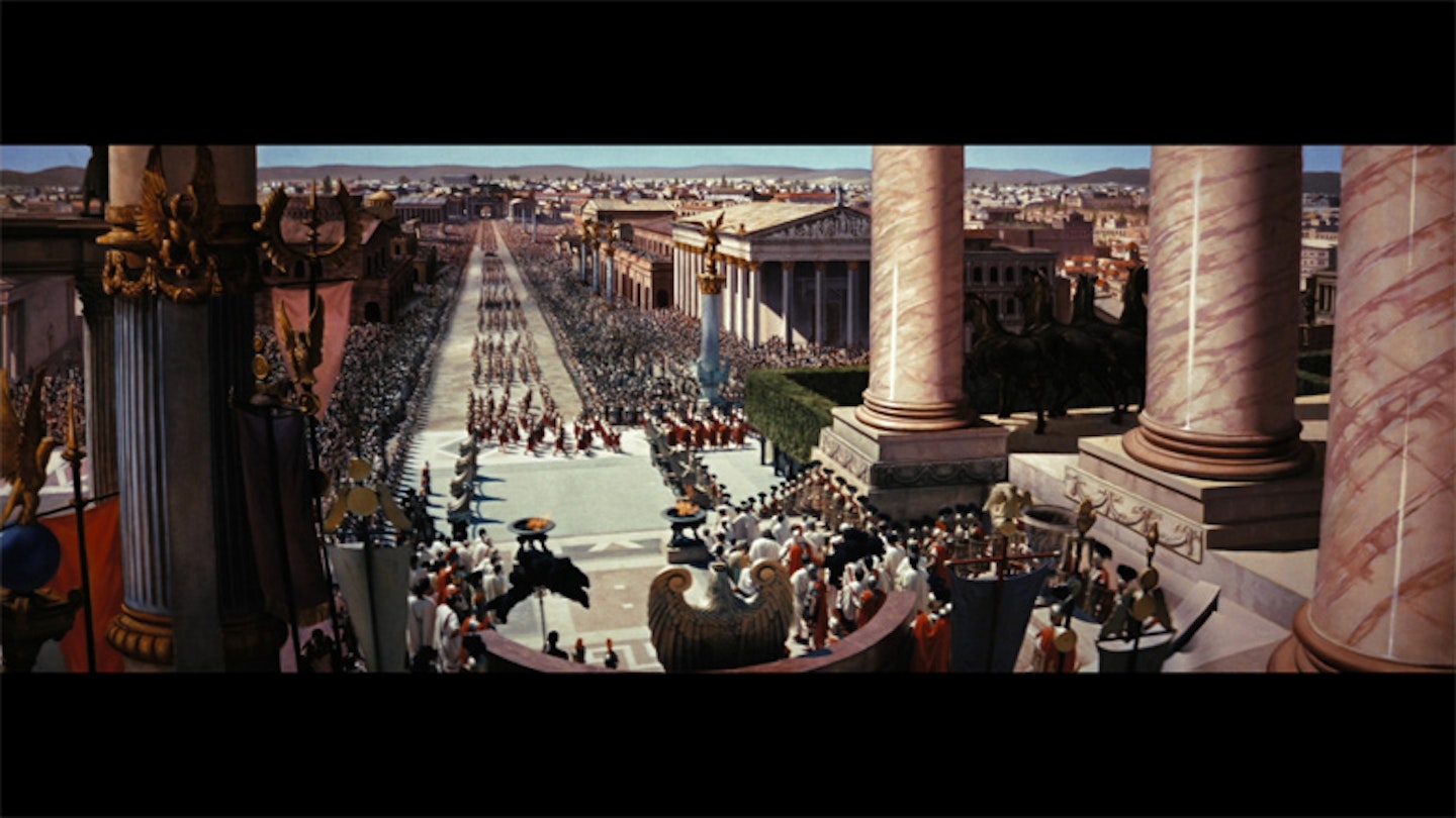
As you’d expect with these insecure Hollywood types, they soon got nervous and started measuring themselves against one another. MGM had such small-man syndrome that it launched MGM 65, which boasted an extraordinary aspect ratio of 2.76:1 on 70mm film – twice as large as the standard 35mm film we’re used to. This was most famously used in Ben-Hur in 1959.
Switching It Up
Since then, aspect ratios have continued to change, but increasingly in line with taste rather than technology. Filmmakers today have a lot of options at their disposal, but the most common ratios for modern films are 1.85:1 and 2.39:1.
Of course, plenty of filmmakers aren’t content with just one aspect ratio. In A Serious Man, the Coen Brothers shot their enigmatic prologue in 4:3 before switching to 1.85 for the rest of the film. Sam Raimi goes one better in Oz: The Great And The Powerful, changing aspect ratio mid-shot – from 4:3 to 2.35:1. (See trailer below from 30 seconds onwards).
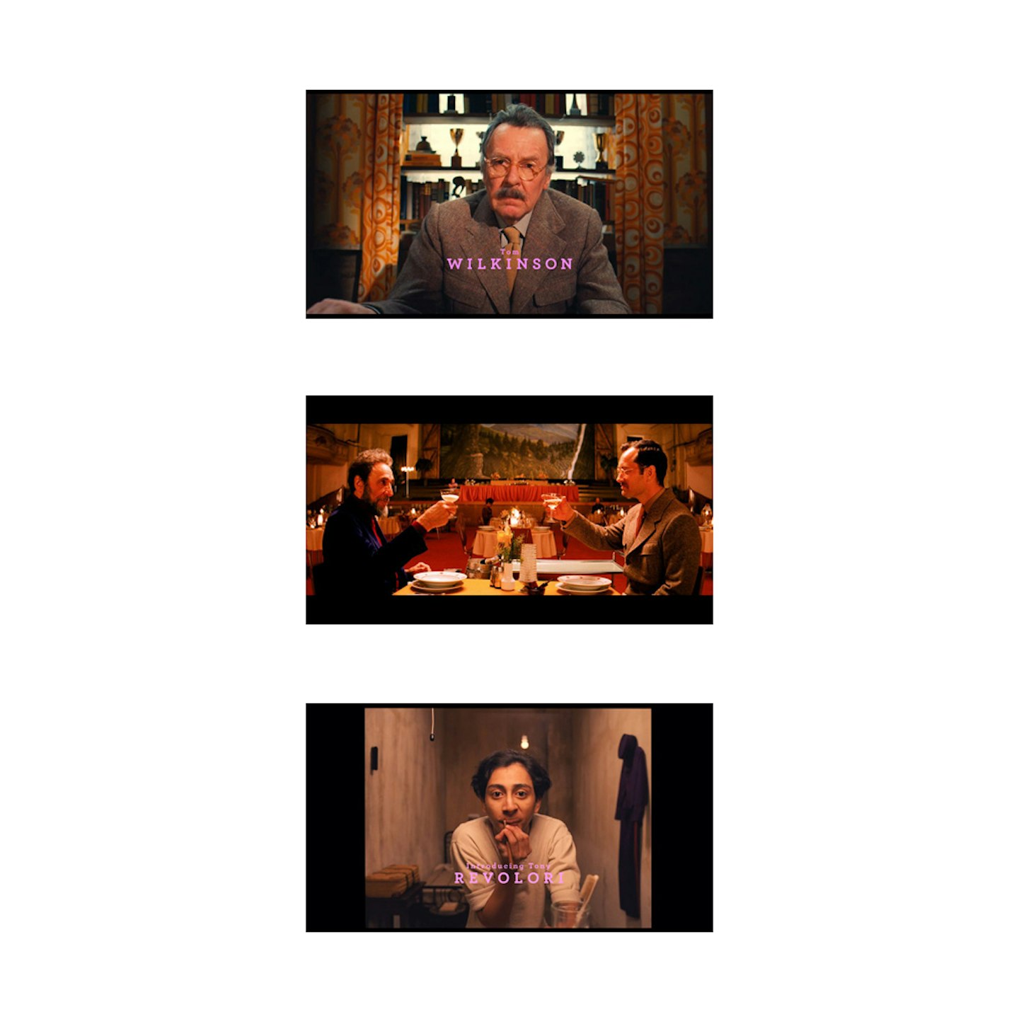
In The Grand Budapest Hotel, Wes Anderson is like a kid in a camera lens store, and he gives viewers something of a potted history of aspect ratios in three easy steps. It starts off pretty normal, with the prologue (and epilogue) presented in the fairly conventional modern ratio of 1.85:1. The film then switches to 2.35:1 for its 1960s sections, where F. Murray Abraham and Jude Law meet and converse over some delicious looking food. Anderson then changes ratio once again to the old fashioned Academy Ratio (1.37:1) in the main body of the film...

All this shifting of aspect ratios is pretty unusual. In fact, when Grand Budapest was released to cinemas, it was accompanied by a card with special instructions for the projectionist, in order to ensure the film was projected correctly. If only VHS manufacturers had taken the same care…
Home Comforts
As detailed above, when TVs began to become widespread in the 1950s, they stuck to screen dimensions that fitted with the films: 4:3. Once widescreen became popular, you – yes, you – had a problem: when widescreen films were shown on a 4:3 TV, they didn’t fit. Citizen Kane looked great, but Ben-Hur was bedeviled by big black bars at the top and bottom – this is known as letterboxing.
It wasn’t until the late 1980s that TV dimensions began to widen (see below), and as such, there were a lot of awkward compromises in this 30 year no-man’s land. If film was a glamorous, sophisticated blonde, TV was a nervous, sweaty teenager, and when busty films like Ben-Hur appeared on the small screen, TV wasn’t quite sure where to put its fumbling hands.
The most egregious and depressingly common solution for a long time was the monstrosity known as 'pan and scan'. This adjusted widescreen films to fit within 4:3 TVs, while (mostly) avoiding distorted images and any black bars at the top and bottom (or at the sides) – in other words, it avoided letterboxing and pillarboxing. Sounds great, right? Wrong.
To fit in the image without any distortion, the sides were often lopped off. This meant that for your more epic films in 2.35 or 2.75, half or more of the original image is lost. The 4x3 rectangle pans from side to side across the image, capturing what the manufacturer deemed the most important part of each shot. Hence, 'Pan'. 'Scan' refers to the act of copying that particular part of the image on which the 4x3 frame is focused.
The technique was a favourite of VHS manufacturers, and many casual viewers were none the wiser – but crucial bits could be lost. While not quite as primitive as a 'centre cut' (where the 4x3 frame is literally taken from the centre of an image, and never moves), elements are inevitably lost.
Martin Scorsese is fond of pointing out that in Ben-Hur, Charlton Heston’s magnificent four horse chariot appears to have just two horses in the pan and scan incarnation. Even more crucially, in the pan-and-scanned version of Oliver!, we are unable to see Bill Sikes stepping back from behind a wall having committed a murder – only young Oliver’s horrified reaction.
Shape Shifting
Finally, in the late 1980s, a dimensional rethink was in order. After a fair bit of prevaricating, 16:9 was settled upon, as it offered a reasonable compromise between the various aspect ratios on offer. Gradually, TV shows caught up and started to produce content to fit a 16:9 screen.
For a while, the BBC and other broadcasters encouraged programs being shot in 16:9 to be careful when framing to keep all the important visuals within a central 4:3 box. This was known as 'shoot and protect', and was meant to ensure that the 16:9 TV audience got a lovely full screen image, while the 4:3 audience didn’t lose any crucial information when sections of the image were lost on their TV.
Although TVs have changed and VHS tapes sit unwanted in charity shops, the ghost of pan and scan haunts us still. Nowadays, the same sort of problem can occur when blissfully unaware viewers have their TV set to the zoom setting. This ensures that when watched on this setting on a 16:9 TV, films in Academy Ratio lose the top and bottom in the process of filling the screen. Embrace the pillarboxes on either side – they’re your friends.

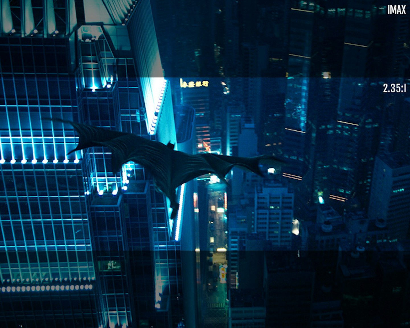
Clearly, aspect ratios are tricky to keep on top of. Directors like Christopher Nolan aren’t helping matters by filming certain scenes in IMAX, as in The Dark Knight. But if you want to avoid chunks of a film falling off the screen, or are keen to explain to all your uninterested friends why Wes Anderson’s films keep going all big and small, aspect ratios are too important to be ignored.
