The opening sequence of Seven (or Se7en, if you’re pedantic), David Fincher’s sophomore feature, gave the director a double challenge. In short order, he needed to put behind him the bitter legacy of Alien 3 (or Alien³, if you’re *really *pedantic) and subvert the expectations of audiences who might have been anticipating Brad Pitt in full-on heartthrob mode or the Morgan Freeman who drove Miss Daisy. And he needed to do it in a little over two minutes. So he turned to title designer Kyle Cooper, a virtuoso but as yet inexperienced movie credit designer, to forge a black-as-midnight sequence that set the pitch, plot and characterisation for the noir thriller. Cooper leapt at the chance to frontload the film with John Doe-dosed menace. “I was really into horror movies when I was a kid,” he remembers, “and I used to get frustrated when they’d hold back the monster to the very end. It occurred to me to get an idea of the killer before they finally catch him. We wanted to get the audience curious about what this guy is going to be. He has to be super, super evil.”
What Cooper conjured up was one of *the *great title sequences. A stylised mash-up of scratched frames and fuzzed-up, glitchy graphics set to a remix of Nine Inch Nail’s Closer, it was shot over two days, taking a further, painstaking five weeks to cut together. It was deemed by the New York Times to be “One of the most important design innovations of the 1990s,” and has proved almost as influential as the film itself. Cooper has since gone on to design iconic credit sequences for Zach Snyder’s Dawn Of The Dead, all three Spider-Man movies and The Mummy among many others, but Seven remains a broody, brutal cut above all its peers. “I think it came from Fincher’s ability to meditate on dark things and the anger I had at that time,” he reflects when **Empire **catches up with him. “Now I think of it as a bit of a playful dance. We were making a mess and having a good time doing it…”.
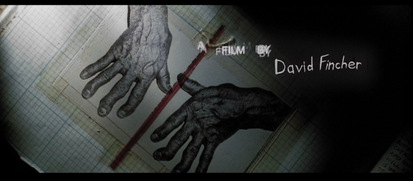
“Fincher initially came to me with an idea about Morgan Freeman taking a train ride from this gritty, dark, rainy city to a house out in the country that he wanted to buy for his retirement. He needed a temporary title sequence for a studio test screening, so we made this slide show using some of John Doe’s scrap books. It was just stills, and we used a hand-drawn type to suggest that Doe did the writing himself. David gave me the Nine Inch Nails music [Closer from 1994’s The Downward Spiral] and I cut the slideshow to that – just a series of stills. When he showed it to the studios, they said to him that he should use it for the main titles, but as he always does – and still does to this day – he was unwilling to comprise on any level. After the slideshow he said to me, 'Pretend we’ve never met and come back and propose something else.' What I proposed was an extension of the slides, where I photographed all of the books and we made some of our own. Once he bought into that tabletop idea, he wanted Mark Romanek to direct it, because he liked Mark’s video for Nine Inch Nails’ Closer, which was all burnt film and rollouts. But I told him I wanted to do it and he agreed."
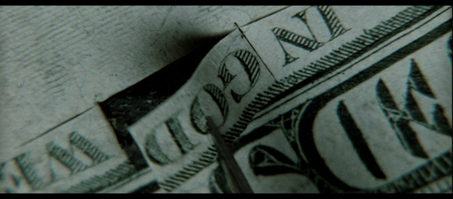
"In [Hughes brothers 1995 thriller] Dead Presidents there’s a shot of a dollar bill with the word ‘God’ burning, and I had this idea that John Doe could cut the word ‘God’ out of a bill, because it’s all about the Seven Deadly Sins and he’s making himself out to be God. He judges all these people, then he punishes them. After the film was released, I’d get all these calls from people asking if someone was being murdered in the sequence, and I’d say, 'No, he’s just getting ready for work.'”
"The idea was that this is John Doe’s job: he gets up, makes his books, plans his murders, drinks his tea... I watched the movie over and over again, and there’s that scene with Kevin Spacey having a cup of tea in the holding tank in the room with the two-way mirror. The way he stirs his tea with the tea bag in his hand is very elegant, so I thought of a down shot with a tea bag going into a teacup. Fincher said, 'Why don’t you cut the fingers, because Doe cuts his fingerprints off with a razor blade?' so there was this back and forth thing where we would both propose all these shots."
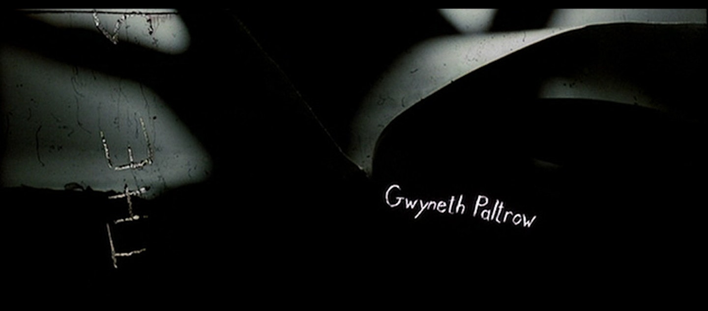
"Fincher has obviously developed into a genuine auteur, a really seasoned filmmaker who doesn’t have to rely on effects. Here he was thinking about the idea of credits as handwriting to suggest the dark part of John Doe’s personality and his obsession, and he actually scratched all the credits on a scratchboard and then scanned it back in. Then we made an animation, pieces of film where the type is clear and everything around it is black, and put those on a light box and shot them all on film, and then opened the gate and over-exposed them. We had to composite all these type accidents on top of the live action plate. It was very difficult. What people don’t understand is that there’s no animation per se – today we all use After Effects and all of this animation software, but in a lot of my credit sequences the animation is created editorially. For Gwyneth Paltrow’s credit might have 15 different cuts, so we create this animation by cutting all of those things."
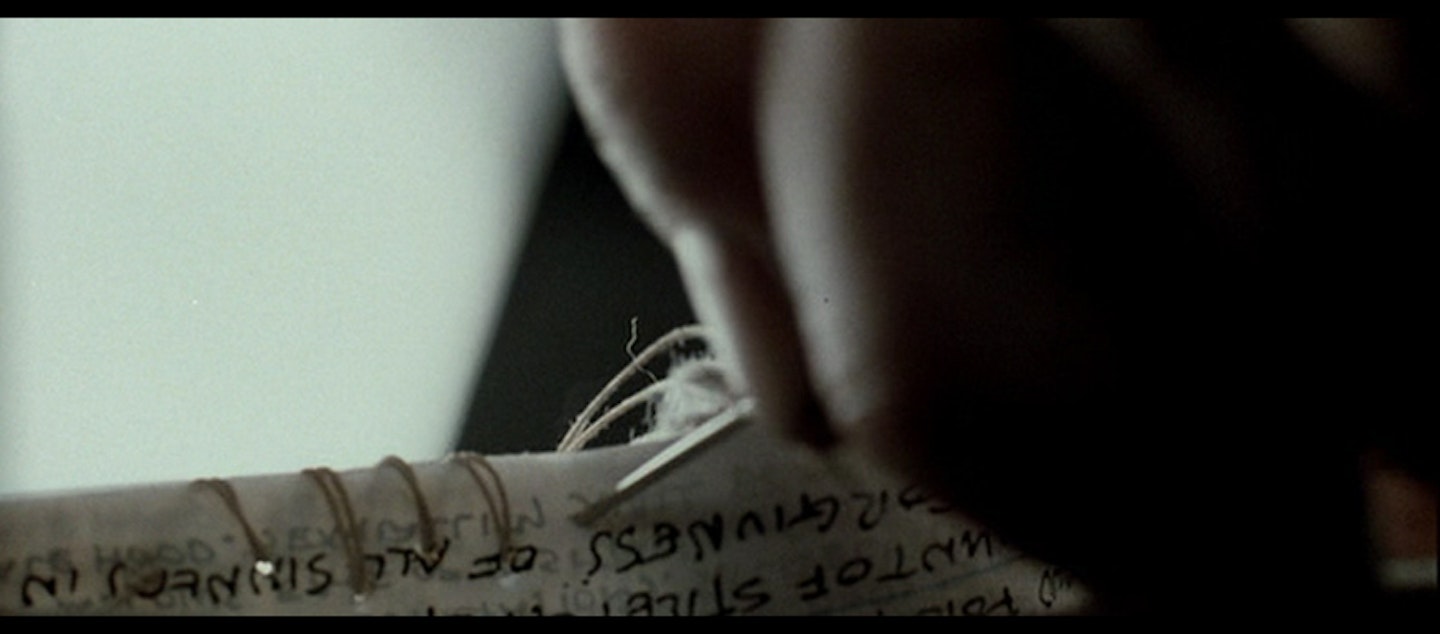
"I was thinking that because John Doe was a photographer, not only is he writing the type but he’s making the film optical in his bathtub – he’s physically doing it because he’s got a dark room in his ratty apartment. So the editor, Angus Wall, who’s gone on to edit The Social Network and Zodiac and other Fincher films, he and I were writing all kinds of things on the film and stapling it together. The night before the shoot I went around my house trying to think about the darkest things I could find to make the shot more twisted. I remember taping fish-hooks together and taking a matt of hair out of my drain."
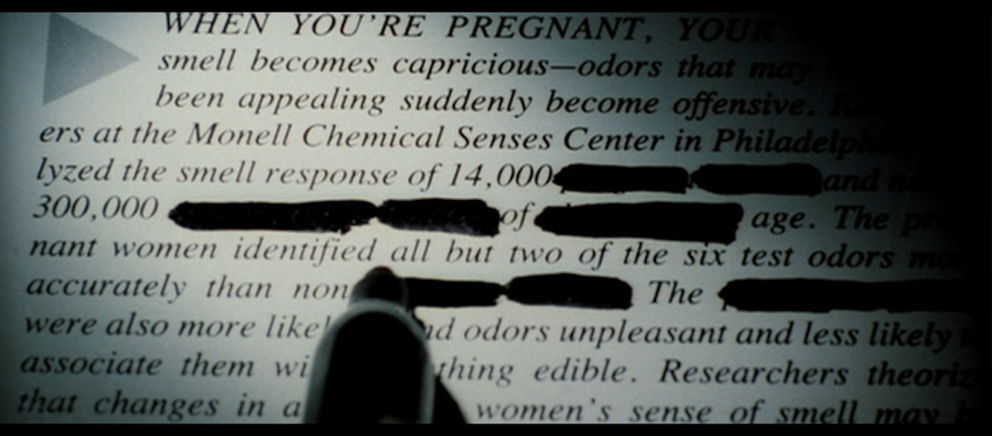
"John Doe has this rage and indignation at people’s behaviour and he’s crossing out things that shouldn’t be there. The idea of life and pregnancy and marriage and our ideas about what this perfect life is: he doesn’t think we deserve to have those kinds of experiences. At the end of the day, people are always trying to do things that are bleak and shocking and it’s difficult to do something that reflects a bleak worldview unless you’ve experienced some of those things yourself. But it’s kind of a wink because it is so playful – it’s like a spirited, playful dance. I don’t think of it as super dark."
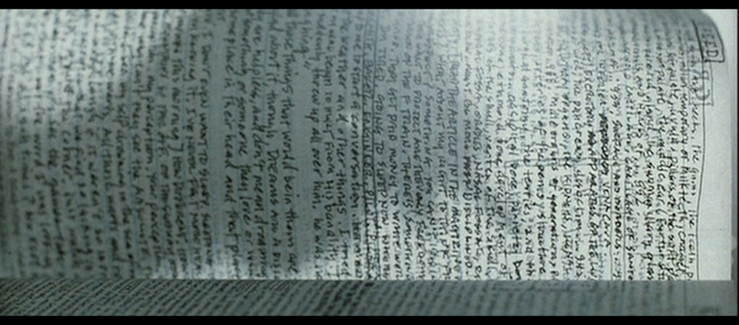
"We hired a design company in LA called Ph.D that had a freelance person we hired to do it. The strange thing is that I have very similar handwriting, and I did write some of it, but the main stuff is this other guy. The actual text doesn’t mean anything to me, but it might mean something to him. Basically he was just wrote and wrote and wrote. It was like Rain Main."
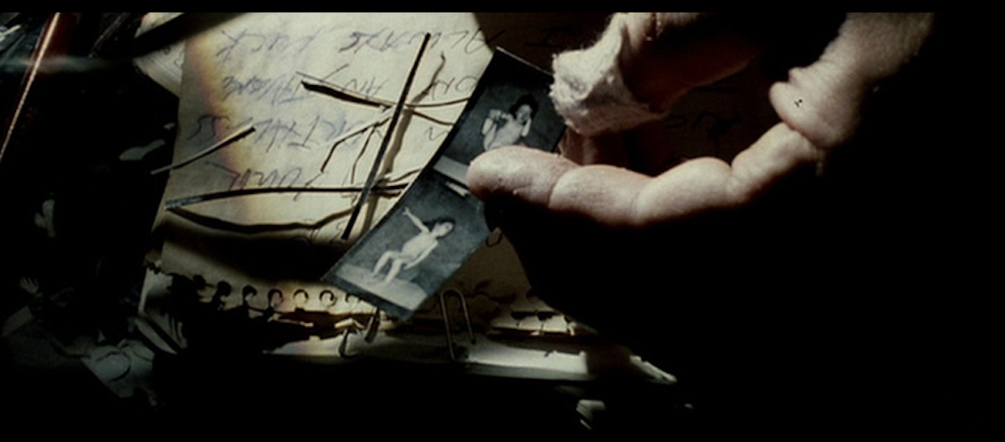
"We looked at a lot of hand models and the one we hired was this Tai Chi guy. He was this pretty heavy fat guy – a strange, scary guy who seemed kind of threatening when we were casting him. His hands seemed kind of elegant, but the funny thing was that David was upset with the choice. He said, 'Why did you cast that guy? His hands look absolutely nothing like Kevin Spacey’s hands.' If you look at Spacey’s hands, his fingers are long and thin, but this guy’s hands were kind of stumpy. Fincher was very dubious but I didn’t think anyone would notice, so we went ahead with him. He was a funny guy. [Seven cameraman] Harry Savides said at the end of the shoot, 'We have to do something to this guy.' So we made him take off his shirt and put Vaseline all over him and then we wrapped him in twine. We didn’t even use that shot, but we didn’t tell him that."
Seven is out now on Blu-ray for the first time