Sometimes, one sheet is all it takes to pique your interest in a film: a dazzling color scheme, a clever concept, an arresting image. Film posters are more than just marketing materials – they’re undeniably an artform in themselves, with the world’s greatest illustrators and designers (including the likes of Drew Struzan, Saul Bass, and Bill Gold who passed away earlier in 2018) producing works that have sometimes become as iconic as the movies they’re promoting. Empire has gone back to the drawing board to find the 50 greatest movie posters to ever grace cinemas, bedrooms, and billboards everywhere.
50. Little Miss Sunshine
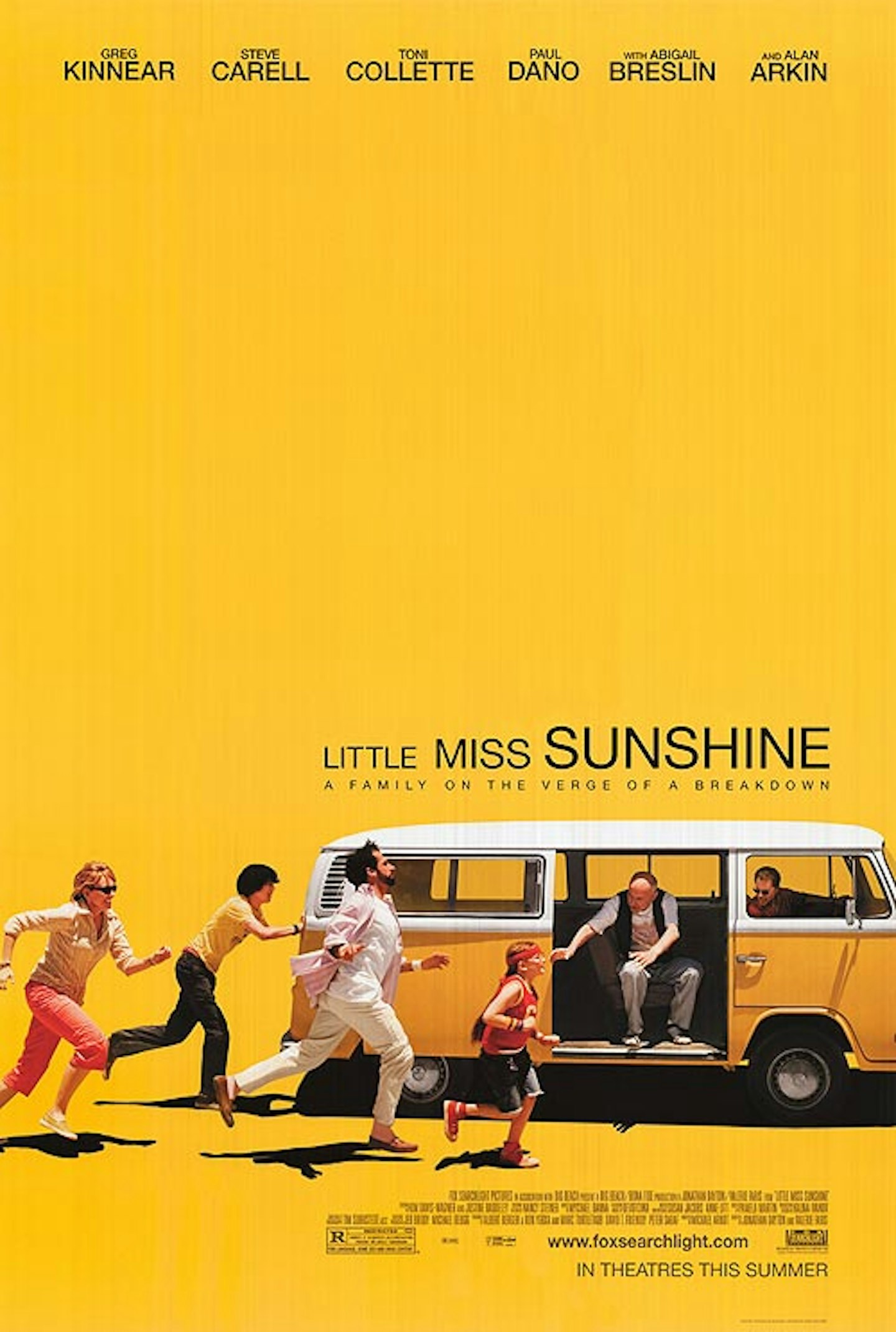
A great example of colour scheme that extends from a film to its marketing. Yellow emanates from this heartwarming Sundance hit, seen on Paul Dano’s t-shirt and the lovably rubbish VW campervan, here flooding the negative space of both trailer and poster. Showing a key element of the film – the van doesn’t start easily, so the family have to run and jump into it – it presents an image in motion, but without losing the sense of family and humour.
49. The Graduate
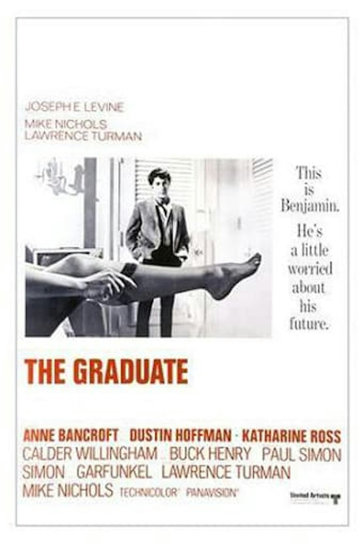
Immortalising the most notorious seduction in cinematic history, Anne Bancroft’s partially-stockinged leg seduces everyone who gazes upon this classic poster. Except it isn’t actually Anne Bancroft’s pin: 46 years after release, model and Dallas star Linda Gray revealed that it was her leg on the poster, as Bancroft couldn’t make the shoot. Gray was paid $25 for the shot – not a bad leg-up.
48. Mean Streets
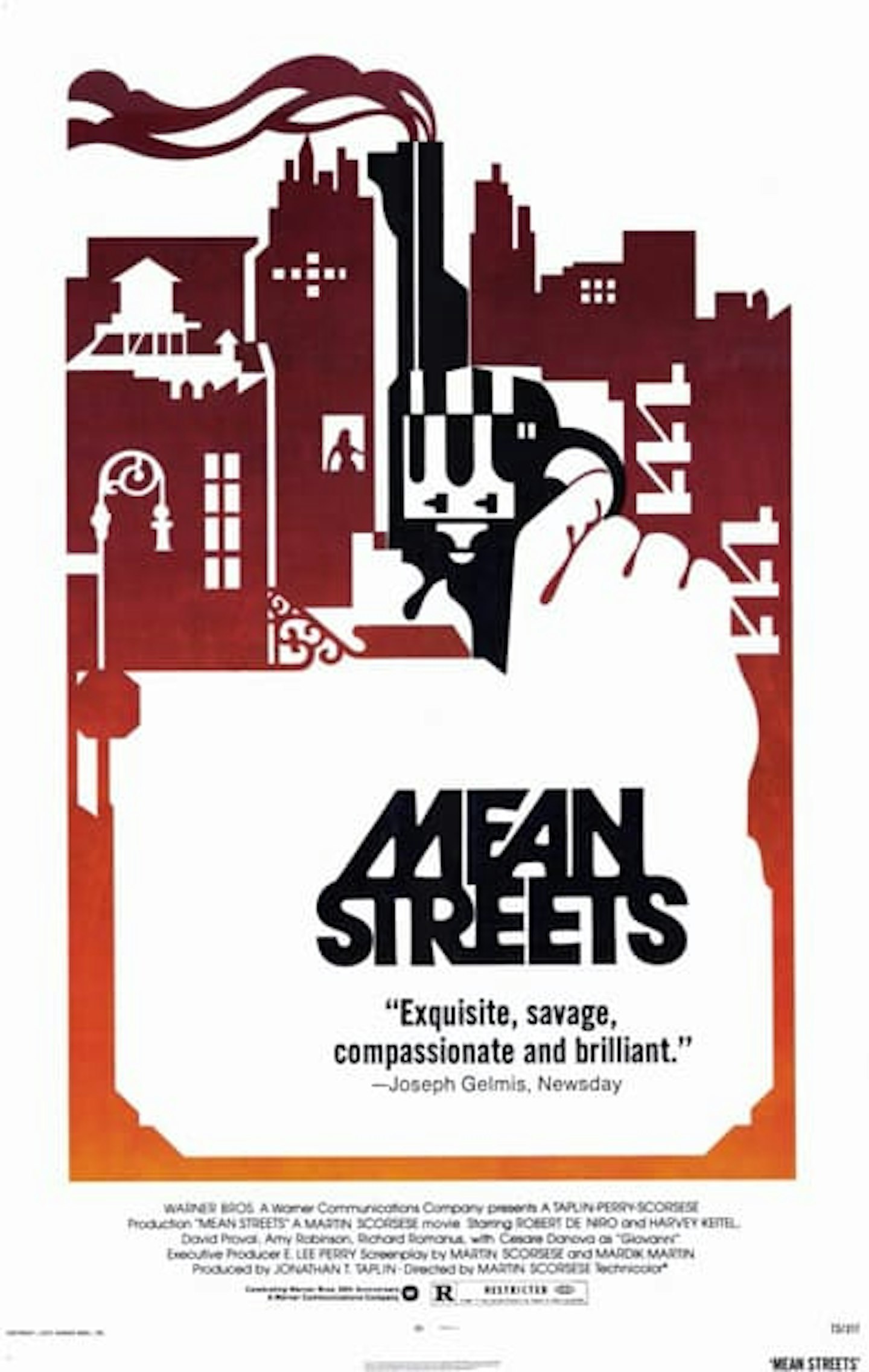
Martin Scorsese’s breakthrough film has a groundbreaking poster to match, a gorgeous representation of the darker side of Little Italy, with the New York neighbourhood’s physical features – fire escapes, stoops, rooftop water towers – melded into graded-colour graphic, with Johnny Boy’s smoking gun doubling as a high-rise chimney.
47. Lord Of War
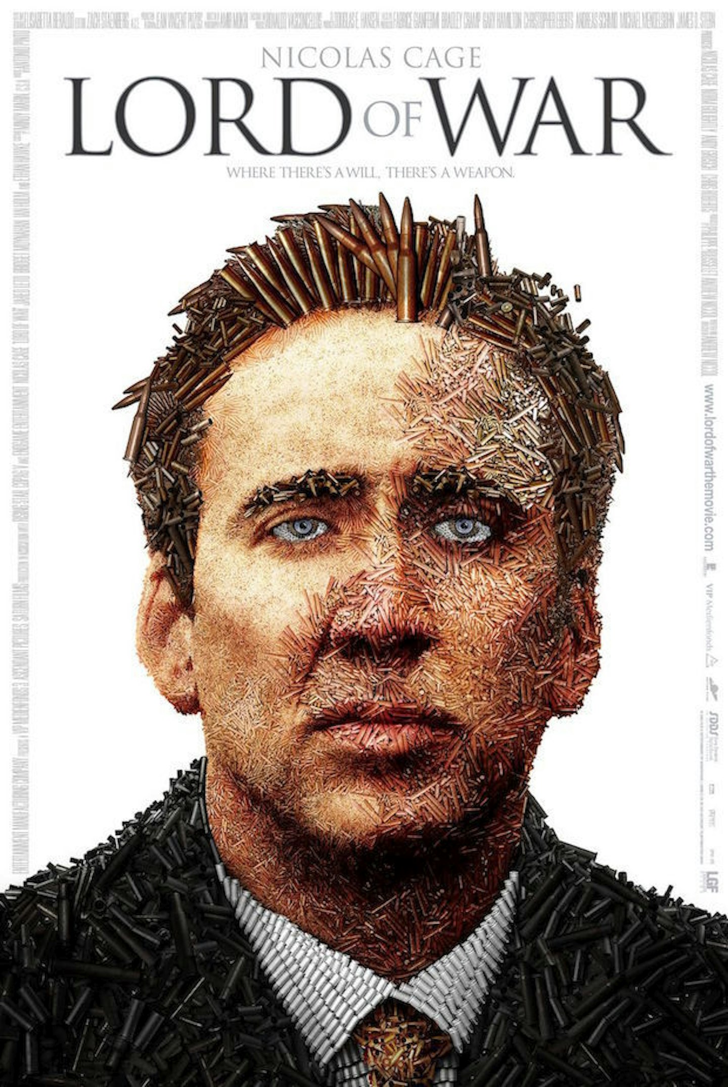
Nicolas Cage has the look of a Lord Kitchener in this ingeniously simple poster for arms trafficking drama Lord Of War. At first glance, it’s a straightforward headshot. Look closer, and it’s a headshot in more ways than one: every fragment of The Cage is made up of bullet and shell casings. It’s a meticulous mosaic of militarism, and it works like a treat.
46. Manhattan
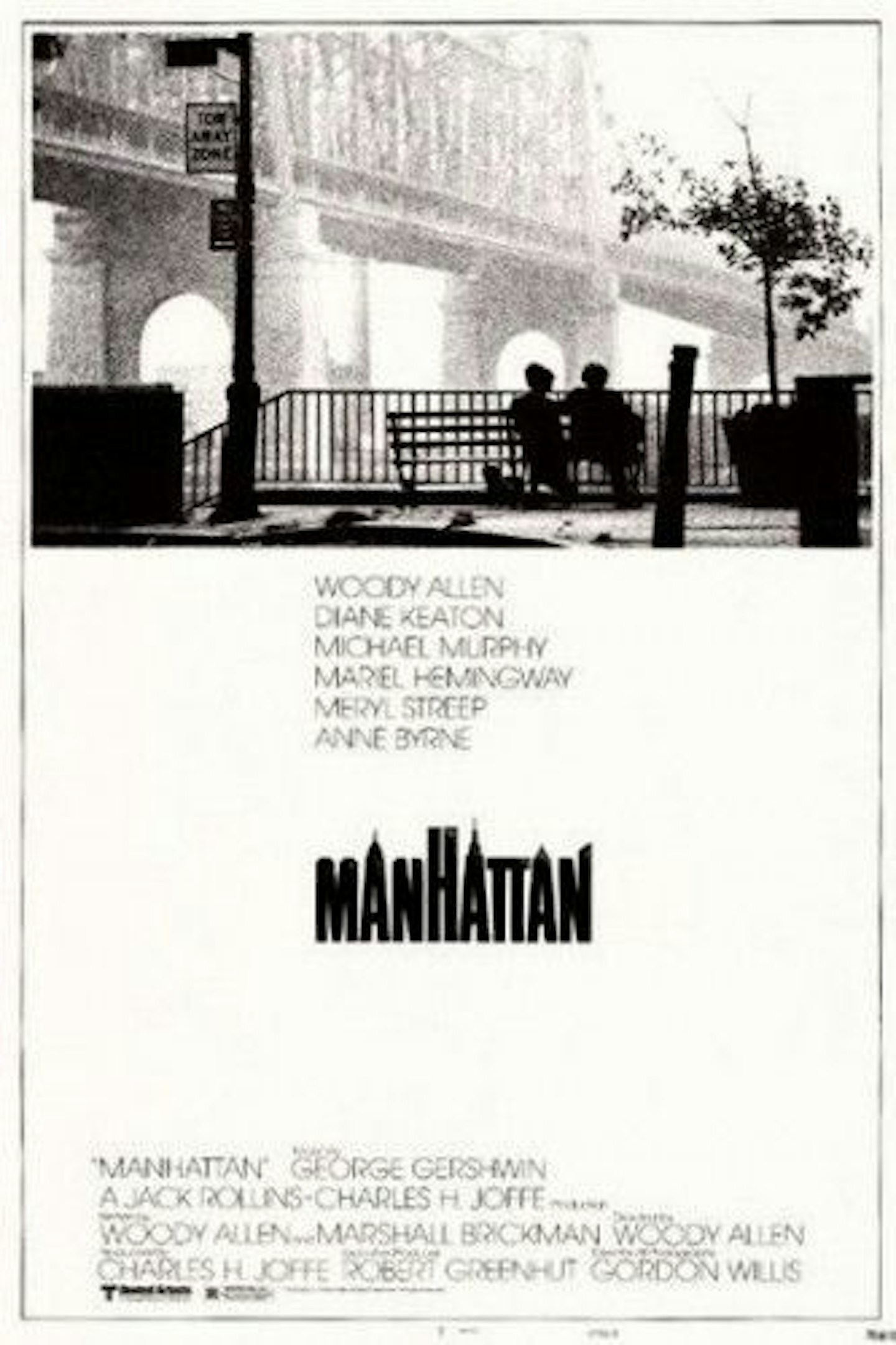
Matt Needle’s design seems almost obvious now, such is this poster’s ubiquity and influence. But it’s brilliantly deliberate and thoughtfully constructed: the monochrome reflecting Woody Allen’s black-and-white cinematography, the white negative space hinting at the wintry setting, the typography gently morphed into the skyline, and the famous bench shot of the Queensboro Bridge taking precedence.
45. Love In The Afternoon
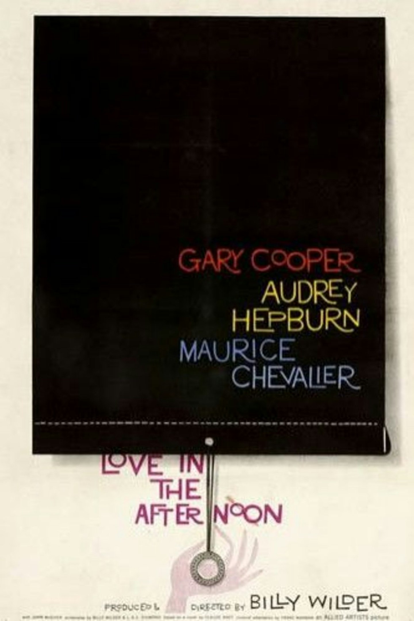
An early design from the legendary Saul Bass, his trademark jaunty typography and bold emblematic graphics proving an ideal fit for Billy Wilder’s screwball romantic comedy. The block of black is bold and imposing, but there’s something rather fun about the sense of impending movement in the blackout blind, ready to whizz upwards.
44. Fear And Loathing In Las Vegas
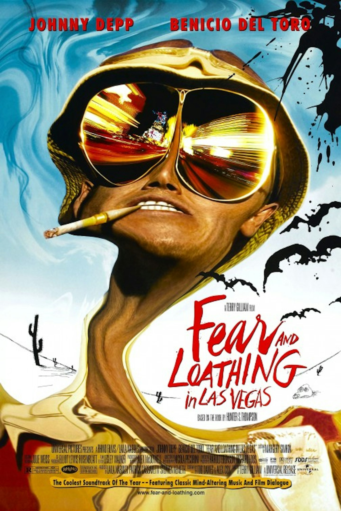
A Ralph Steadman poster for a film adaptation of a Hunter S. Thompson book seemed almost inevitable, given that the Welsh artist’s surreal, explosive style had accompanied Thompson’s gonzo missives for years. It is, as you might expect, a match made in acid-fuelled heaven, Johnny Depp’s head warped into Dali-esque delirium.
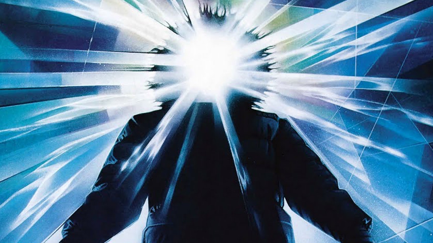
43. The Thing
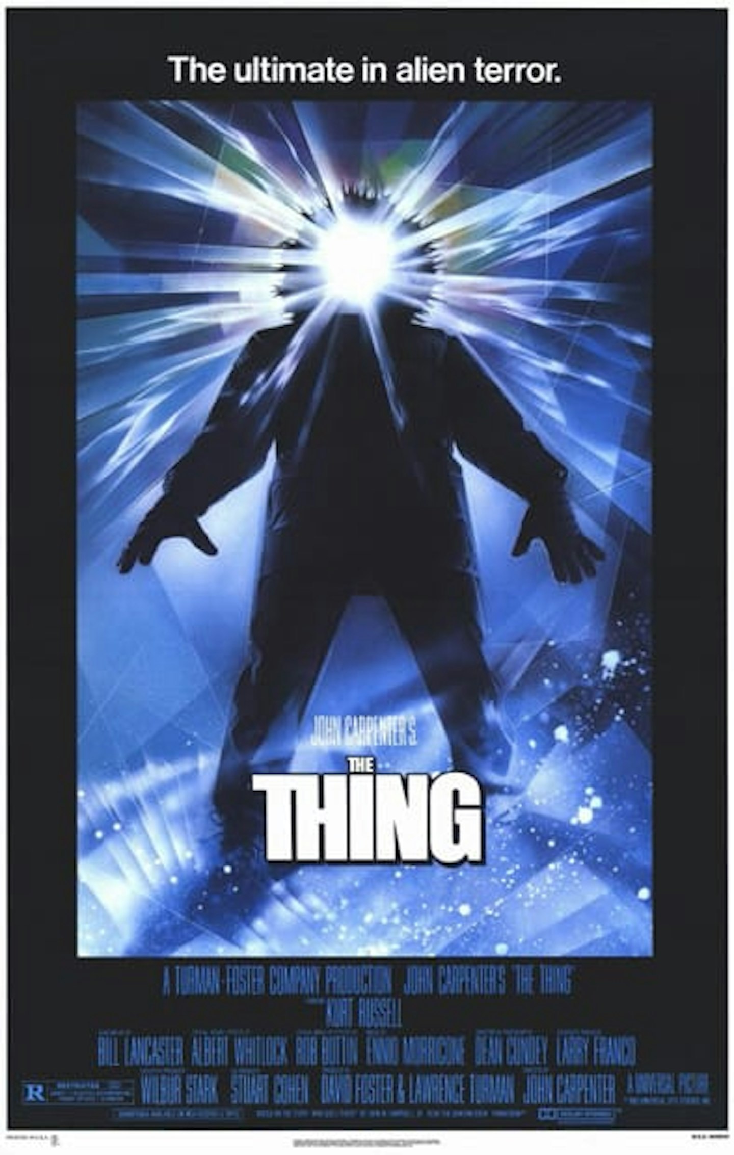
“The ultimate in alien horror”, reads the tagline, and this is the ultimate in Drew Struzan poster design – at least among his horror output. Perhaps what’s powerful is that the imagery does not directly reference any scene in the film. It’s pure Struzan: having been given the briefest of briefs, and knowing next-to-nothing about what the movie was about, he whipped it up in 24 hours, the paint still wet when the courier picked it up.
42. The Social Network
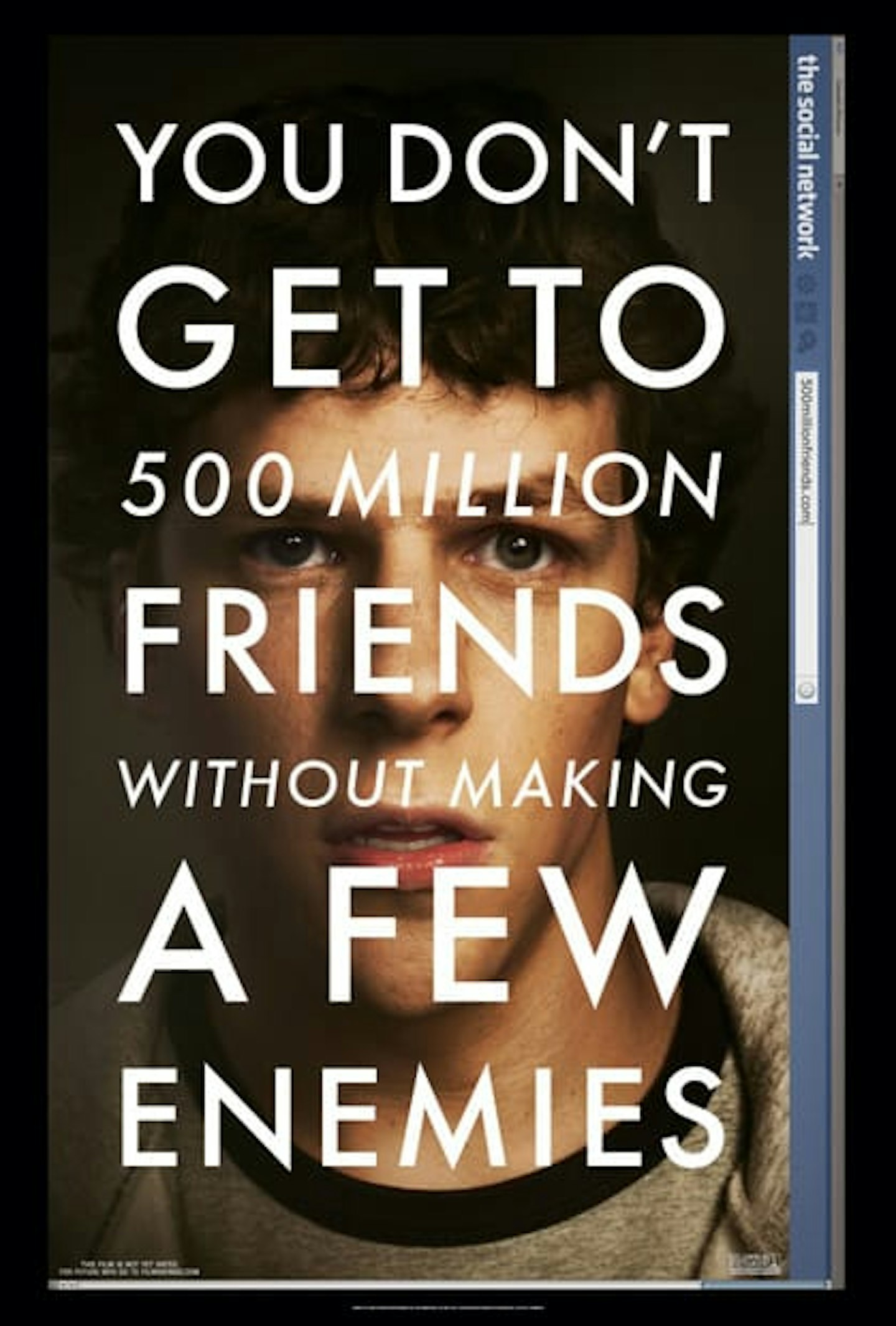
The Social Network wasn’t the first poster to start the Big Letters On A Face poster trend, but it was the most memorable, and effective. That giant tagline – written in Futura, David Fincher’s favourite font – is a pithy summary of the film’s premise, while the film’s title, unusually set on the left hand side, cheekily parodies the Facebook logo and header. Like all of Fincher’s films, the marketing has his fingerprints all over it.
41. Breakfast At Tiffany's
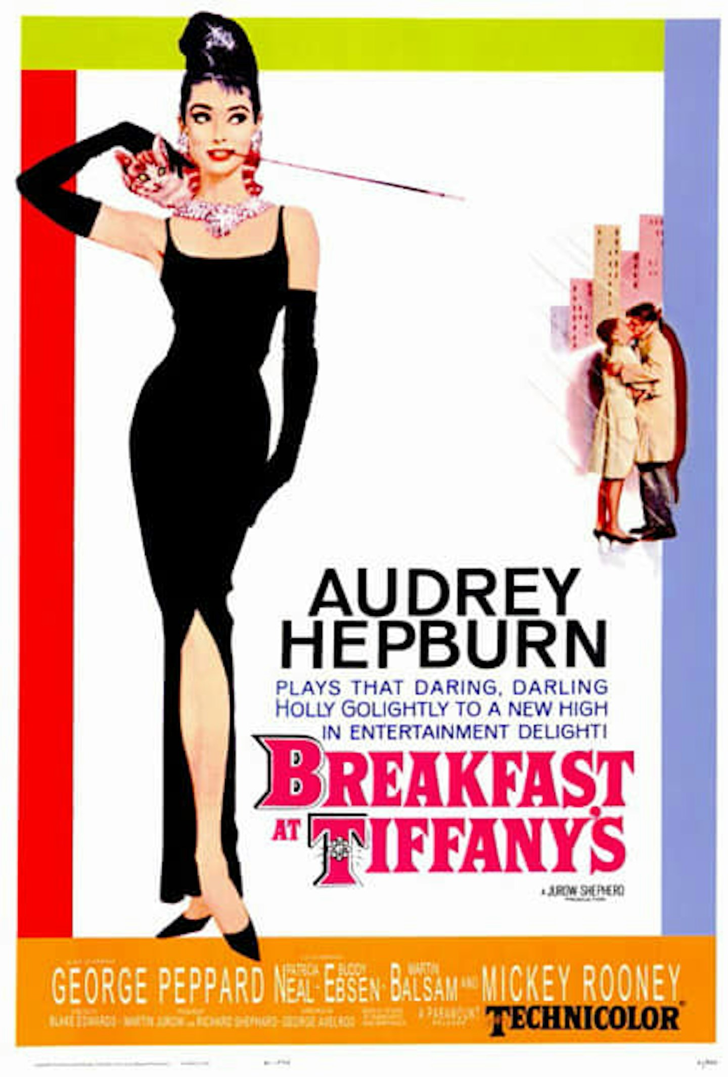
Some posters do just as much work as the film in establishing an iconography and legend. This poster for Breakfast At Tiffany’s turned Audrey Hepburn from wide-eyed innocent into socialite aspiration, establishing Holly Golightly as the café society dream girl that predated the Manic Pixie variety by decades.
40. Scream
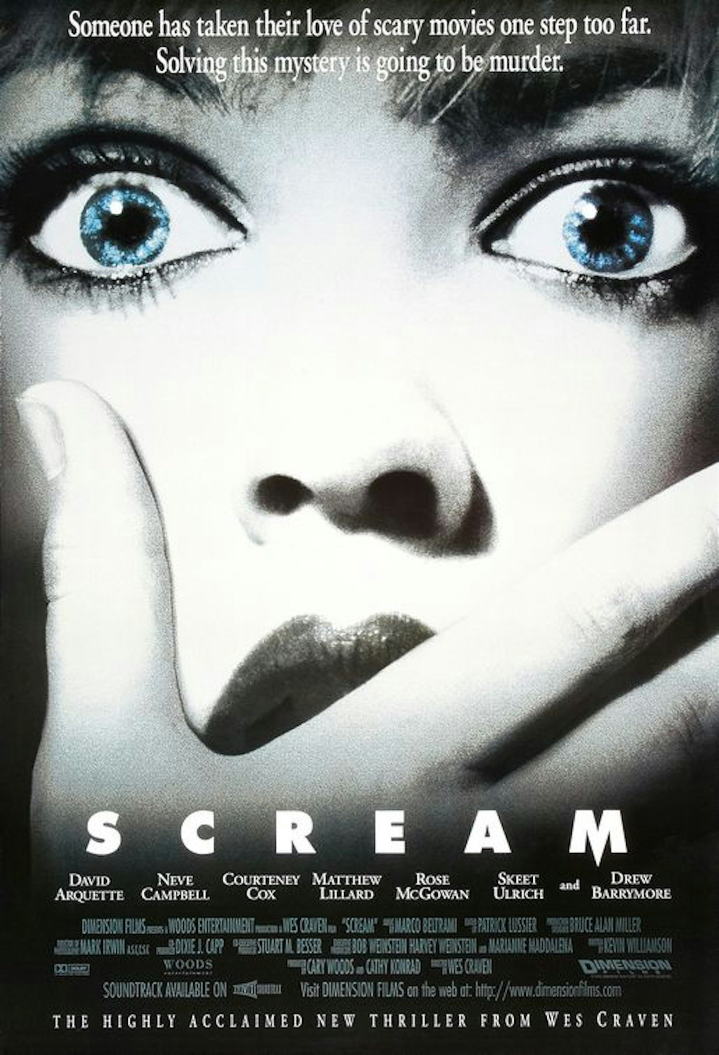
The obvious choice for this poster might have been to feature the film’s villain, ‘Ghostface’, or riff on Edvard Munch’s famous painting. Instead, the designer opts for an extreme close-up of Drew Barrymore’s face, her eyes accentuated in glistening blue. Wes Craven lumped for the same trick Hitchcock used some 36 years earlier in Psycho, by putting his most famous star front-and-centre, only to kill her character off early in the film.
39. Moon
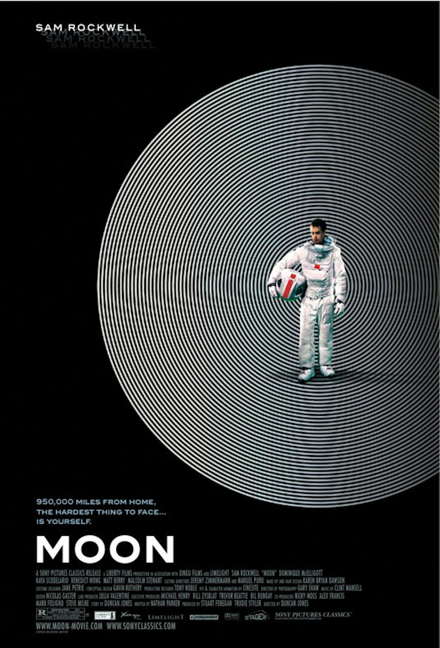
Recalling the trippy, dazzling lines of Saul Bass, this striking design for Duncan Jones’ debut comes from London-based AllCity, a creative agency who have churned out some of the most interesting and innovative posters in recent years (see also: La La Land, The Death Of Stalin). It’s minimal and pictorial, but still evokes the loneliness and paranoia that Sam Rockwell’s character faces in his lunar exile.
38. Rosemary's Baby
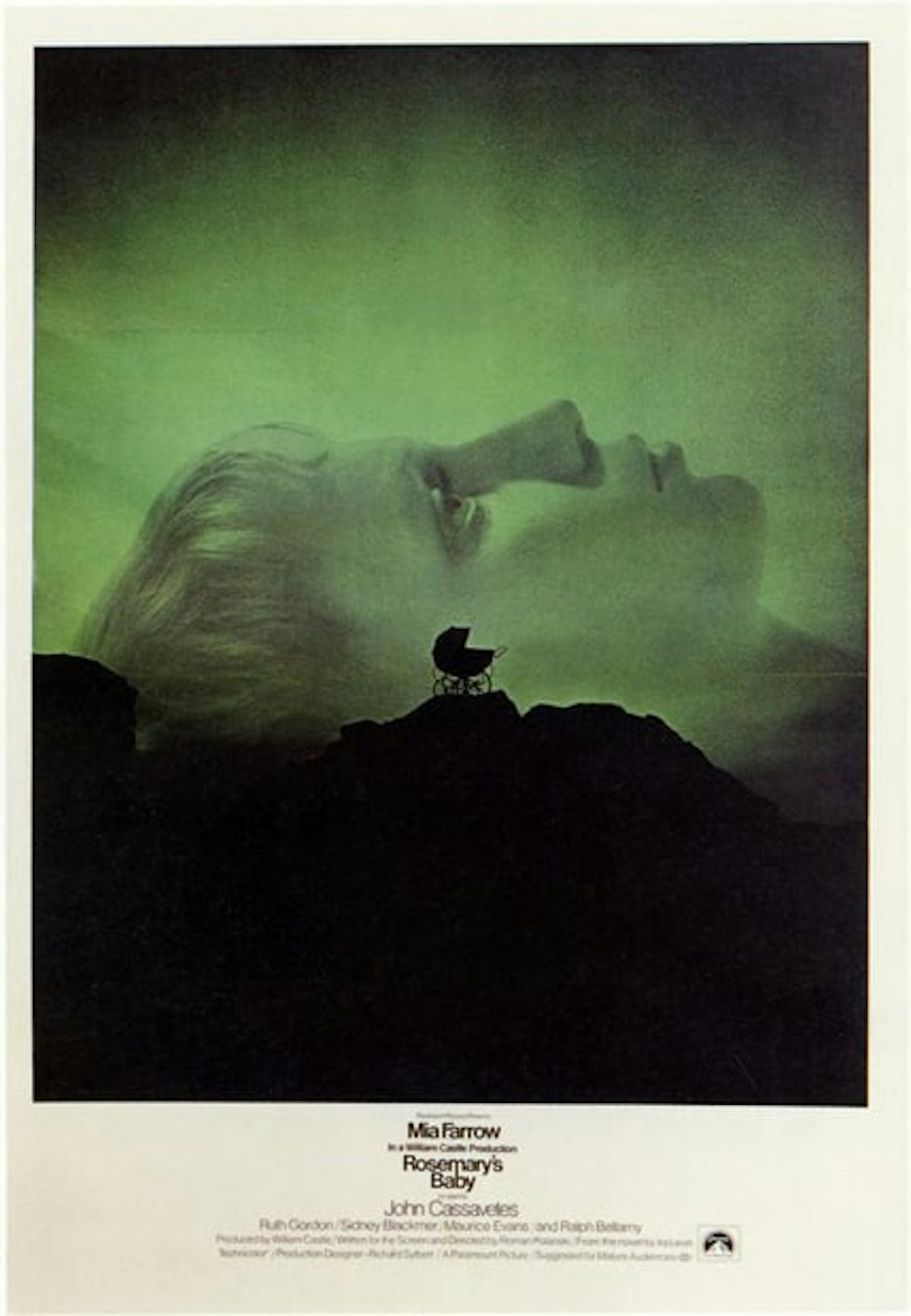
Mia Farrow’s face dominates this poster, her face in profile swamping a hazy green background, with the eerie silhouette of a pram set against it. Advertising creative and real-life Mad Man Stephen Frankfurt was responsible for the design, and a pioneer of making title sequences, posters, and trailers uniformly branded.
37. The Rocketeer
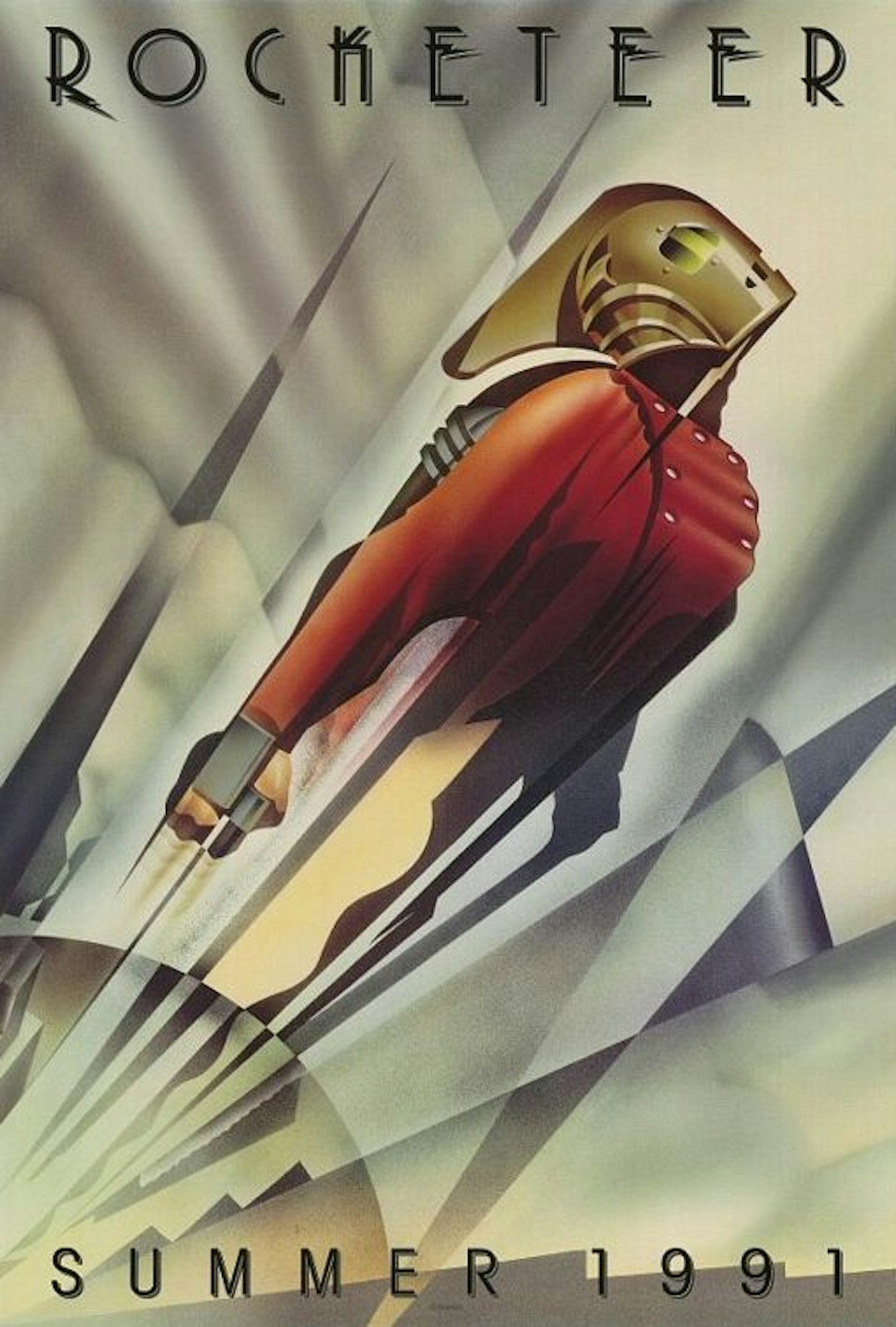
Disney’s much-underrated art deco period superhero flick earned this suitably art deco teaser design, setting the period and style in elegant fashion. Alas, as splendidly presented as it is, the poster was partially blamed for the film’s financial failures, as it neglected to feature any of the film’s stars (including then James Bond, Timothy Dalton).
36. Apocalypse Now
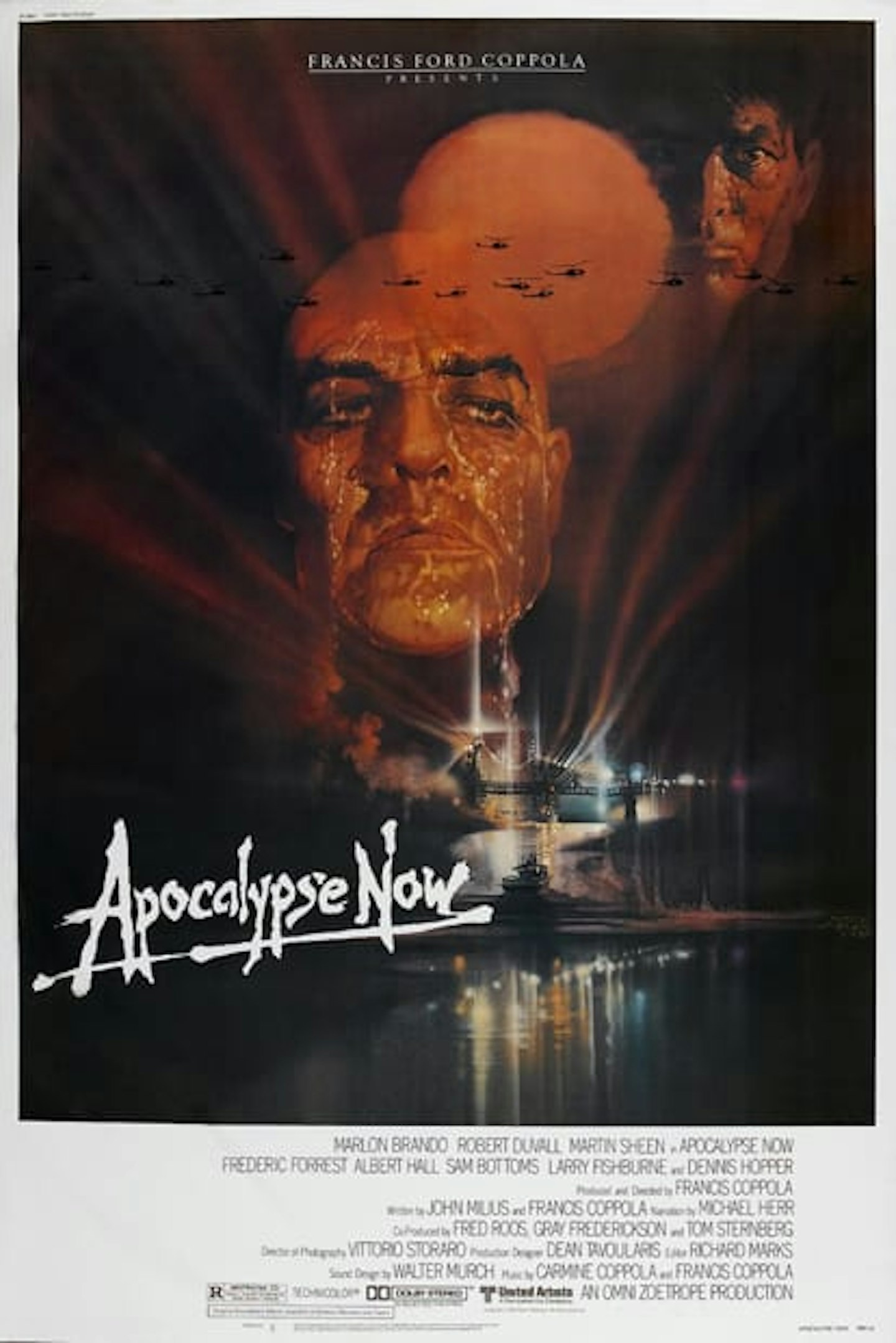
Hypnotic, confusing, hallucinogenic, and mystifying, Apocalypse Now’s poster matched the film in every sense. Marlon Brando’s giant bald head fades into the shimmering sun like a mirage, while the choppers flying over have an unreal, bug-like quality. With this poster and others, Bob Peak became one of Hollywood’s most in-demand poster designers, second only to Drew Struzan.
35. Halloween
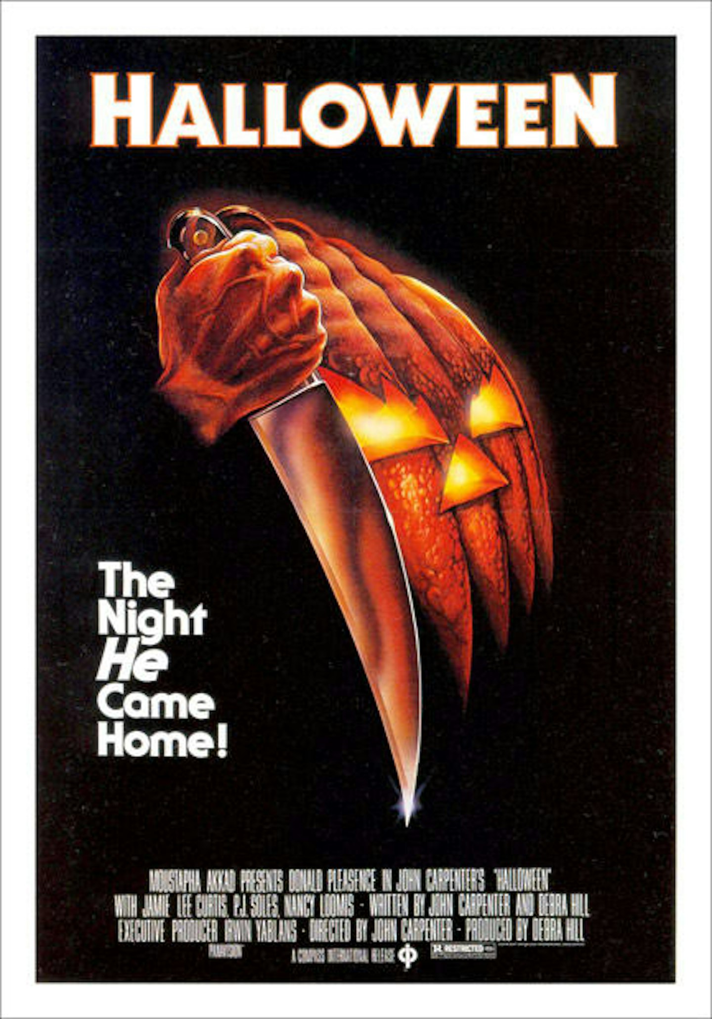
Proving that even the humble pumpkin can be considered menacing, Robert Gleason’s acrylic demonic nightmare is arguably unmatched among horror one-sheets. We only see Michael Myers’ hand here, but his presence is felt heavily – especially in that tagline, with the italicised ’He’ suggesting so much from so little.
34. Clockwork Orange
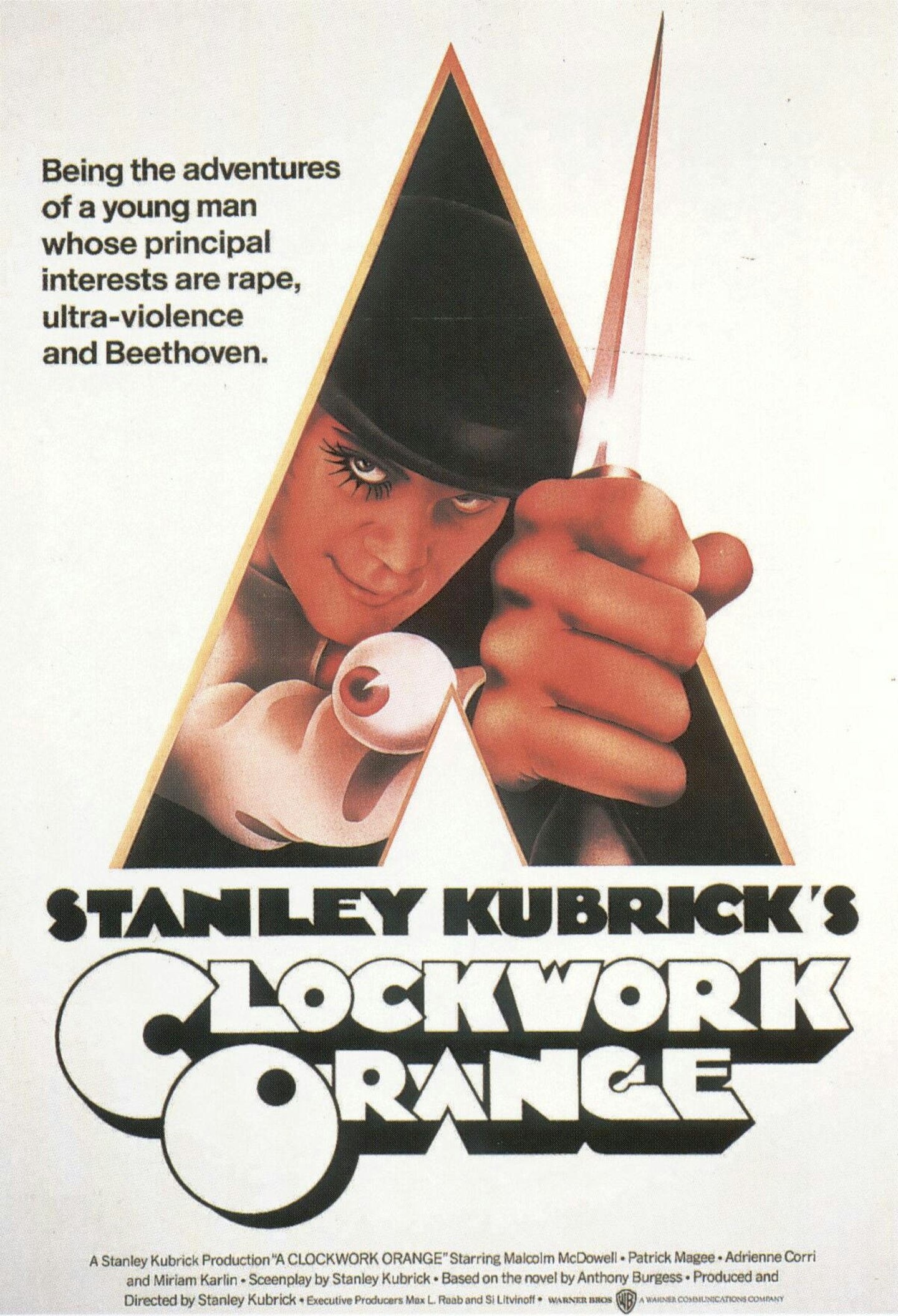
In 1973, Stanley Kubrick banned his own film from release, following a media storm of controversy, and for years this was the only image many audiences had of A Clockwork Orange. Philip Castle’s design presents its lead character almost hidden in a pyramid design, brandishing a knife, accompanied by an eye-popping tagline. Viddy well, little brother.
33. Metropolis
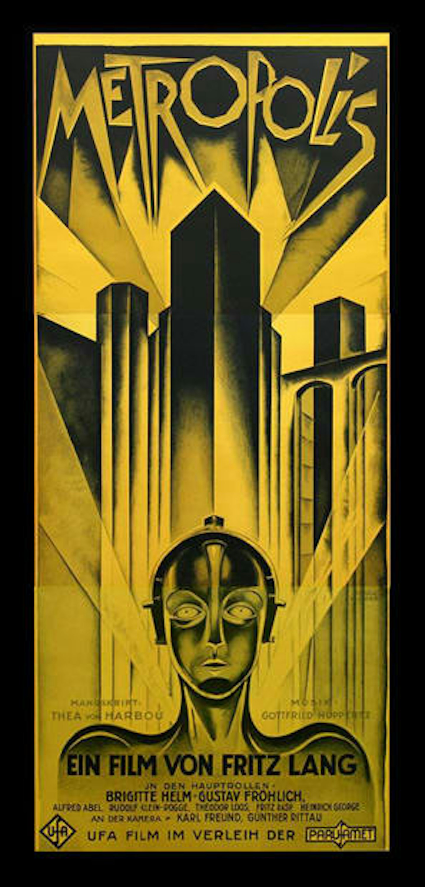
This shimmeringly beautiful work of art deco futurism – in the archaic ‘three-sheet’ format – comes from the hand of German graphic artist Heinz Schulz-Neudamm. Such is its fame that a rare original copy of the poster, thought to be one of only four in existence, recently sold for $1.2 million at auction.
32. Anatomy Of A Murder
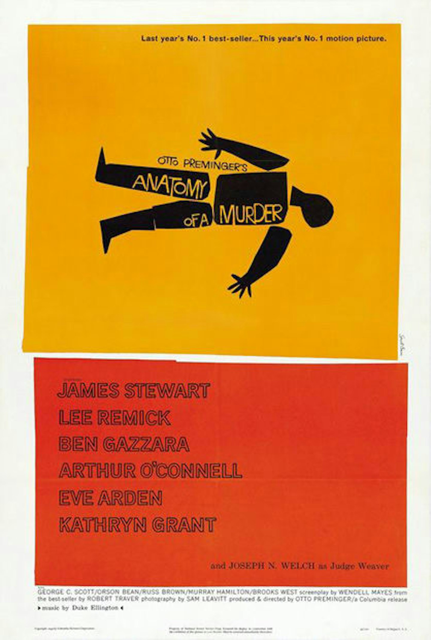
Another of Saul Bass’ many masterpieces, matching his equally brilliant title sequence. The simplified, almost cartoonish shapes of a corpse sum up the themes and premise of Otto Preminger’s courtroom drama efficiently and effectively; the simple, unusual orange/yellow colour schemes makes it instantly recognisable.
31. The Exorcist
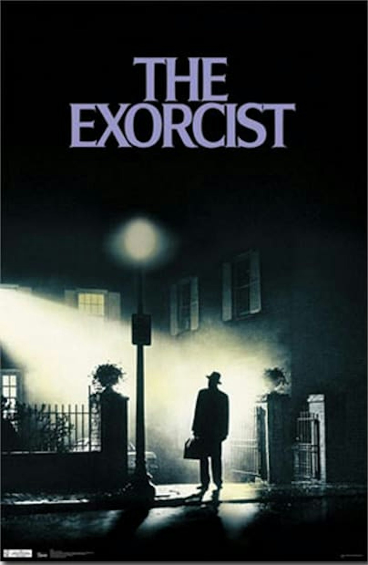
Prolific poster artist Bill Gold strikes, well, gold, with this instantly famous silhouette. Taken directly from the scene in the film where Max Von Sydow’s Father Merrin first arrives to begin his work, it shows director William Friedkin’s love for German Expression-esque mood lighting and gothic horror – and soon became a favourite in student hall bedrooms.
30. Forbidden Planet
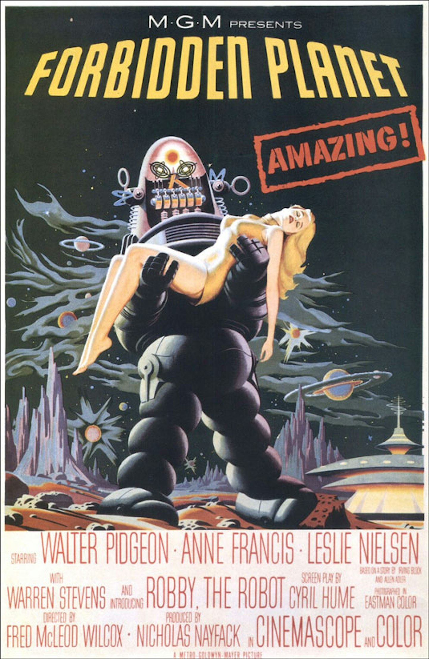
For viewers of a certain generation, Robby The Robot was the entry point to a whole new world of science-fiction gods and monsters, and his futuristic visage takes centre stage in this nerd’s vision of paradise, a film – and poster – so influential that it now lends its name to the nerd mecca bookshop.
29. Gone With The Wind
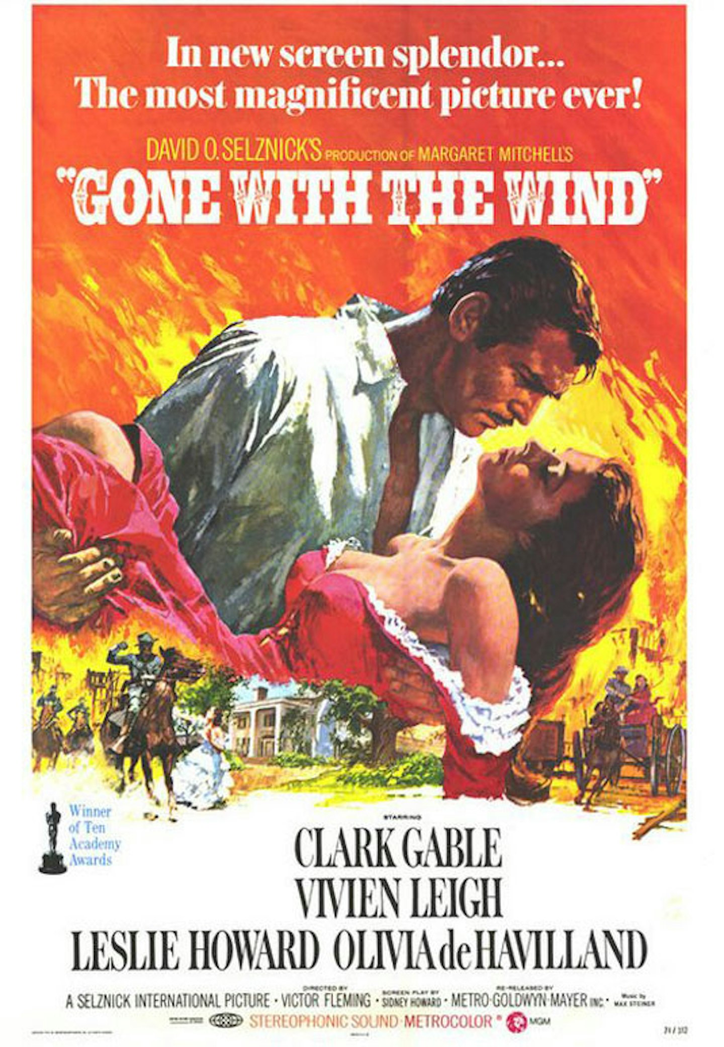
Gone With The Wind’s 1967 re-release poster bursts into your face with a blaze of Old Hollywood razzle-dazzle and Hays Code-bothering visual seduction. Hard to decide what is more eye-catching: Rhett Butler’s rakish open shirt, Vivien Leigh’s racy low-cut dress, the city of Atlanta filling the background with flames, or the blustery lack of humility (“the most magnificent picture ever!”).
28. Platoon
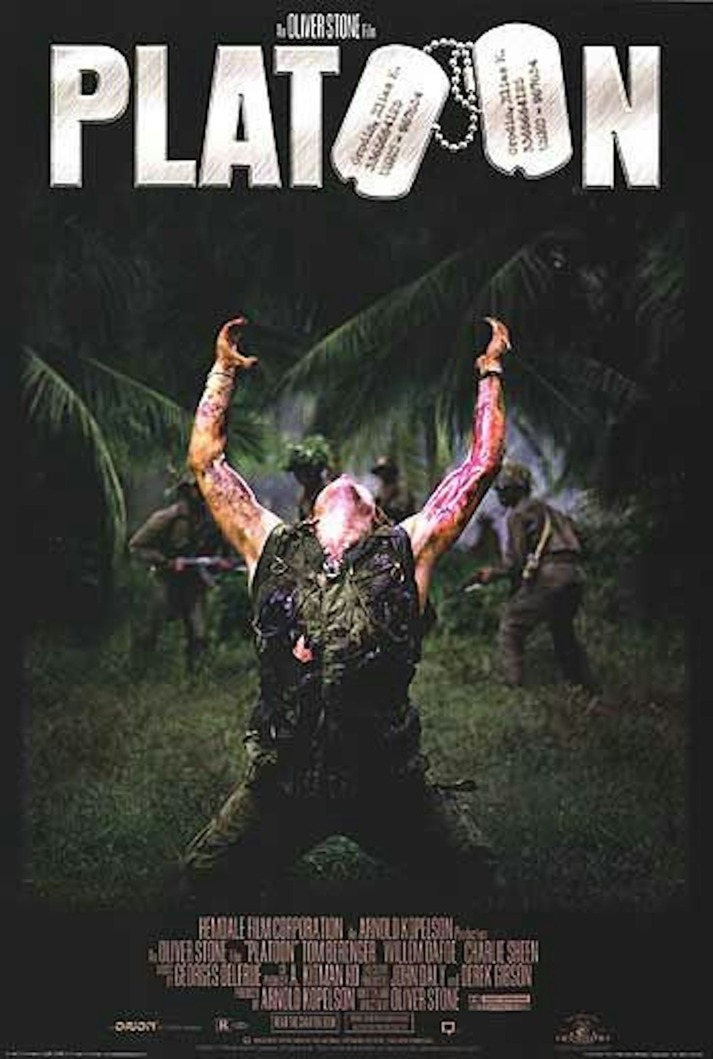
Two things make this poster for Oliver Stone’s war movie classic great: the chunky-fonted logo, with military dog tags substituting two of the letters; and a bloodied Willem Dafoe, falling to his knees, arms outstretched to sky in despair as he finds himself abandoned and cornered by the Viet Cong. The poster cemented this powerful image as its most famous scene, and quickly became the source of parodies galore (see: Hot Shots Part Deux).
27. Star Wars Episode I: The Phantom Menace
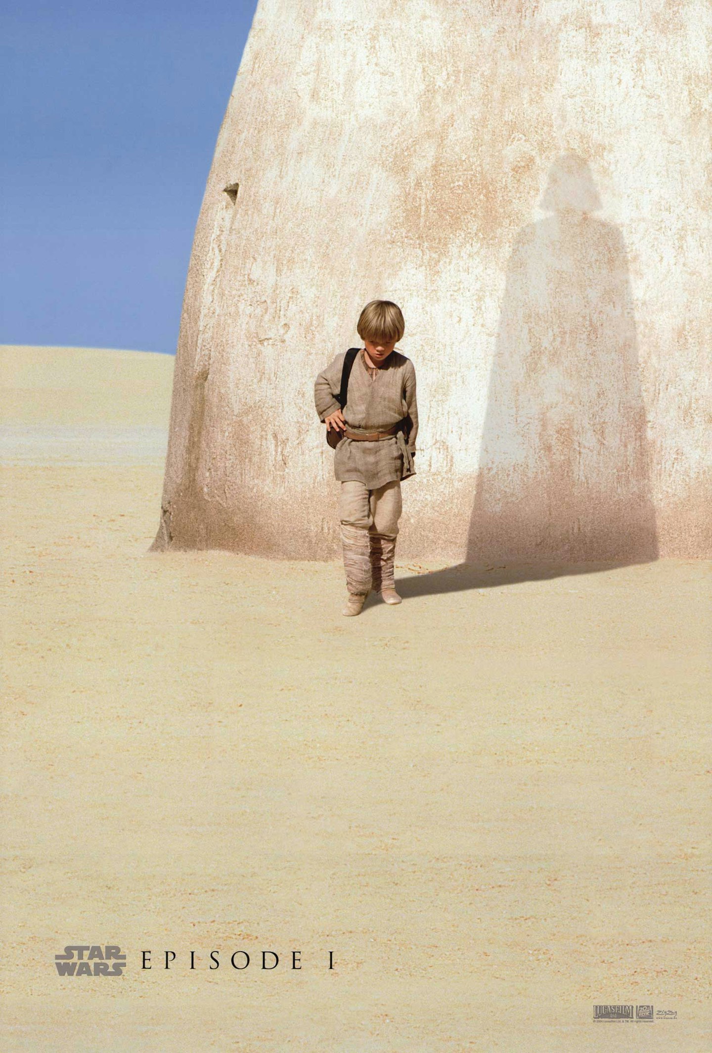
Perhaps it’s not as subtle as it thinks it is, but with the benefit of hindsight, this was the perfect teaser to the Star Wars prequel trilogy, essentially summarising the entire Tragedy of Anakin Skywalker in a single shadow. Now this is poster design!
26. The Driver
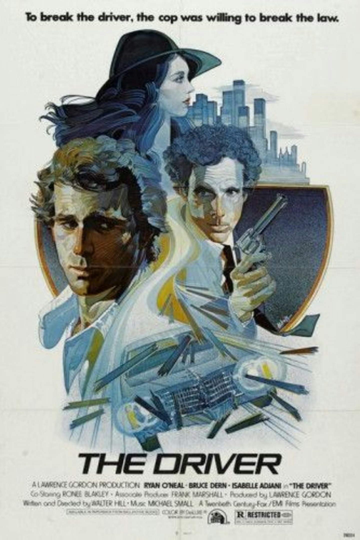
Walter Hill’s underrated, influential classic (Edgar Wright is a vocal fan) earned itself this handsome poster, one of the more elegant examples of characters and elements fused into a single shape, with muted pastel colours and lovely illustrative flourishes (check out the detail on Bruce Dern’s hair!).
25. Nymphomaniac
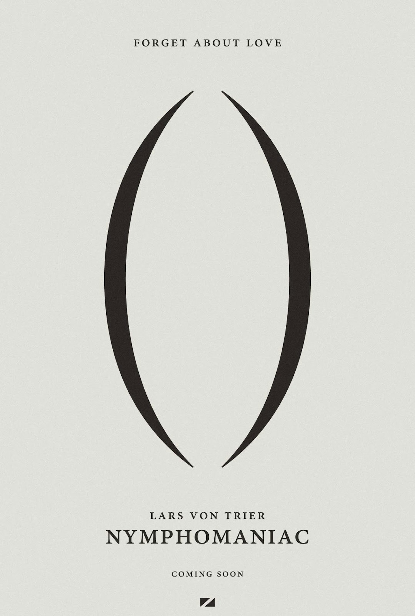
How on earth do you market a 325-minute, two-volume arthouse film which features unsimulated sex, sadomasochism, paedophilia, and dialogue like “I discovered my cunt at age 2”? This smartly minimal teaser poster is the answer, inferring so much from just a couple of parentheses. Punctuation has never been so erotic.
24. Batman
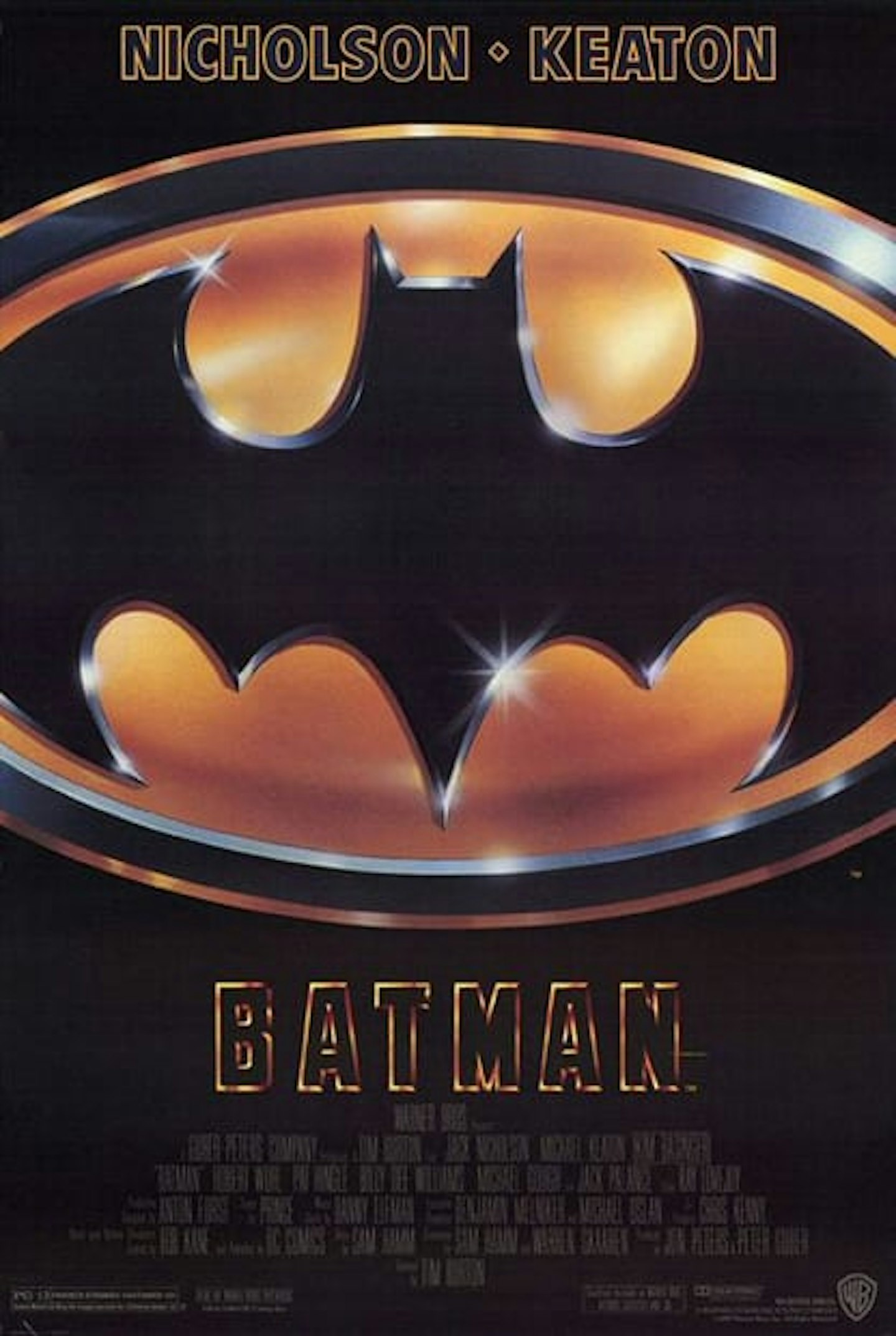
Hard to think of it now, but in the late ‘80s Batman was not widely considered the brooding, grizzled grumperhero we all know and love today. Among the wider public, the popular perception was Adam West’s campy ‘60s interpretation. This sleek, simple poster design did much of the heavy lifting in shattering that perception and introducing a new era of Bats.
23. Attack Of The 50ft Woman
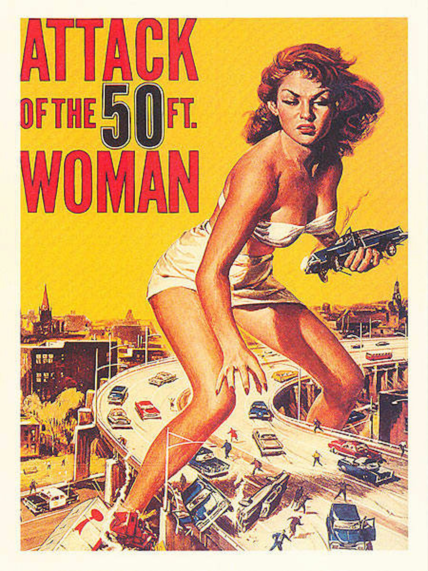
File this one under ‘Posters Better Than The Film They Are Advertising’. For while the movie is forgettable ‘50s schlock, the poster is an enduring icon of a bygone era, with a gigantified Allison Hayes terrorising a freeway (and the sexual fantasies of teenage boys for generations to come). Prolific poster artist William Reynold Brown teased impressive special effects that the finished movie ultimately didn’t match – it mostly involved a giant prop hand.
22. Full Metal Jacket
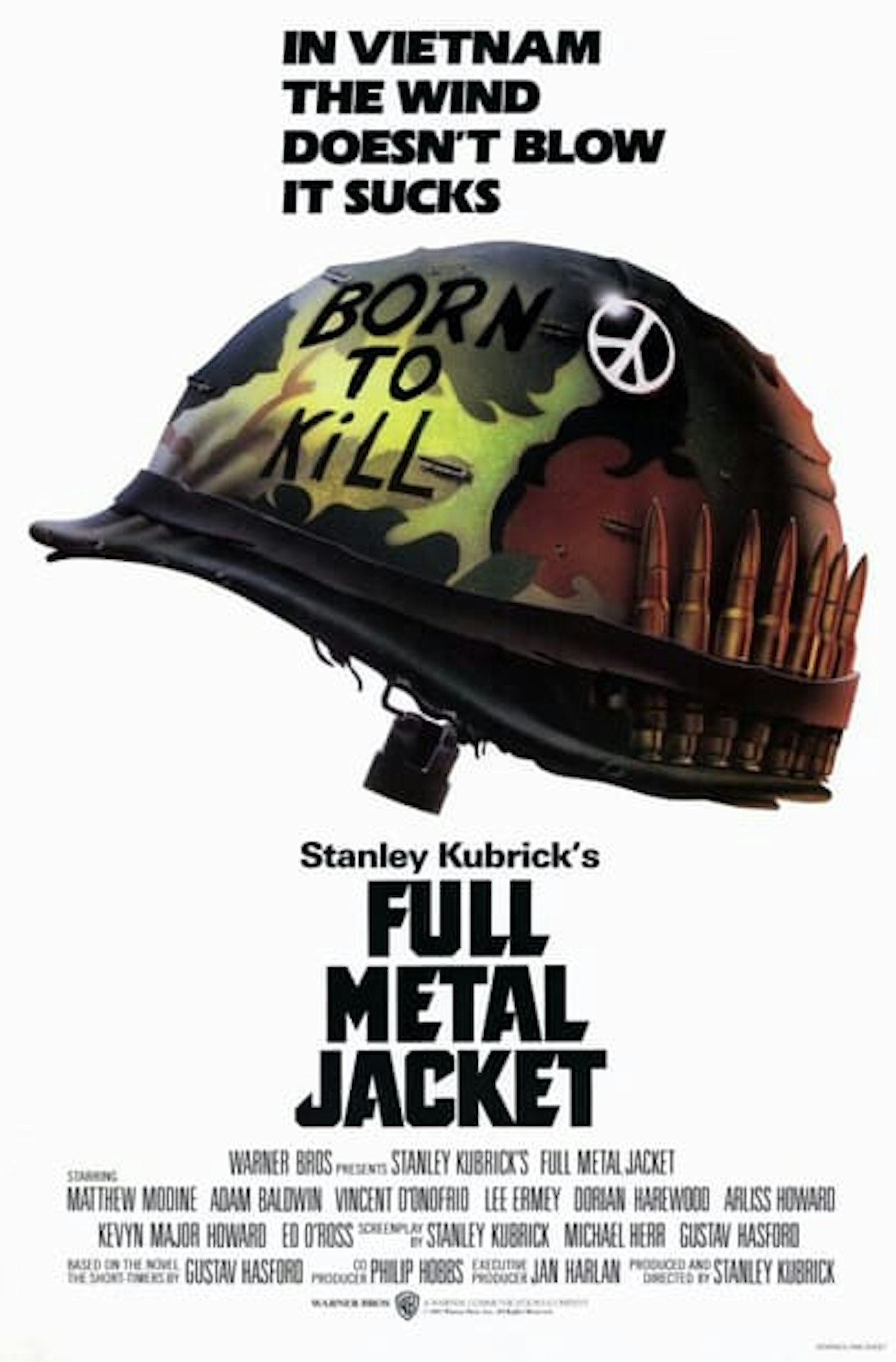
Stanley Kubrick, an incorrigible perfectionist who liked to control everything from projection instructions to catering, also controlled every element of his film’s marketing – and that can be seen in this one-sheet. Kubrick's love of minimalism, white space, striking images and bold typefaces is all on display – plus, a tagline for the ages.
21. Blade Runner
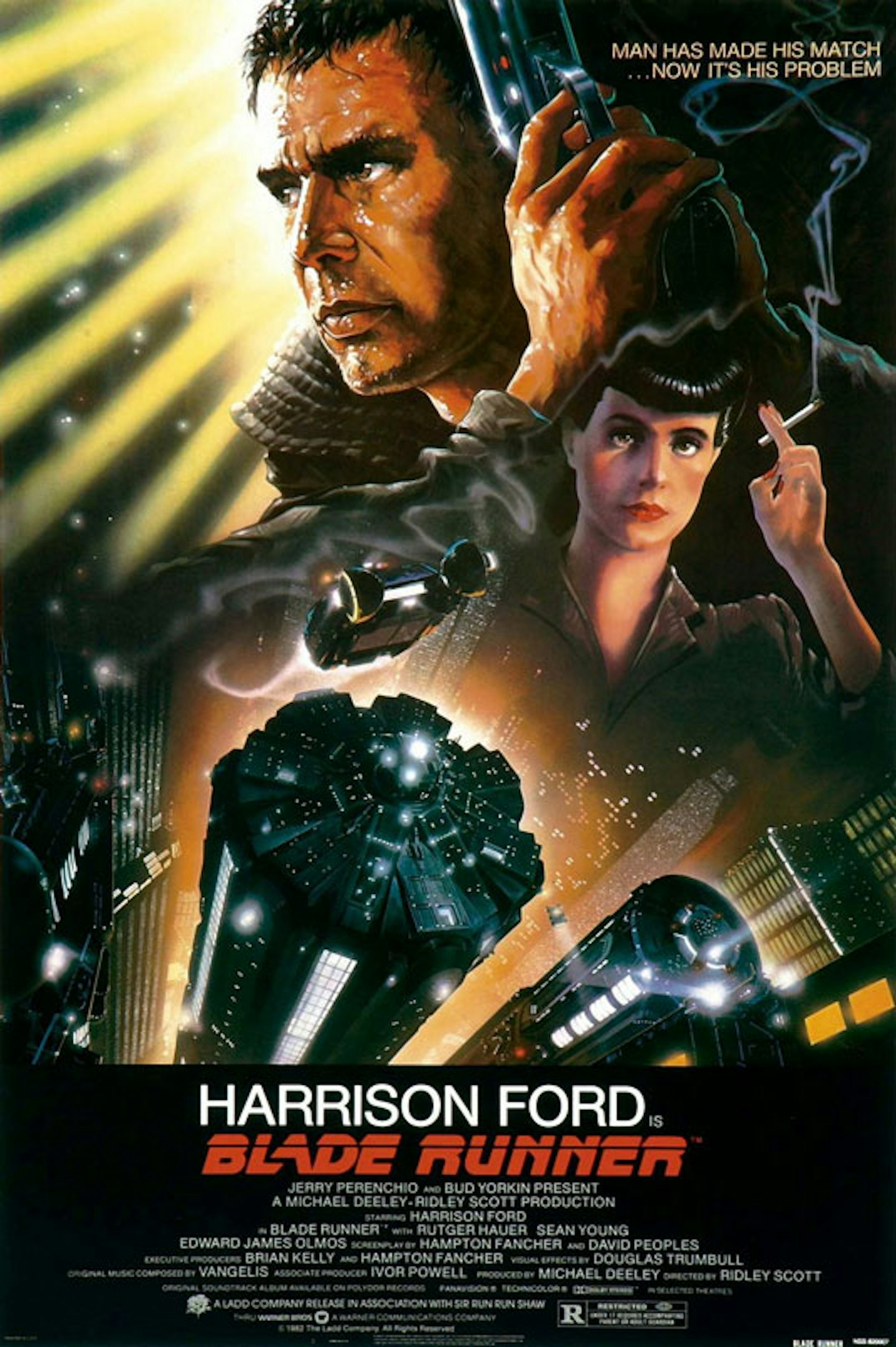
From the pen of John Alvin – an illustrator who pops up more than once on this list – comes this classic, as beautiful as C-beams glittering in the dark near the Tannhäuser Gate. The smoke trail from Sean Young’s cigarette doffs a cap to the film’s noirish disposition, while the cityscape and Harrison Ford’s future-gun hints at the cyberpunk future on offer.
20. The Truman Show
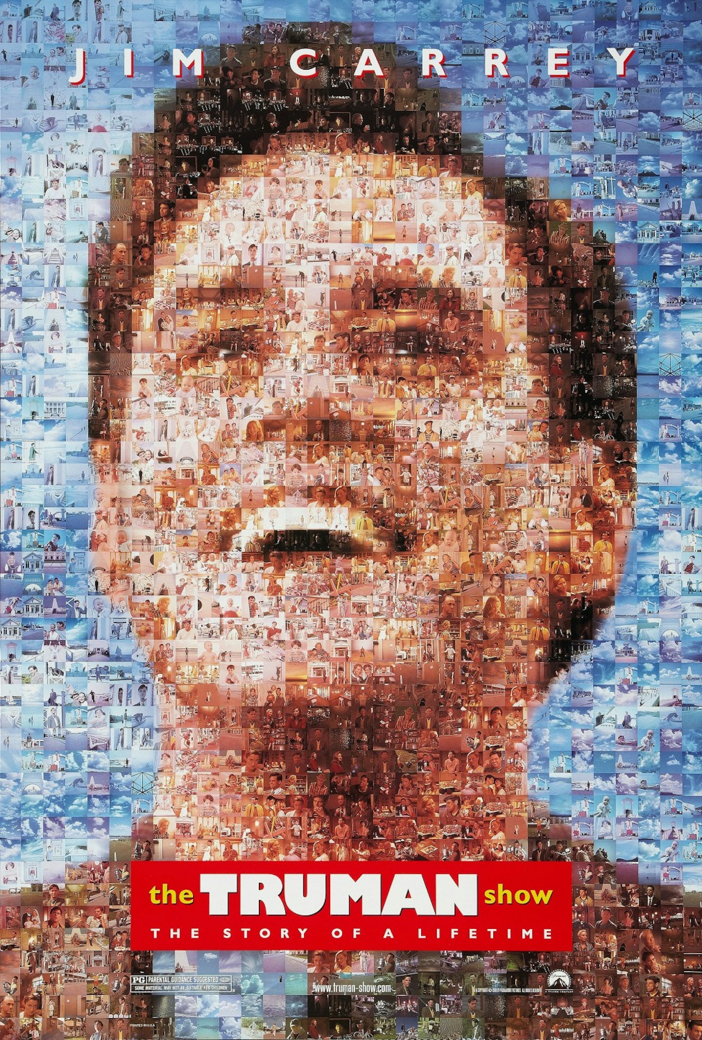
Photographic mosaics are ten-a-penny these days (with each penny made up of a thousand photos of pennies, presumably) but in the halcyon days of the late ‘90s, this poster was something of a design trailblazer. It also makes perfect sense for visually communicating Truman Burbank’s life, continuously-observed by reality TV cameras, in a single image.
19. Goodfellas
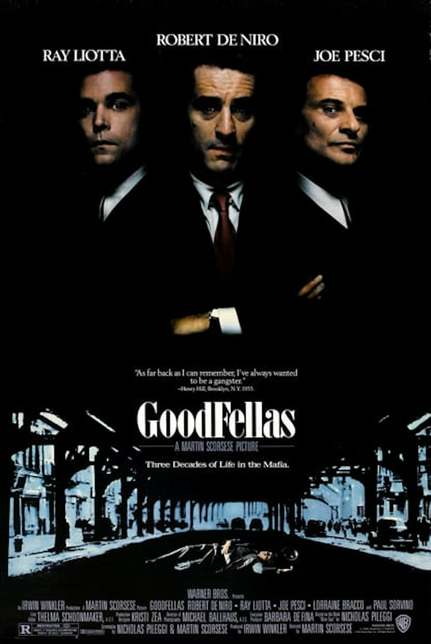
Ignore the fact that Robert De Niro receives top billing over Ray Liotta, the actual lead of the movie (which may have contributed to De Niro earning a Best Actor nomination at the Oscars, but nothing for Liotta). No matter: this is a beaut, the three mafioso looming in shadows over a victim like Italian-American phantoms. “I like this one: one dog goes one way, one dog goes another way. And this guy’s saying, ‘whaddya want from me?’”
18. Trainspotting
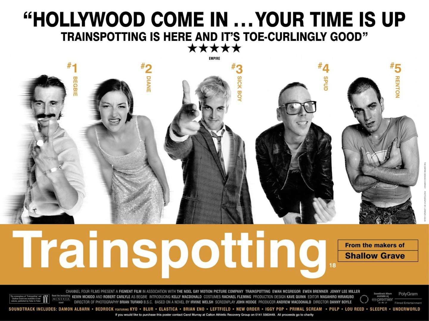
The best British film poster ever? Rare is the artwork that manages to sum up a national mood, a subculture, a generation and a film all at once. Trainspotting’s iconic shade of orange, its character-defining lineup poses, and a swaggering quote from a certain film magazine ensured its place in history.
19. The People Vs Larry Flynt
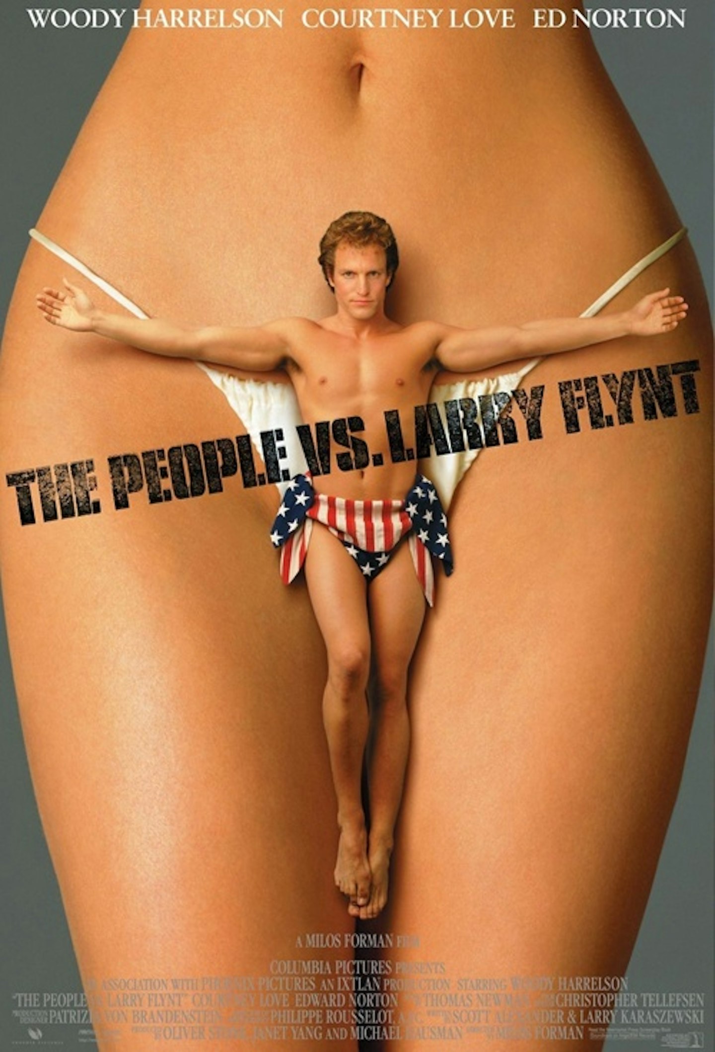
The irony was not lost on director Milos Forman when The People Vs Larry Flynt – a film about censorship – had its poster censored. Perhaps it was the stance a mostly-nude Woody Harrelson took, in a crucifixion pose; perhaps it was his stars-and-stripes makeshift underwear; or perhaps it was that he was makeshift underwear for some giant, unseen woman. Whatever it was, this appropriately titillating design was as effective as it was scandalous to America’s more conservative corners.
16. The Usual Suspects
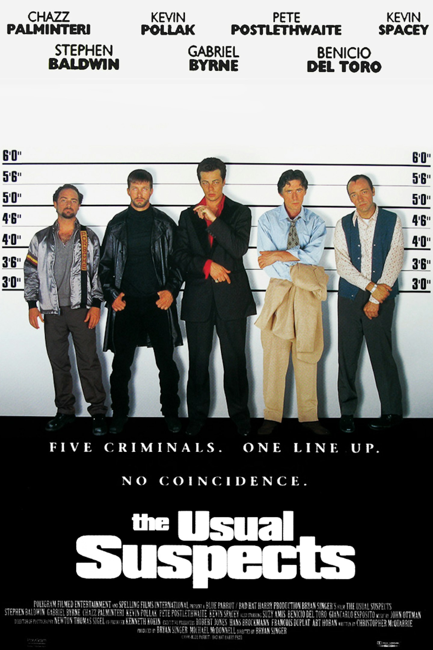
Legend has it that Bryan Singer and Christopher McQuarrie came up with the idea for The Usual Suspects by visualising a poster featuring “a bunch of criminals who meet in a police lineup”. Remarkably, that back-of-the-envelope vision came true, cementing the film’s most famous scene in a straightforwardly effective way. (Back in 1995, the posters became especially famous when vandals scrawled Keyser Soze’s true identity on billboards.)
15. Ghostbusters
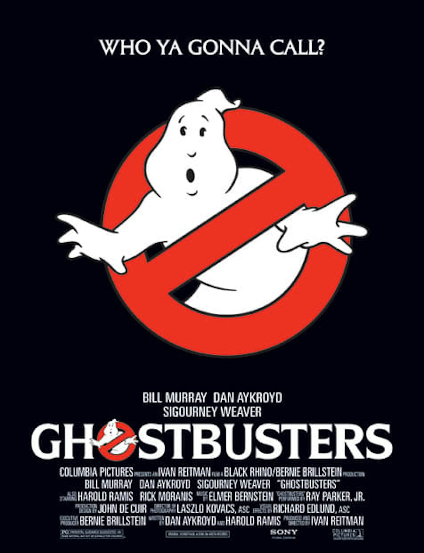
The most iconic logo in cinema? Without doubt. In fact, if you were to line-up the most recognisable iconography on Earth, it would probably make the top 10 – just after the Christian Cross, the American flag and Superman’s chest insignia. The ‘no ghosts’ sign was created by the film’s art director, John DeCuir, but the idea behind it can be traced to Dan Aykroyd, who referred to it directly in the film’s screenplay.
14. Pulp Fiction
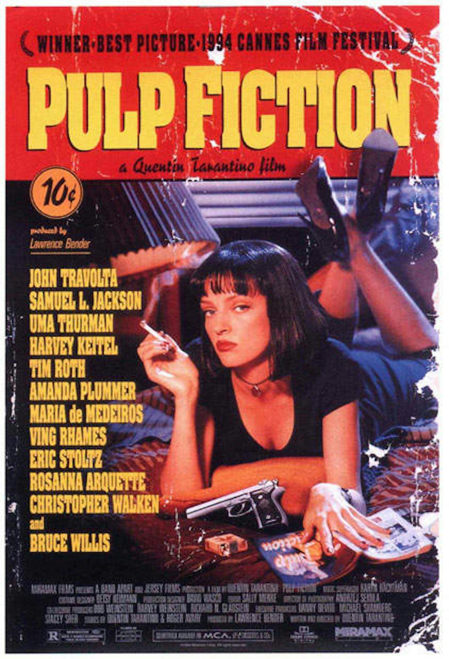
An image depicting a piece of pulp fiction itself (complete with cover creases, dog-eared corner and 10c price tag) this design not only captured the film’s effortless cool but became one of the most ubiquitous images of the mid-nineties. By 1994, you couldn’t enter student accommodation anywhere in the country without seeing Uma Thurman’s smouldering gaze staring back at you.
13. Airplane
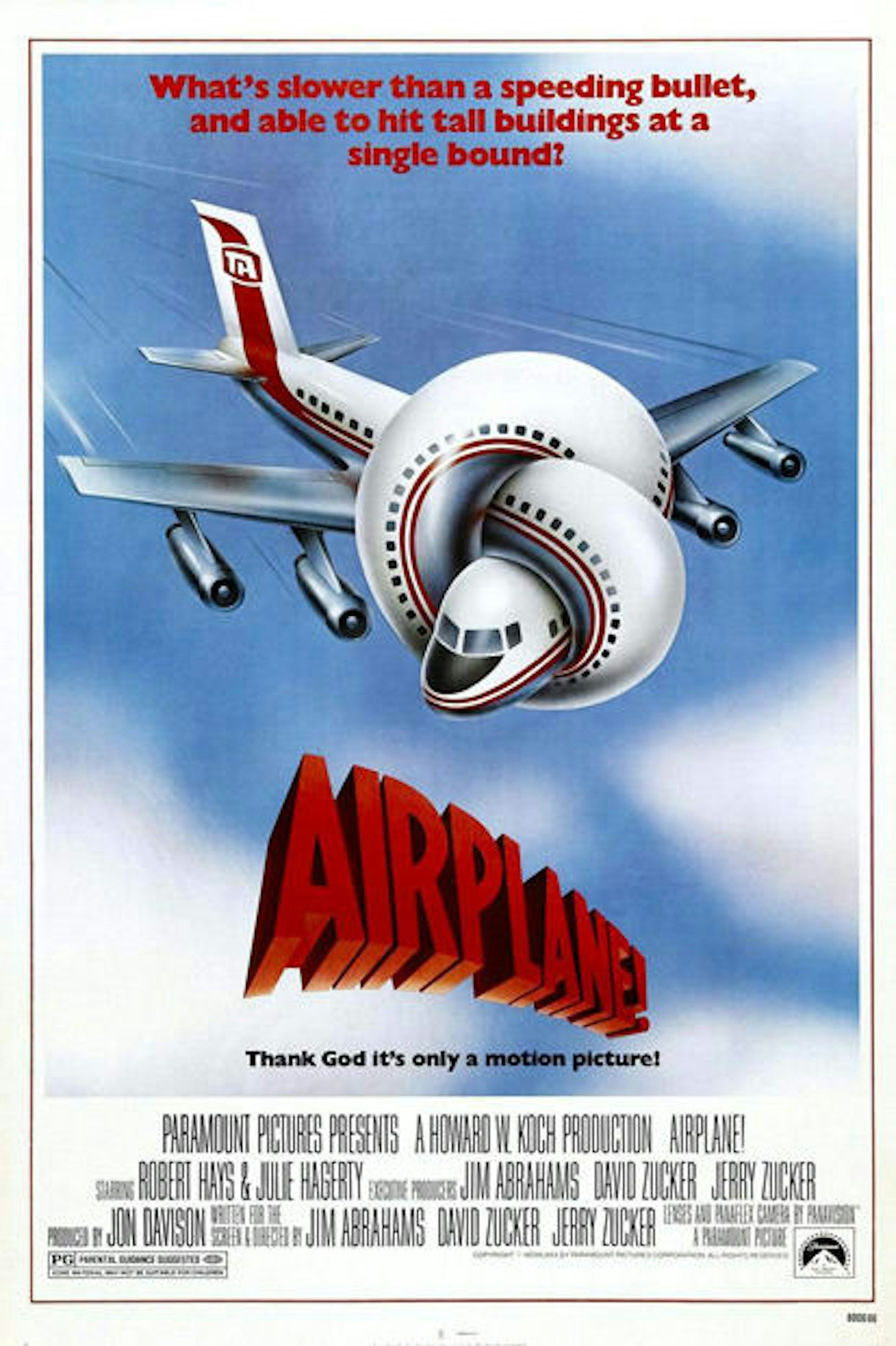
The most famous work of prolific multihyphenate Robert Grossman (a cartoonist, author, musician, filmmaker and painter), this knotted Boeing 707 is the perfect metaphor for the film’s particular brand of demented satire. The sly taglline “Thank God it’s only a motion picture!” is just icing on the cake.
12. The Godfather
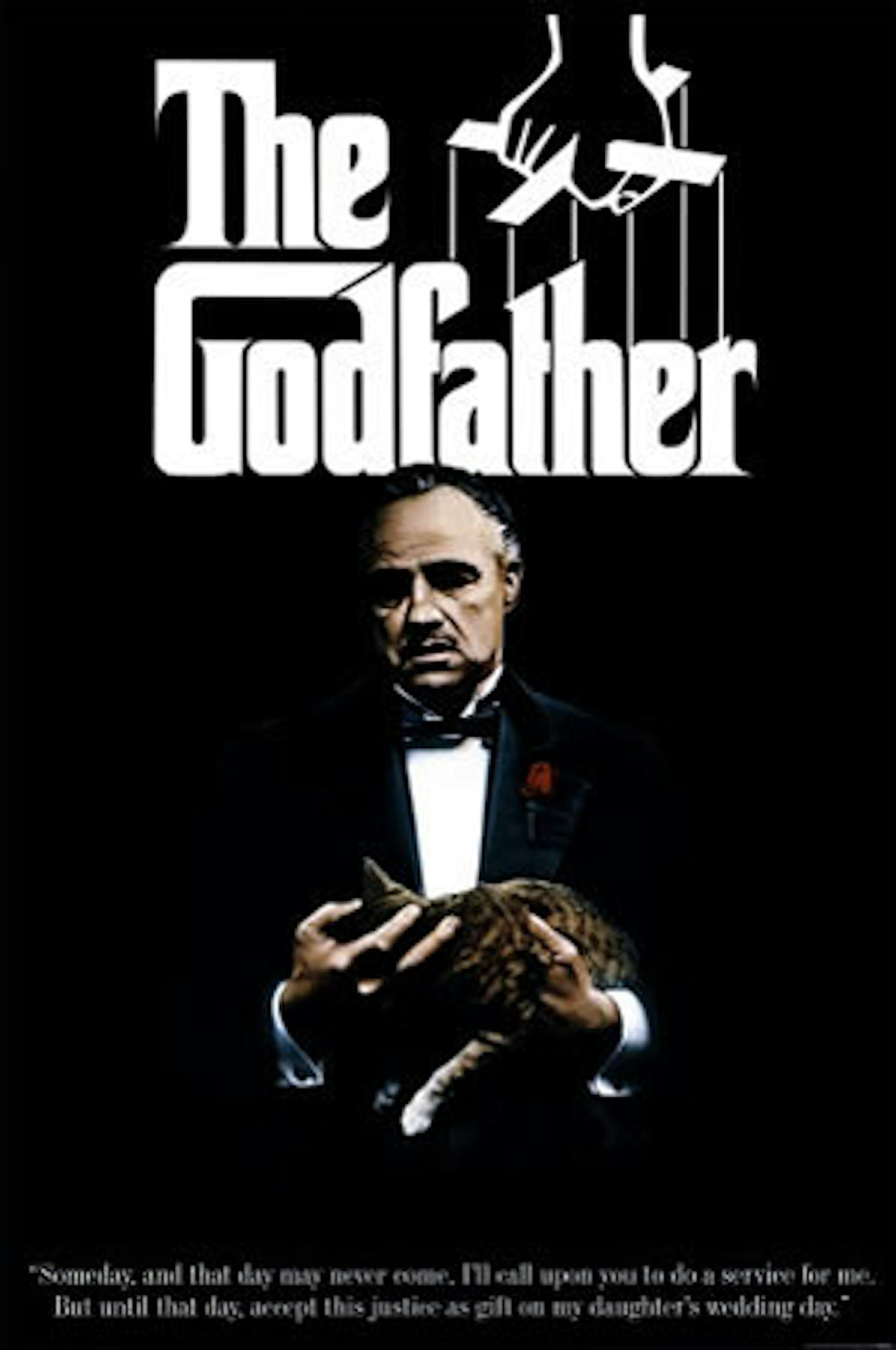
The image of Marlon Brando’s Don Corleone is certainly striking — his black tuxedo fading into the all-black background – but arguably, the star of this poster is the instantly recognisable ‘puppeteer’ logo, lifted direct from Mario Puzo’s book cover, and designed by legendary graphic designer S. Neil Fujita. In simple black-and-white, it tells us everything we need to know.
11. Chinatown
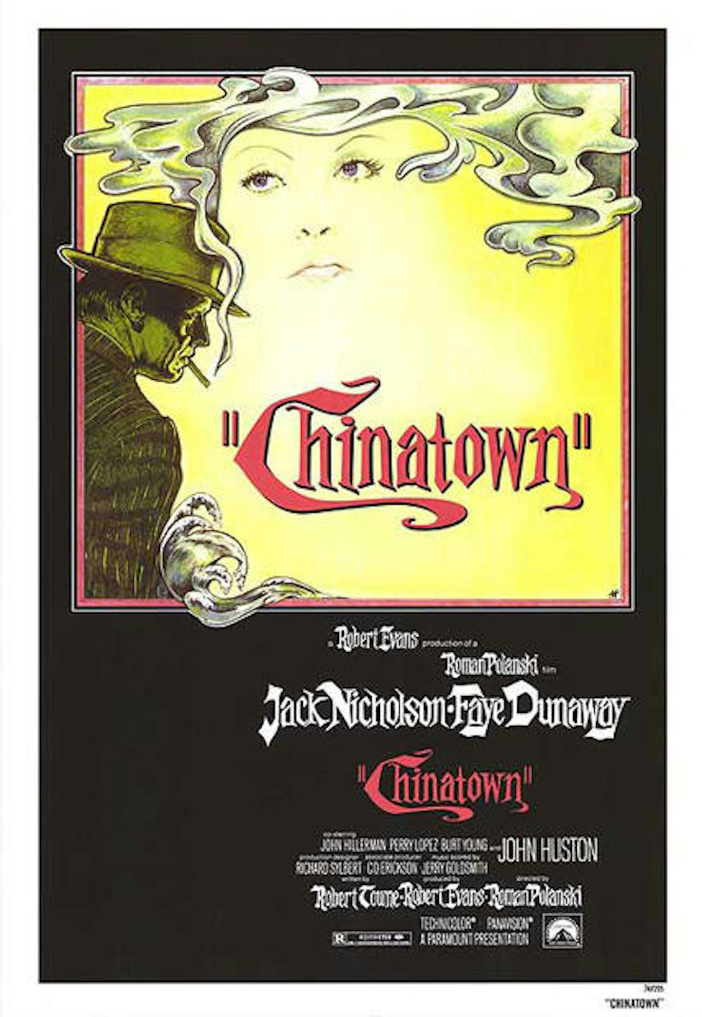
Composed by Richard Amsel, the man behind poster art for The Sting, The Dark Crystal and Flash Gordon, this quintessentially noir artwork has Jack Nicholson’s PI, J.J. Gittes, cast in shadow and framing Faye Dunaway’s disembodied face with a cloud of cigarette smoke ‘hair’.
10. Back To The Future
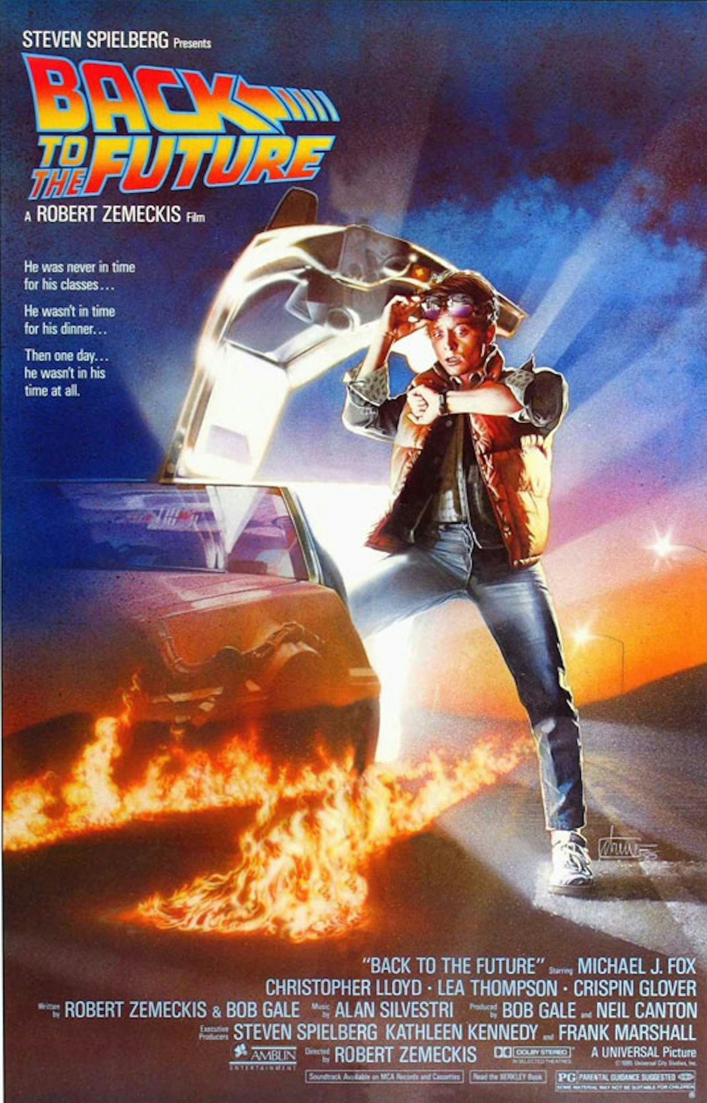
Superbly riffed-on in the posters to both sequels, this artwork from master of the medium Drew Struzan takes all of the film’s iconic objects (Marty’s threads, the DeLorean, the flaming tyre tracks) and combines them in a single, stunning image. Plus he’s looking at his watch. Because time travel.
9. American Beauty
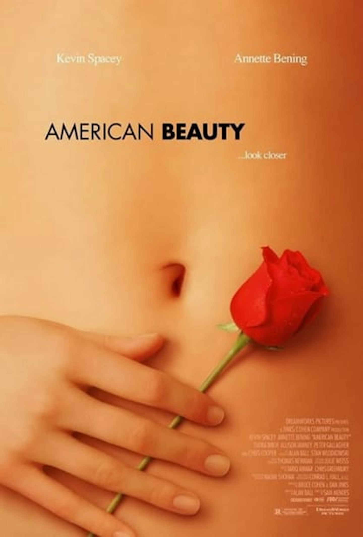
Deliberately seductive, this nods to the film’s most memorable scene, when Kevin Spacey’s Lester Burnham has a petal-scattered fantasy about Mena Suvari’s schoolgirl, Angela. Interestingly, the navel on display does not, in fact, belong to Suvari but is the displaced midriff of Chloe Hunter. Fact: it (and she) also appears in Leprechaun 5: Leprechaun in The Hood.
8. The Silence of the Lambs
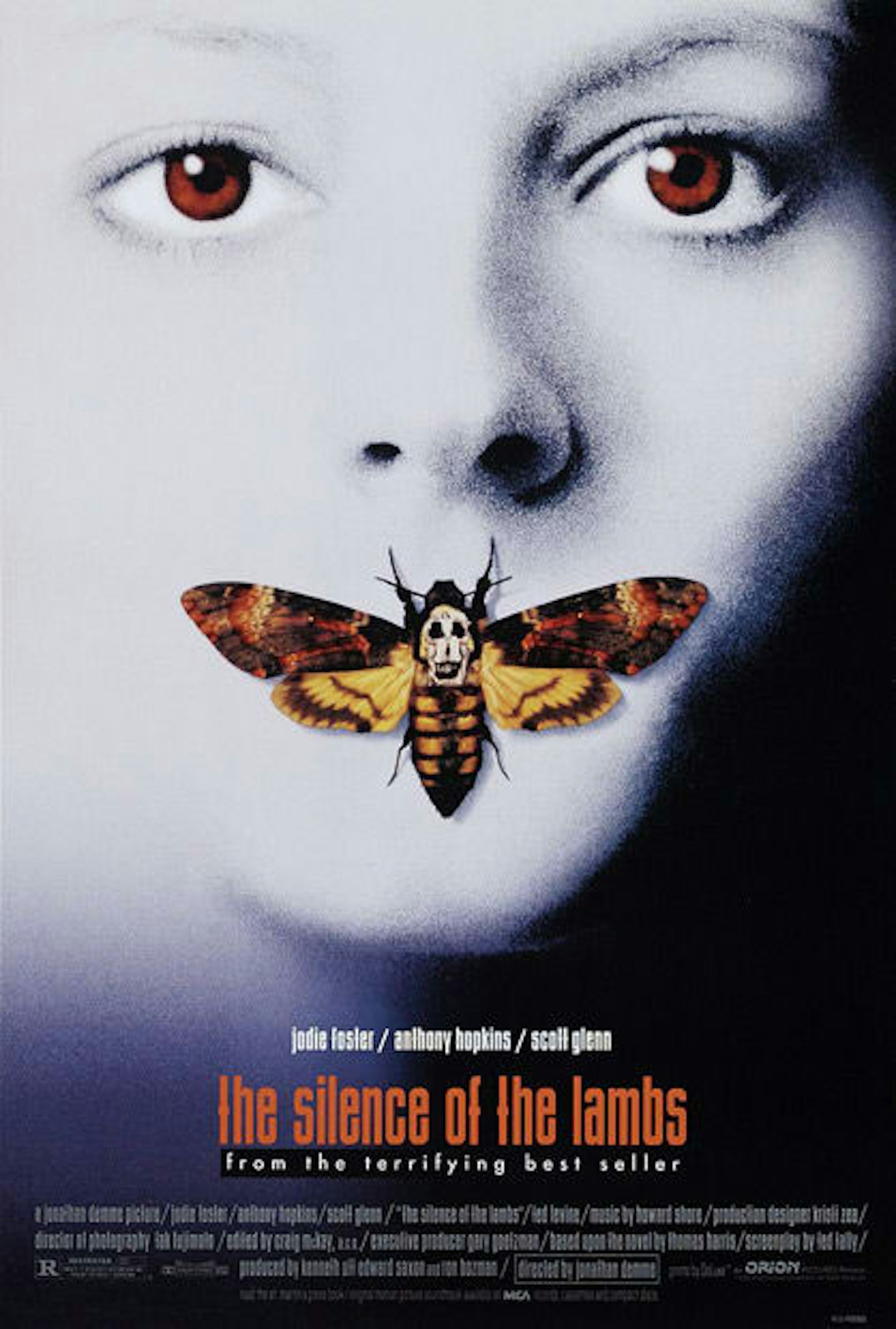
While also available in a red/Hannibal flavour, this blanched Jodie Foster image is the more famous and more powerful of the two. The death’s head moth takes the central focus, the skull on its back made up of nude female forms (lifted from Salvador Dali’s In Voluptas Mors). You can draw all kinds of symbolism from the colours, detail and moth’s placement but beyond any of that, it’s a chilling image.
7. Jurassic Park
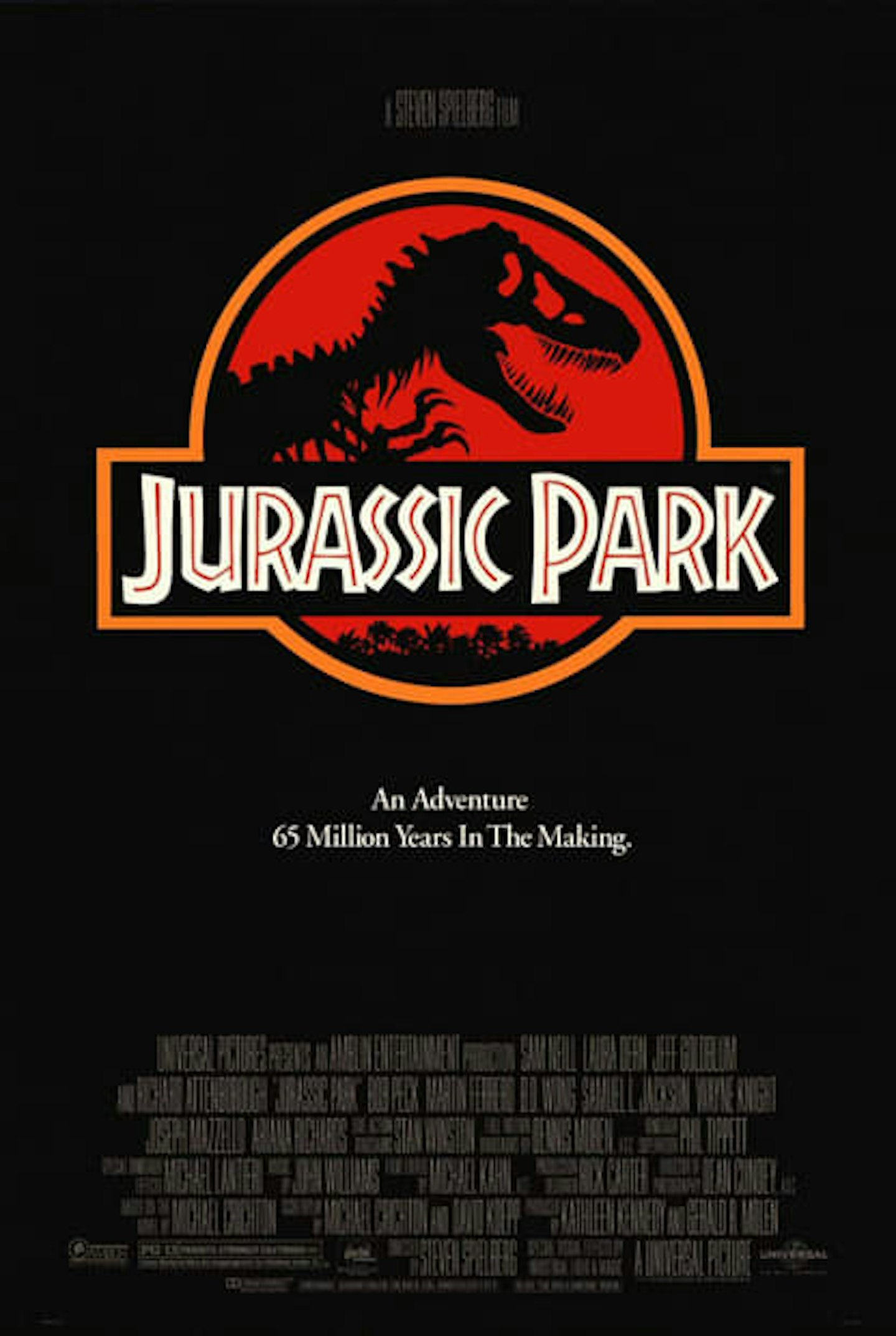
No frills here but then none were needed. The park’s logo against a simple black background and signed off with the inspired “An Adventure 65 Million Years In The Making.” Instantly identifiable and conveys all the information with simple elegance. Testament to the fact that sometimes less is more.
6. Alien
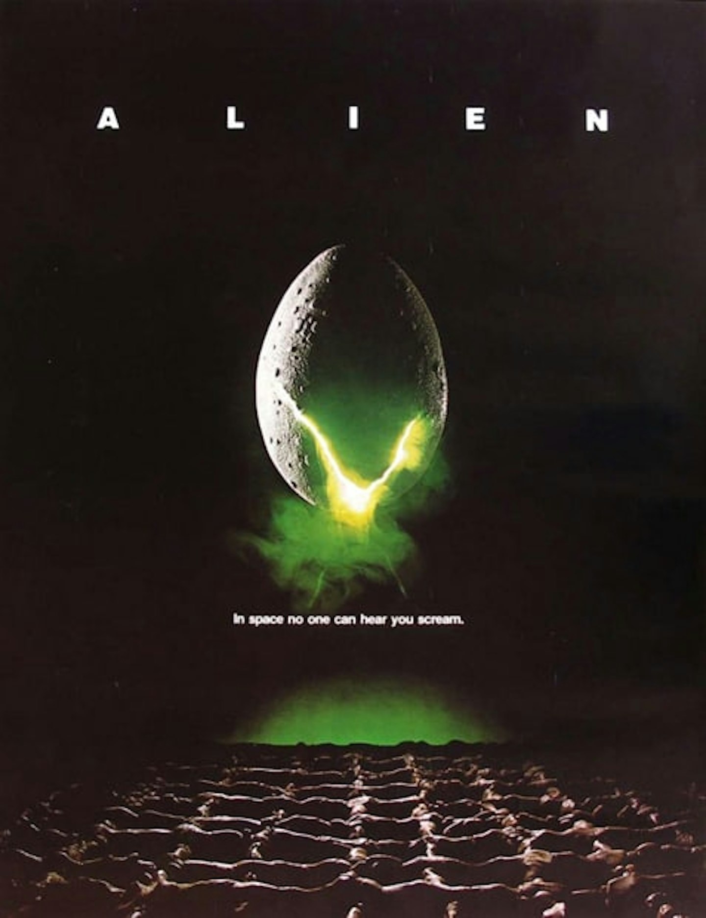
A poster that’s become synonymous with Ridley Scott’s chilling space horror in spite of the fact it looks absolutely nothing like the Xenomorph eggs that appear in the final film. A simple visual — cracking egg, creepy glow, alien bioorganic texture on the floor — matched with the title’s sparse, mega-kerned typography, this is pregnant with foreboding and beautifully finished with the film’s chilling tagline. Not bad for a chicken egg caked in plaster.
5. Vertigo
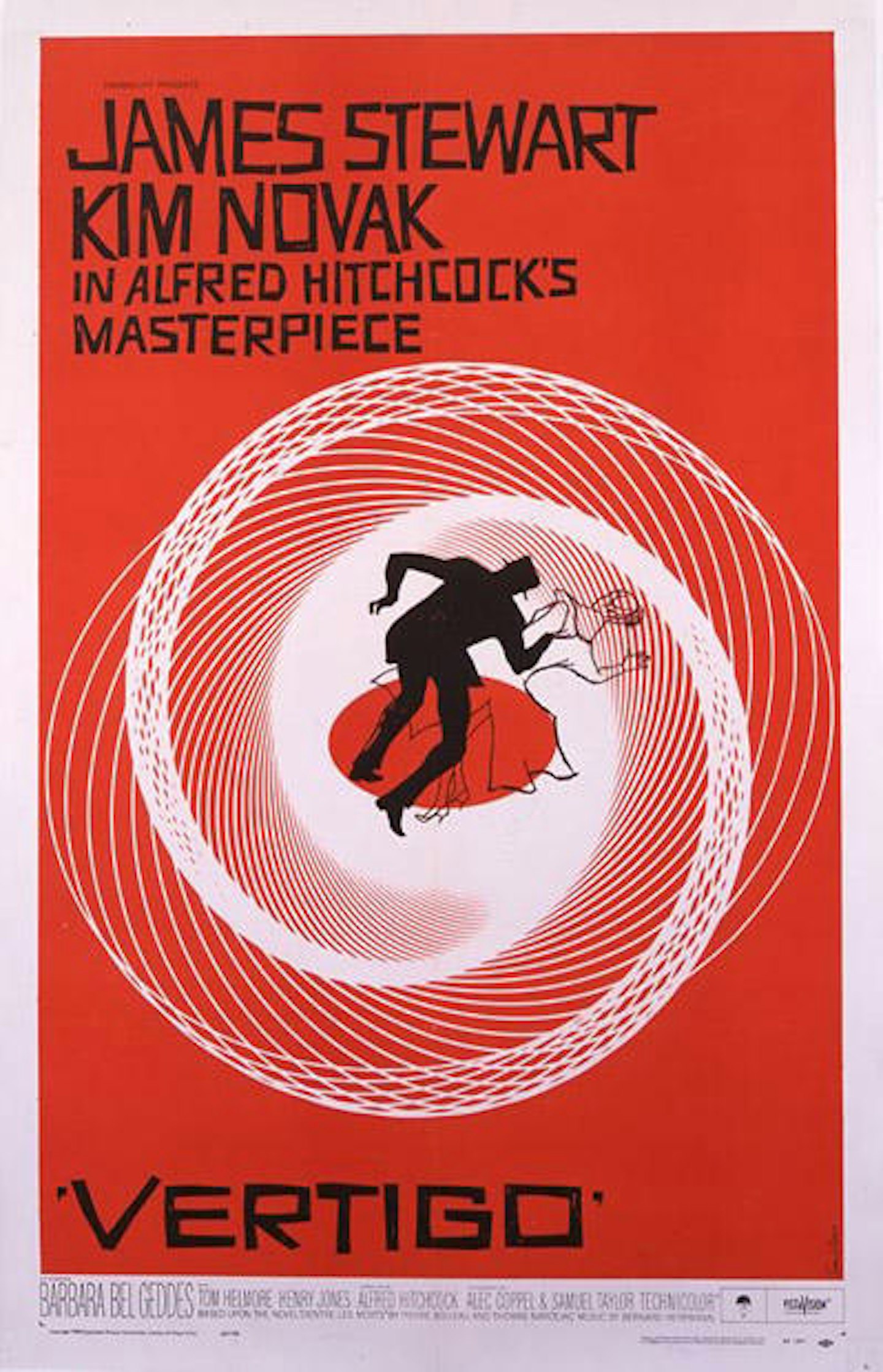
Title sequence and poster maestro Saul Bass has created enough iconic imagery to populate a list in itself. But it’s this disorienting poster for Hitchcock’s Vertigo that is arguably his best. Using Lissajous spirals to recreate the film’s titular sensation, it is a simple, yet enormously effective image that works doubly well when translated to the film’s opening titles.
4. E.T. The Extra-Terrestrial
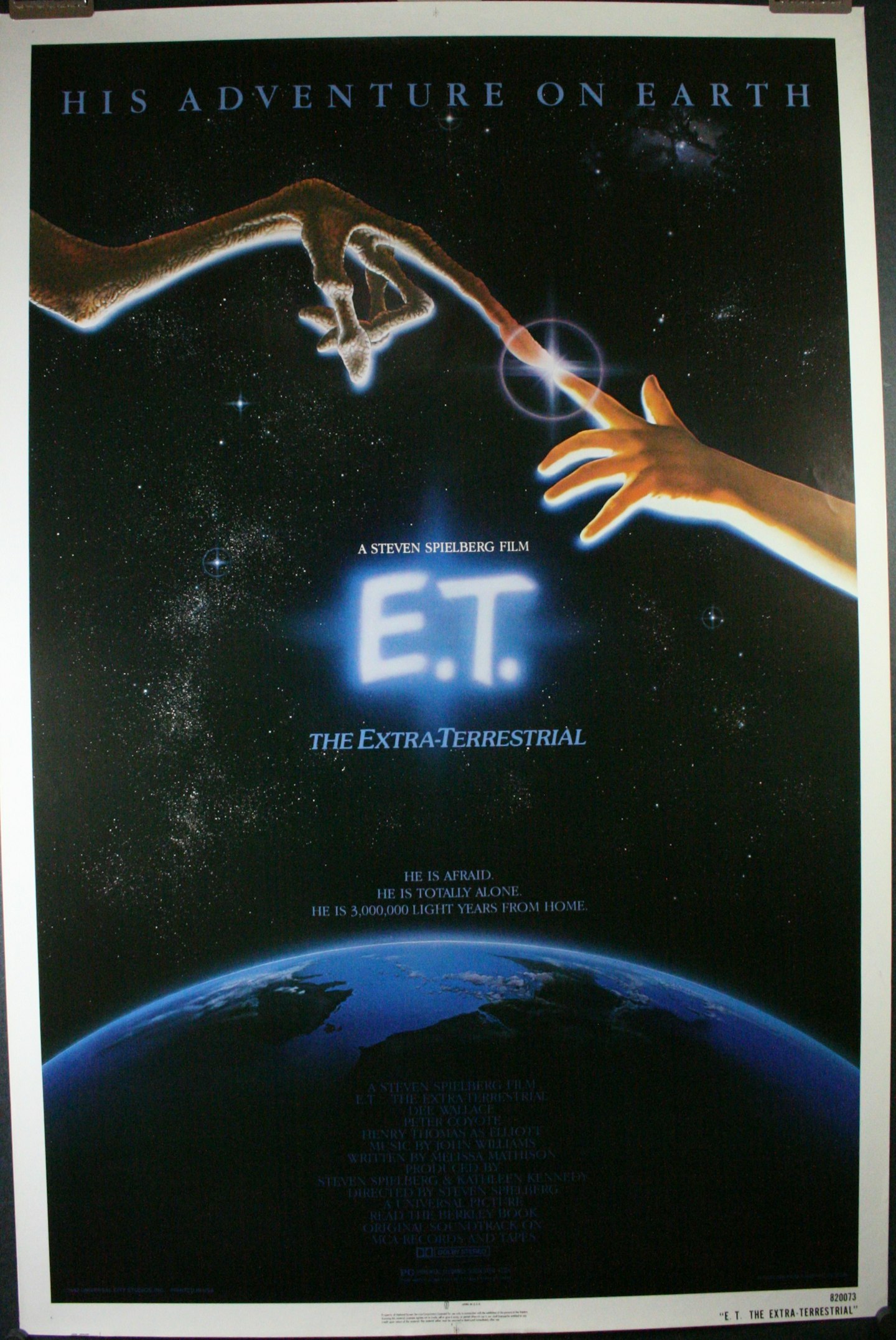
Based on Michelangelo's Sistine chapel ceiling piece, The Creation Of Adam, this reproduction has E.T.’s as the hand of God and Elliot’s (actually poster designer John Alvin’s daughter) as Adam. It’s an apt reflection of the film’s religious allegory and an indelible image for movie fans. It was replaced by Amblin’s now synonymous flying bike image in later posters but this first effort remains the most effective.
3. Star Wars
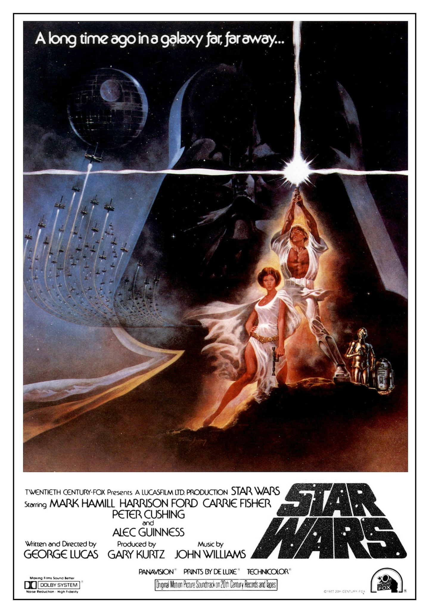
Aping the style of pulp artist Frank Frazetta, Tom Jung’s striking theatrical poster for Star Wars could easily be reimagined as one of Frazetta’s Conan images, with sword held aloft. Composed around a ‘good vs evil’ concept, Jung used the lightsaber’s unusual cross motif against the dark of Vader’s helmet to convey the film’s moral struggle. The title style here is a direct nod to the opening crawl.
2. Raiders Of The Lost Ark
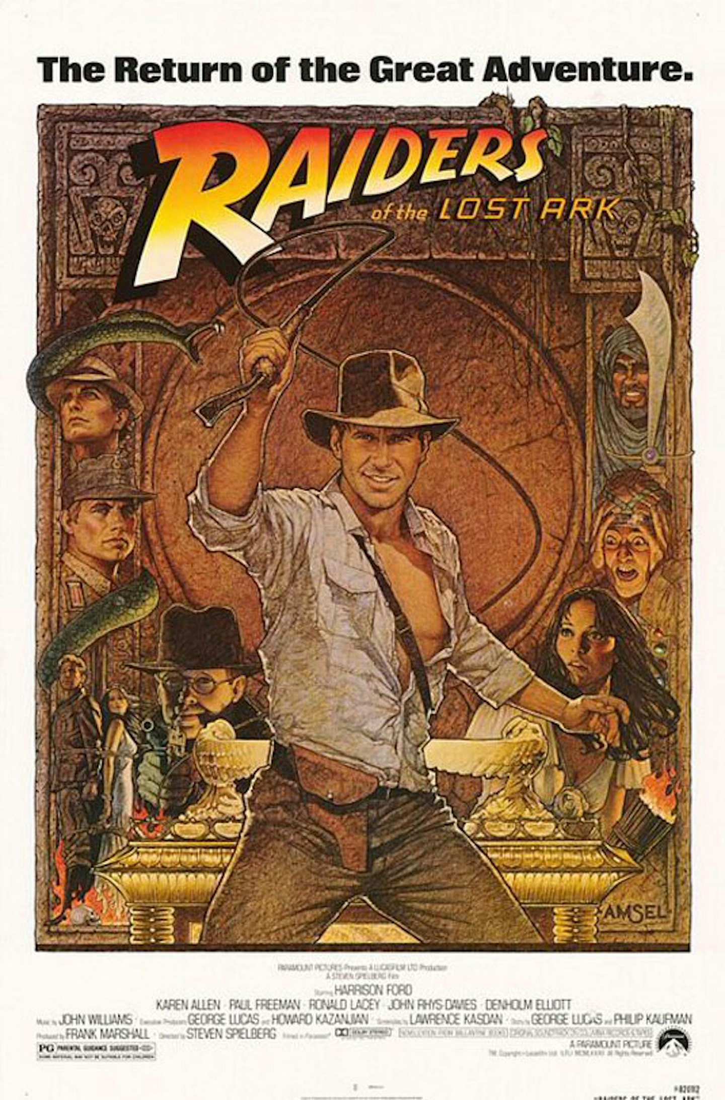
Another Richard Amsel creation, this poster sums up the boyish adventure and excitement of Raiders perfectly. This poster actually accompanied the film’s re-issue in 1982, with Amsel’s poster for the original release being a simpler, less dynamic image of Indy with the whip slung over one shoulder.
1. Jaws
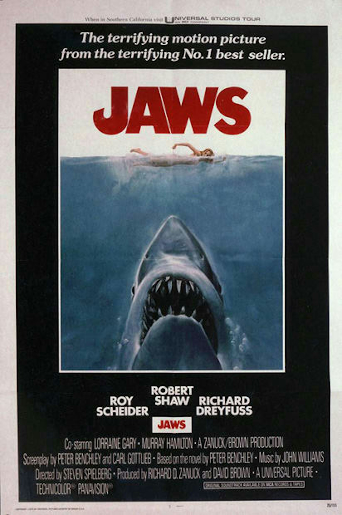
The most iconic poster of all time. Jaws’ terrifying image of the great white rising to devour its unwitting victim is a simple, yet inspired piece of visual marketing. From the ridiculously oversized beast, to its gaping maw filled with rows of jagged, uneven teeth, it’s is a viscerally terrifying image, one that struck fear into the hearts of swimmers everywhere and put people off beaches for a generation.
