What is a film without its poster? Often the first glimpse of a film we are offered, posters are more than a mere marketing tool – they’re an artform in themselves, showcasing the blistering work of the world’s greatest illustrators and designers. 2015 was a vintage year: clever concepts, elegant artwork, boldly original ideas, our walls have truly been spoilt. Here’s 25 of the year’s best.
The Martian
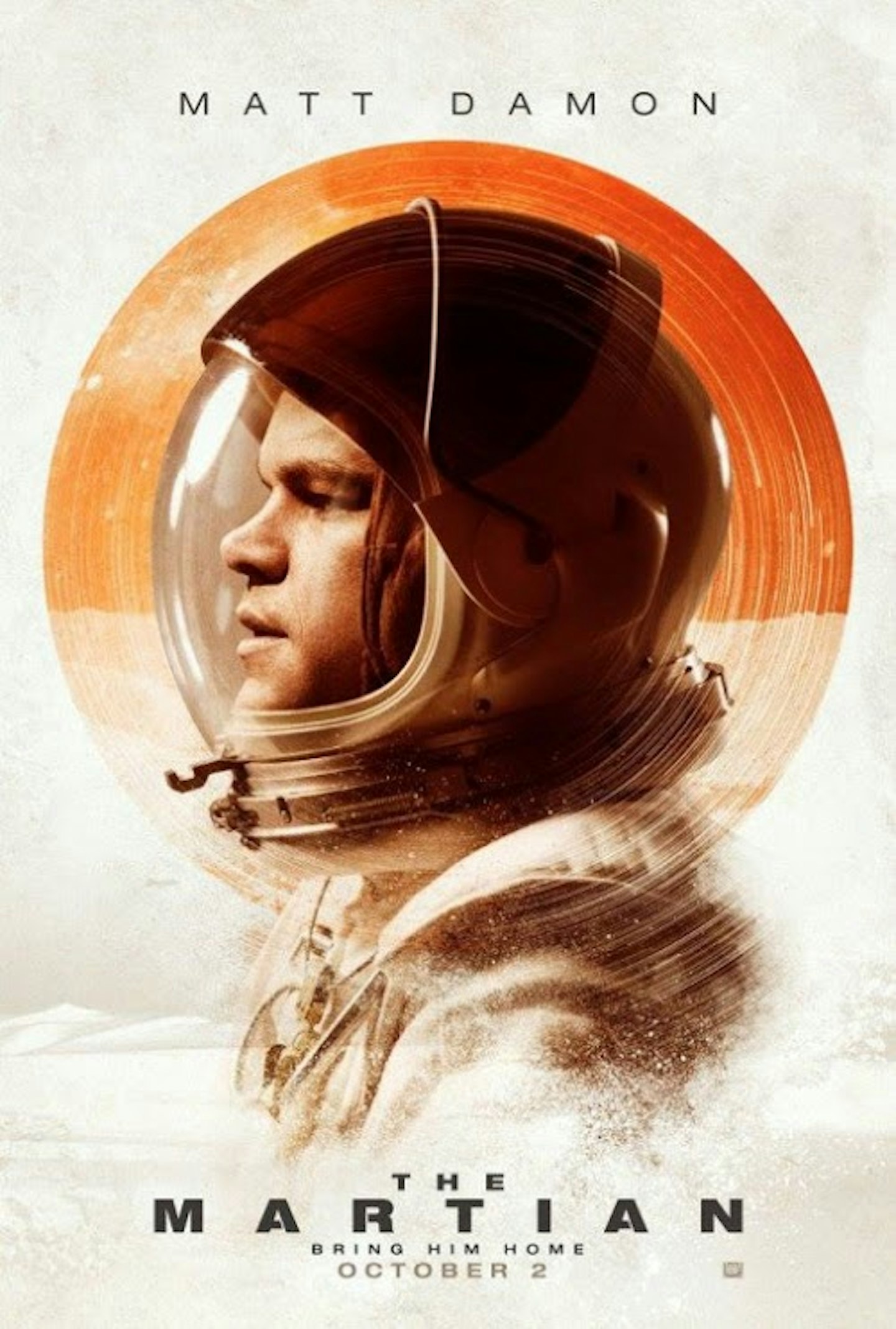
Most of the posters for Ridley Scott’s space adventure were dominated by the tagline ‘Bring Him Home’, but for this alternate version, Scott was going to have to art the shit out of this one. And so he did, with a paintbrushed red planet acting as a halo to Matt Damon's helmet.
The Revenant
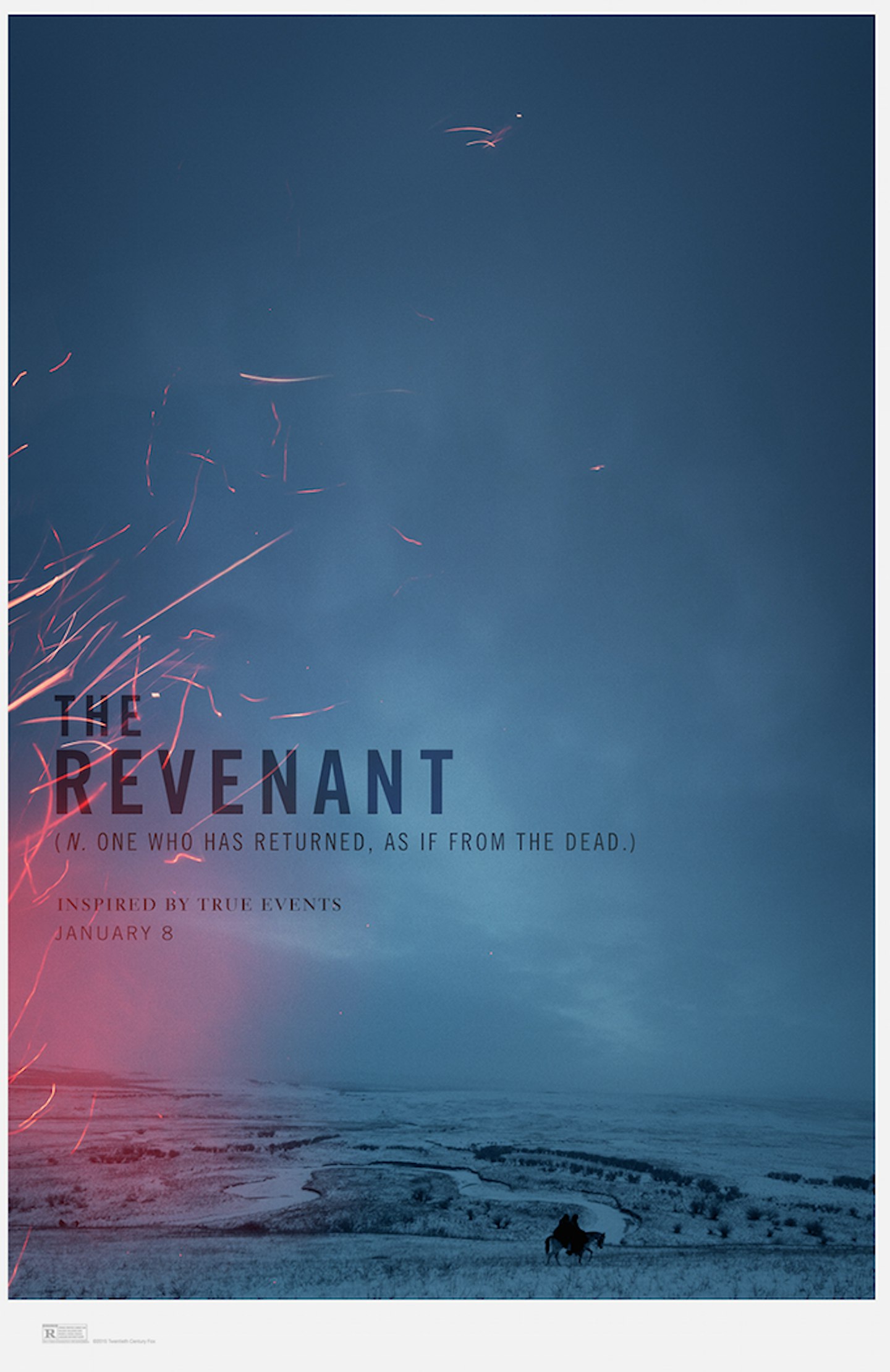
For a film which threw everything at its cast and crew – snowstorms, -25° temperatures, a grizzly bear – this teaser poster is refreshingly minimalist: moody sky filling the space, embers from a fire artfully encroaching, the tiny figure of Leo on a horse. Moody, and somehow portentous.
Slow West
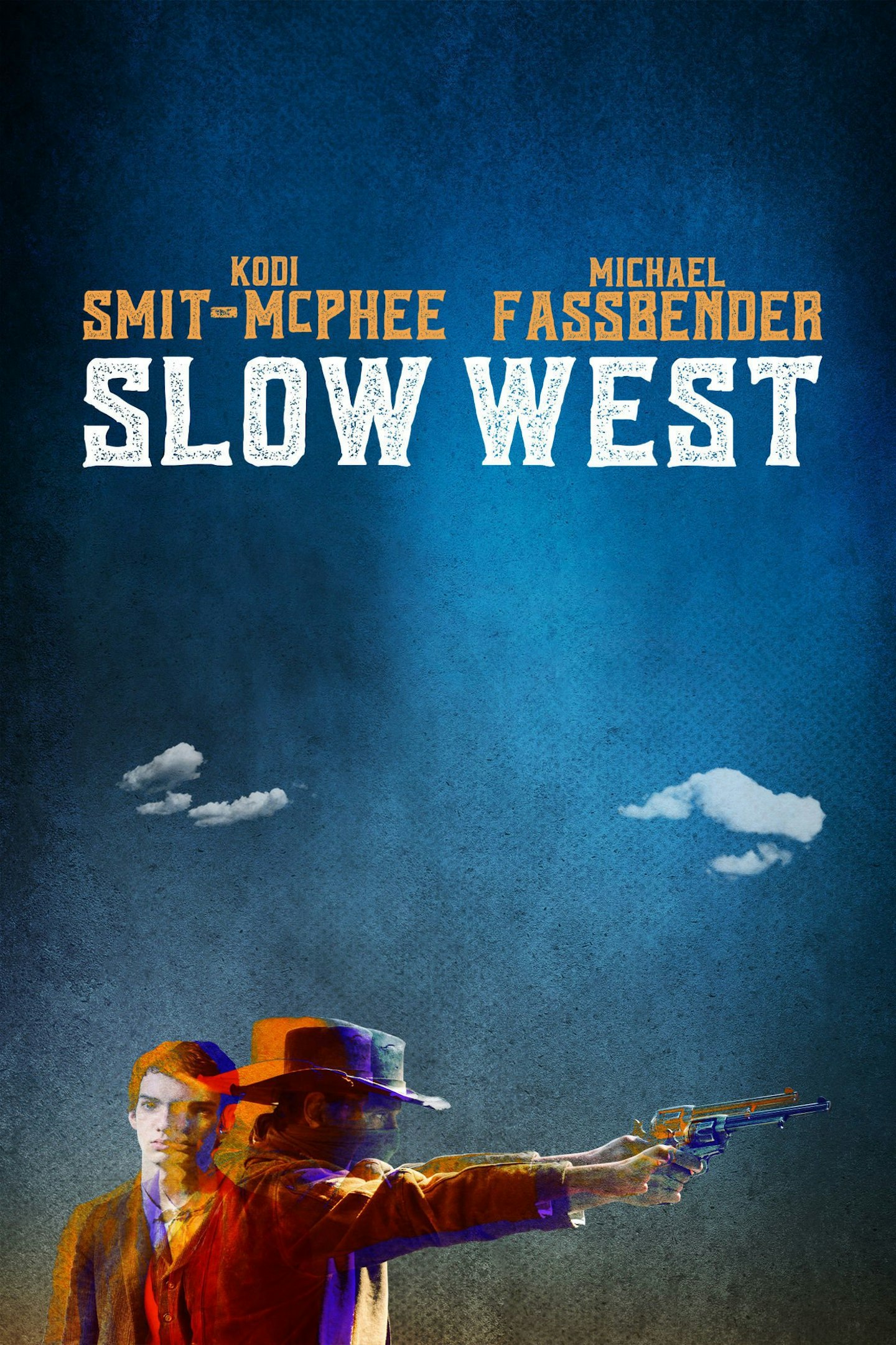
Screenprinting was a common visual theme on this year’s posters, as evidenced by this lovely entry from the criminally underrated Western Slow West. Rarely has The Fass looked quite so badass.
We Are Your Friends
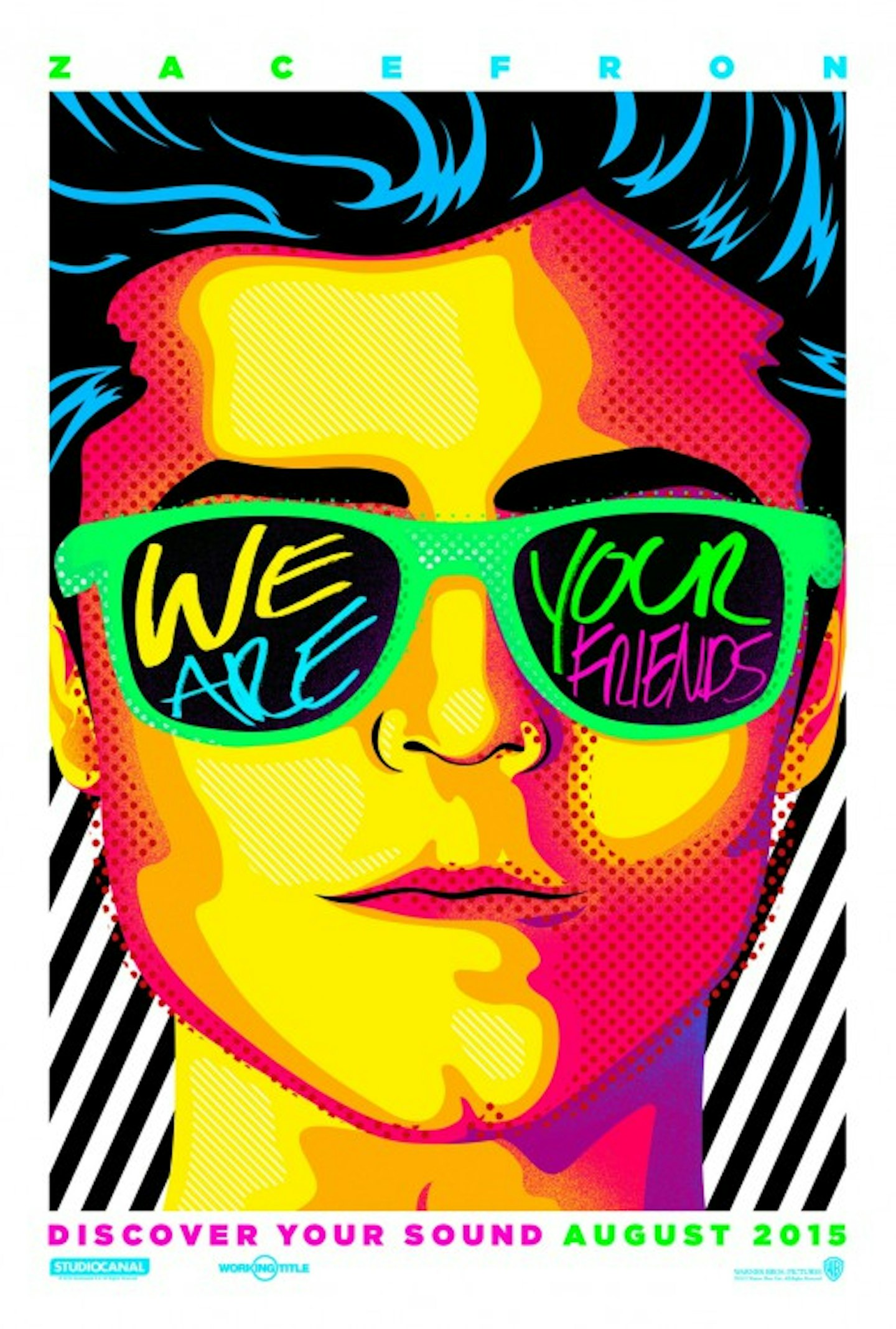
The best posters give a sense of the movie directly through visual cues – as it is with this day-glo neon number for We Are Your Friends, which perfectly elucidates the choons, and cheekbones, of Zac Efron’s superstar DJ.
High Rise
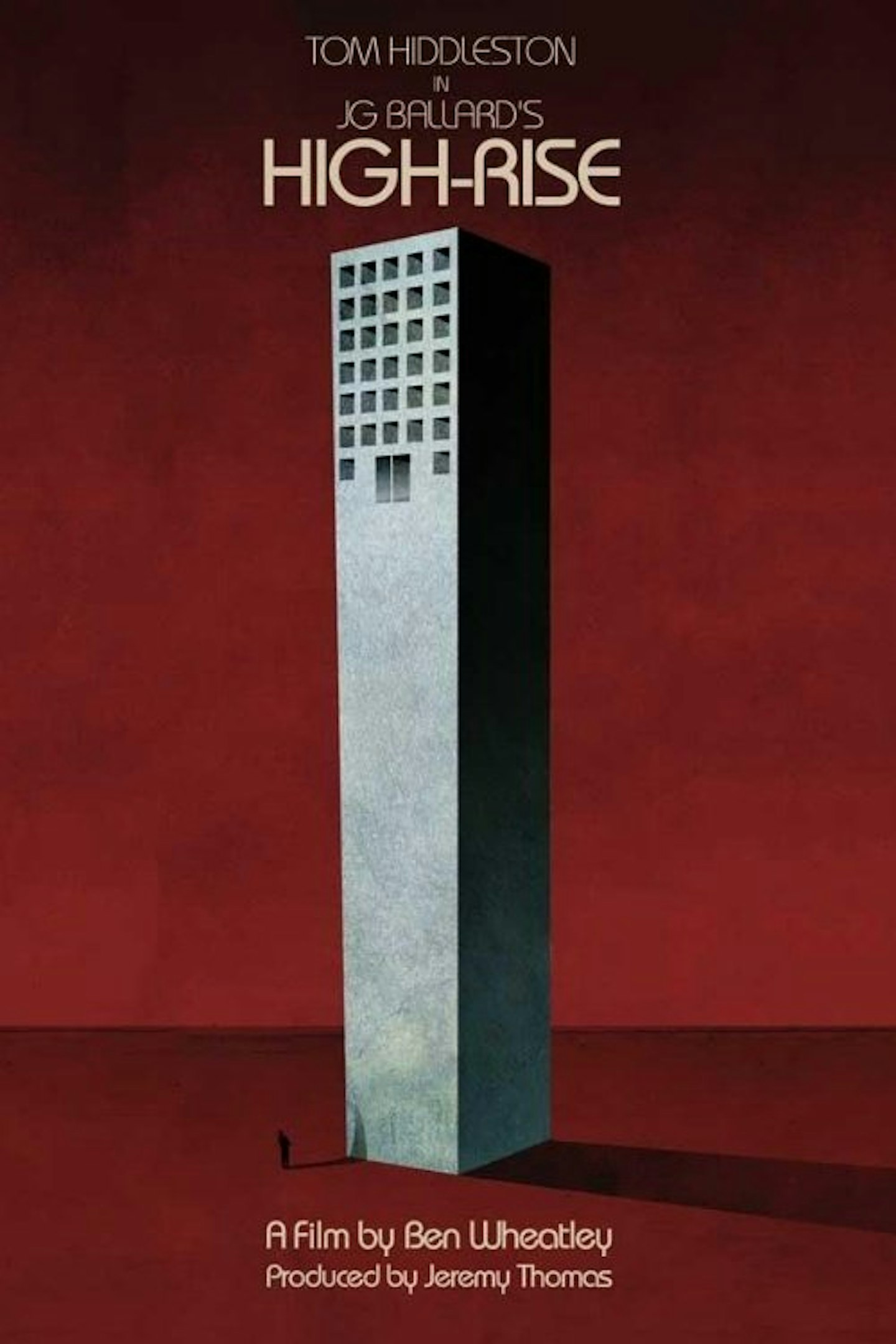
JG Ballard has never looked bleaker or more imposing in this tantalisingly stark illustration for Ben Wheatley’s next movie. Promises to be the best movie about concrete since Locke.
Ant-Man
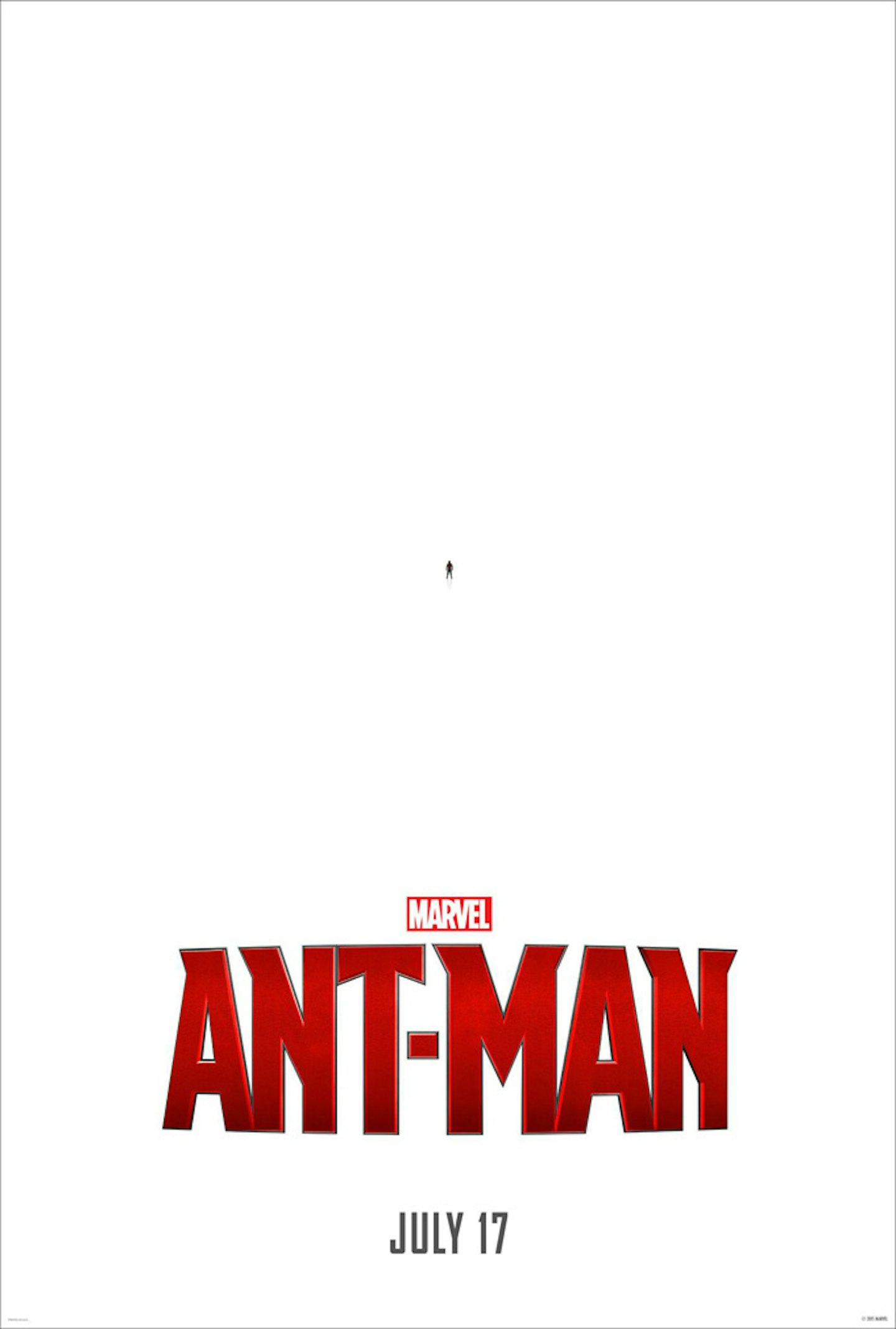
I mean, it almost seemed too obvious, didn’t it? Kudos to Disney and Marvel for taking their hundred-million-dollar investment and turning it into a microscopic proposition – resulting in one of the boldest, simplest, and most striking posters of the year.
Call Me Lucky
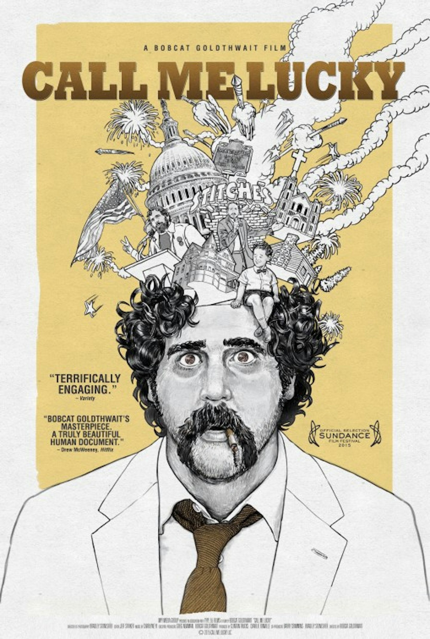
A single glance at this one-sheet for Bobcat Goldthwaite’s documentary and you instantly appreciate the eccentricity of its subject, comedian Barry Crimmins. This illustration comes from the pen of designer Jesse Vital.
The Lobster
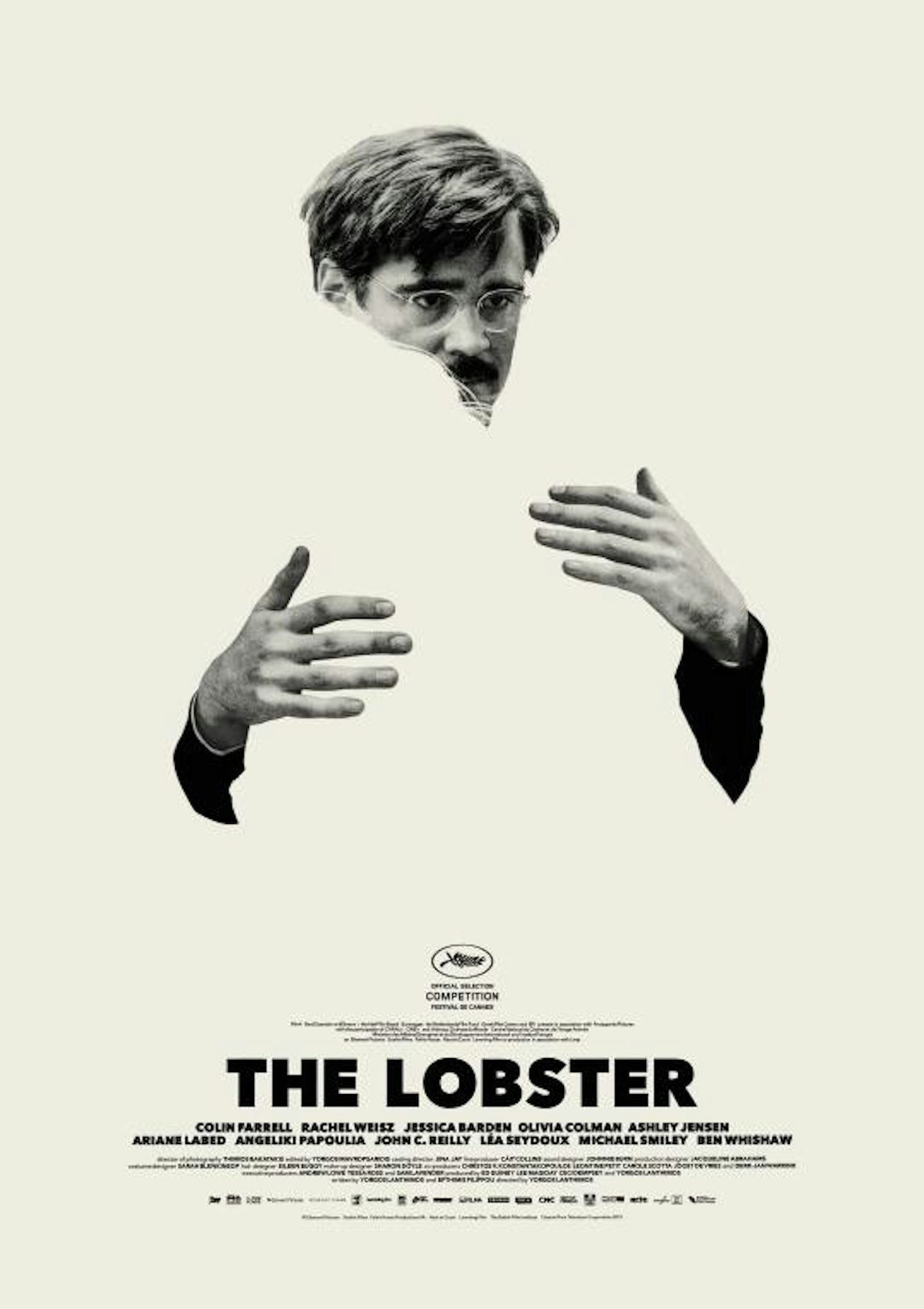
For a film that demands you to read between the lines, here was a poster that asks you to read between the Farrell. Perhaps the most eye-catching use of negative space we’ve seen.
Ex Machina
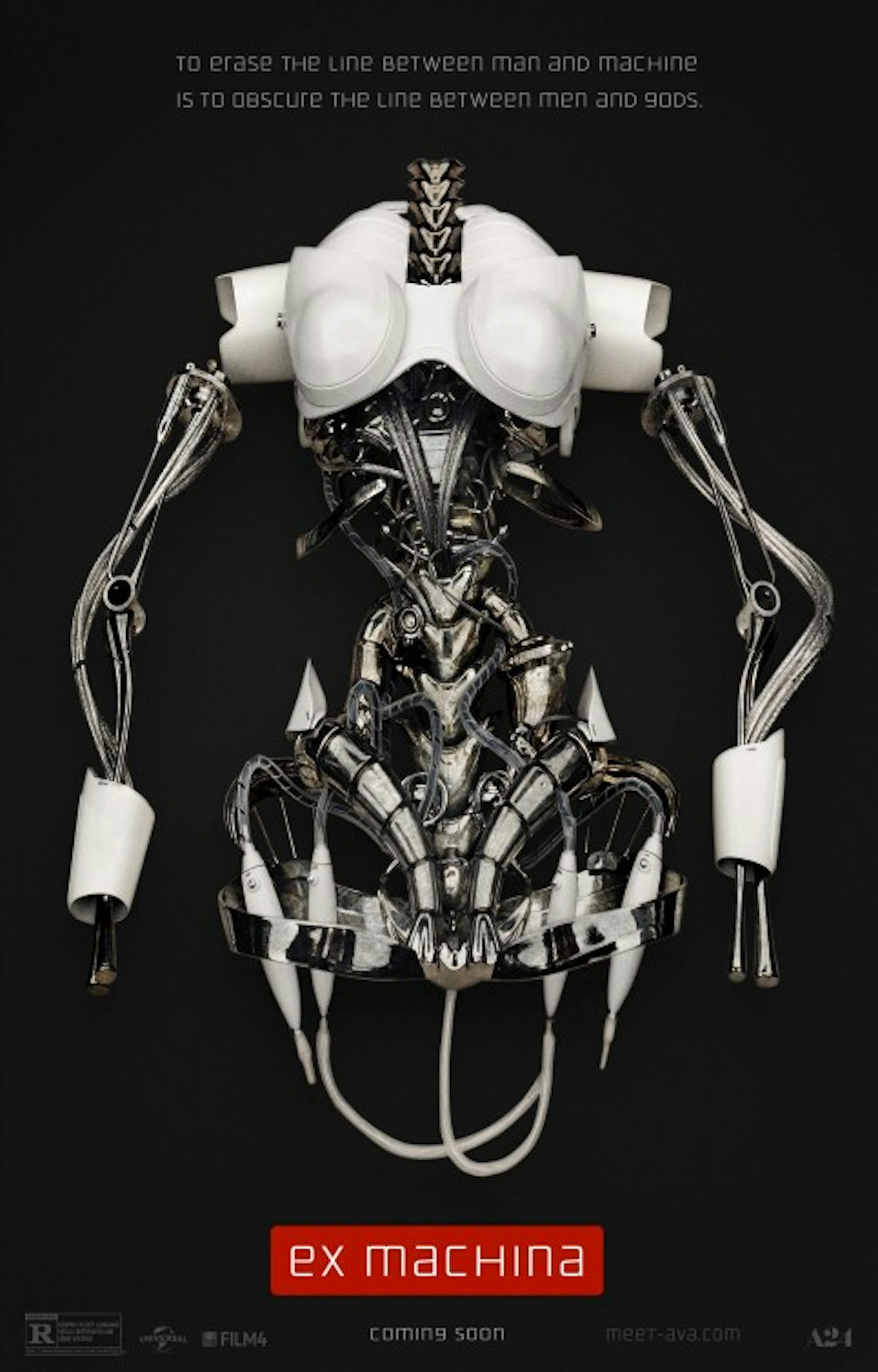
An ideal teaser poster: gives practically nothing away, but hints at the foreboding to come. Nothing artificial about the intelligence behind this one.
The Good Dinosaur
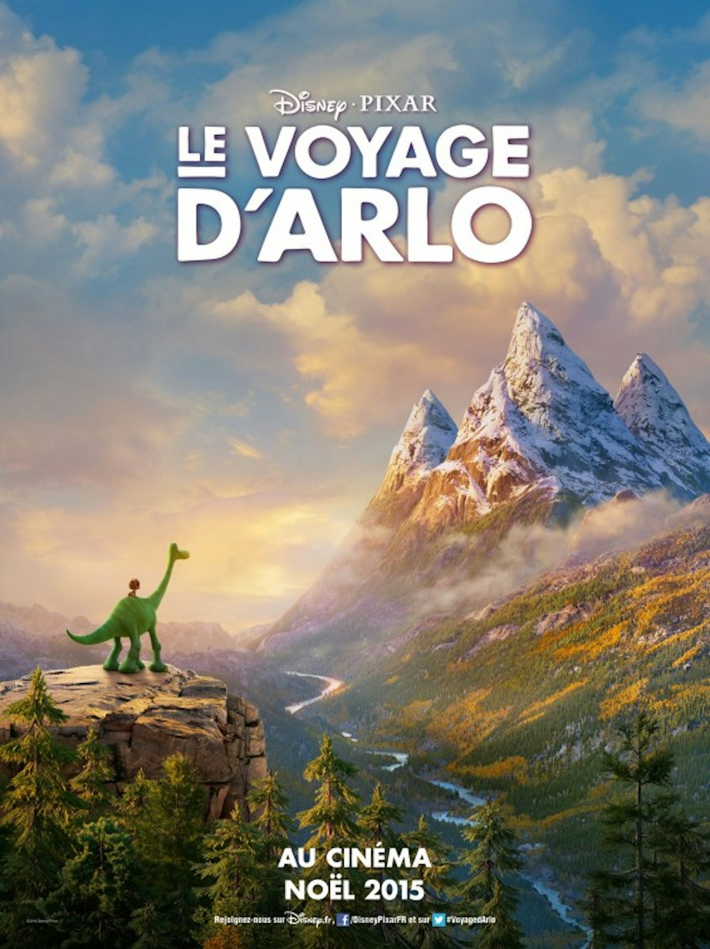
The initial 'pawprint' teaser poster won a lot of fans, but this French effort (featuring an alternate title) properly conveys the jaw-dropping landscapes and scenery that Pixar managed to conjure up from their box of animated tricks.
The Hunger Games: Mockingjay - Part 2
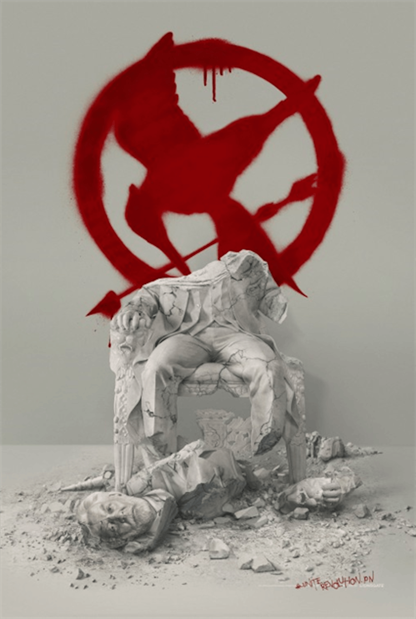
Panem went out with a bang this year, and alongside the more conventional character posters, these teaser one-sheets – depicting the severed head of a President Snow statue – felt like the artful cry of a revolution. May the odds, etc!
I Dream Too Much
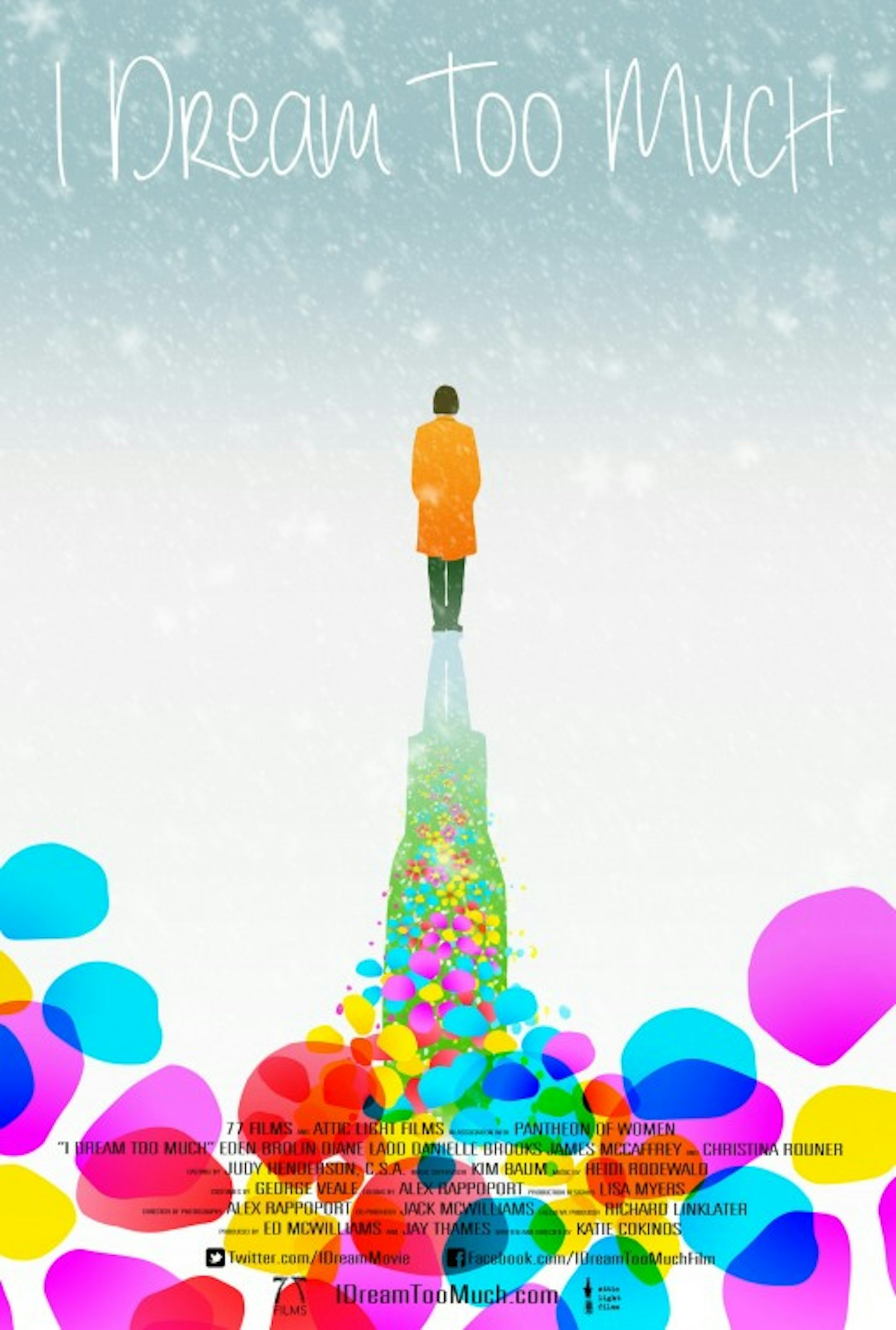
It’s often the smaller, more modest films which go for the grander, ambitious posters – perhaps less hamstrung from marketing-by-committee, perhaps simply more open to creative innovation. Whichever - you’d hang this on your wall, wouldn’t you?
Ink And Steel
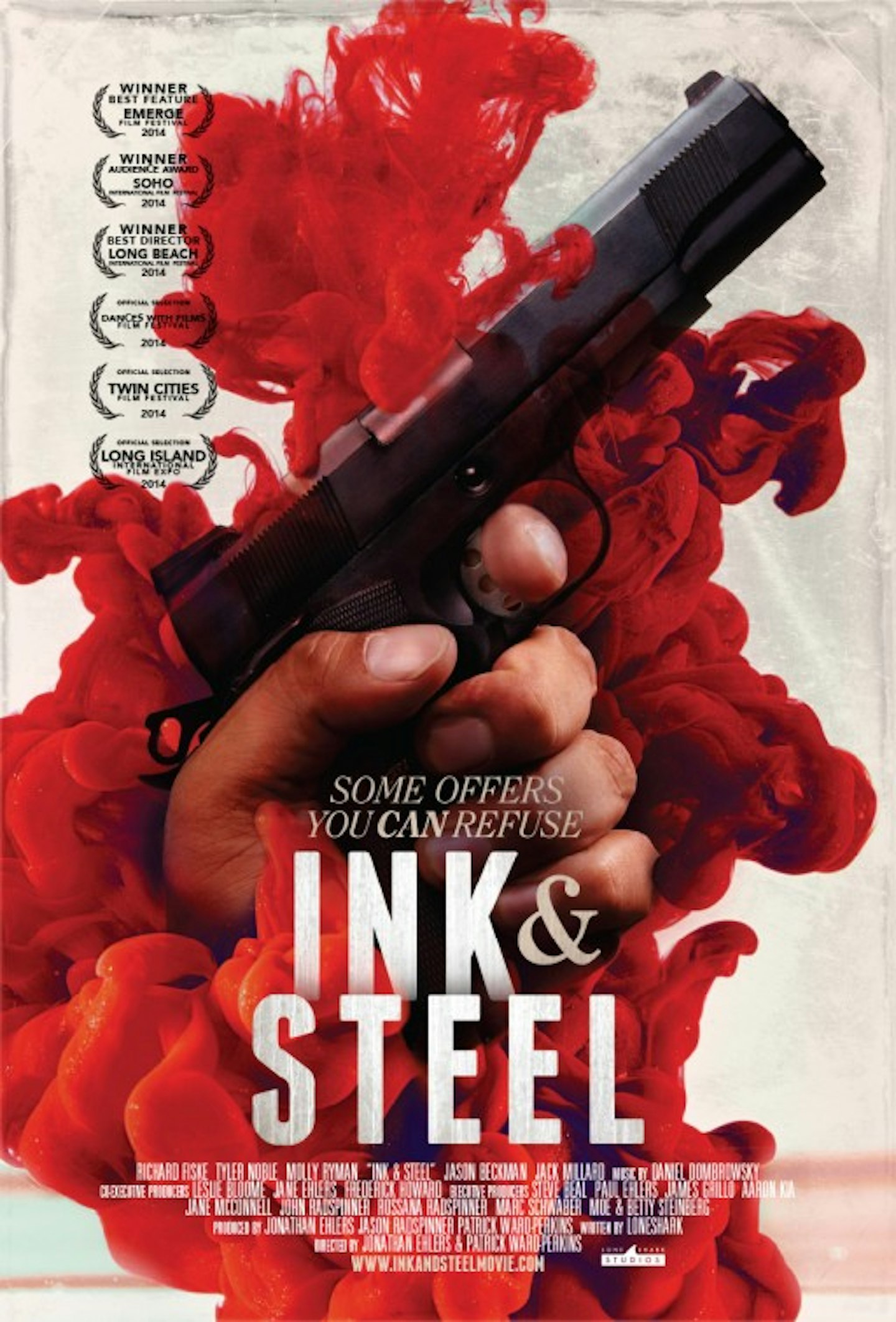
Ink – as the savvy designer for this poster has wisely understood – looks nice. For a film called Ink And Steel, some ink in water, bubbling like an explosion in a pre-Raphaelite painting, is an undeniable win.
The Divergent Series: Insurgent
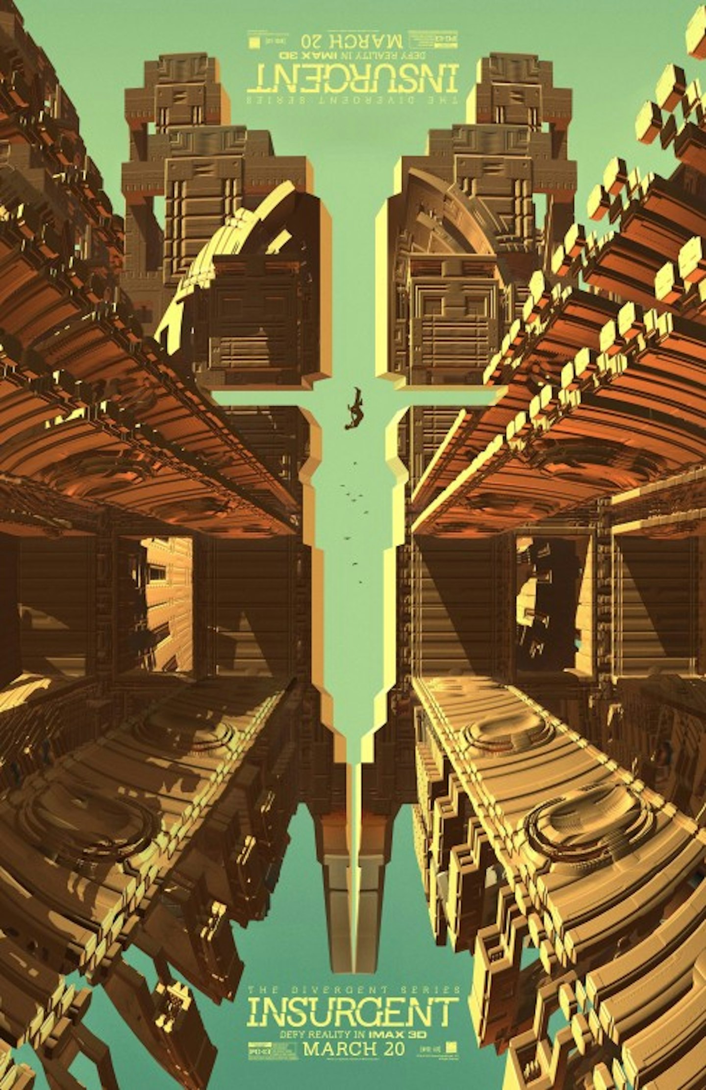
Occasionally, a poster will exceed the reach of the film it is promoting. We didn’t love the latest entry in this dystopian teen franchise, but we wholeheartedly loved this kaleidoscopic, semi-symmetrical, MC Escher-esque future-nightmare.
Iris

Another fine example of how a poster follows its subject. In this case, the subject is a flamboyant 93-year-old fashion goddess, and accordingly, the poster is a vividly illustrated background of flowery fabric design, the hero boldly contrasting in monochrome, front-and-centre.
It Follows
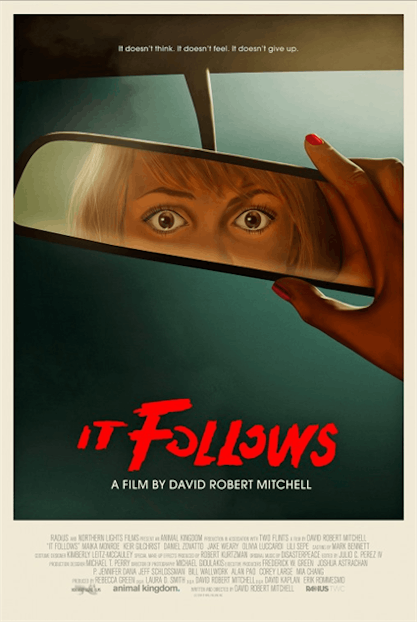
It Follows evoked the creepy, tension-filled mood of John Carpenter, so it – ahem – followed that an eighties-inspired art print would be commissioned. Includes a very eighties-inpired tagline, too.
Jurassic World
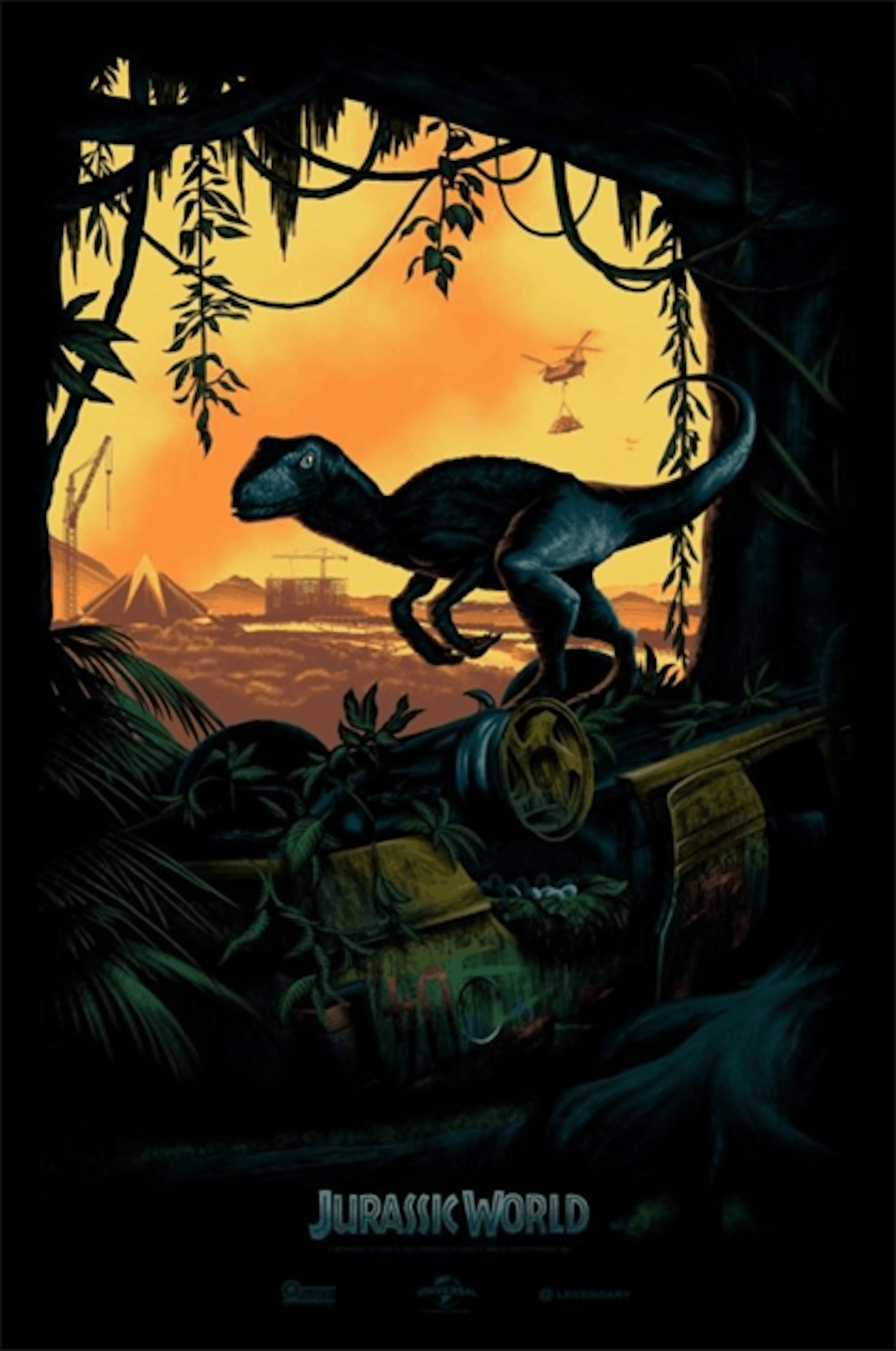
Before any trailer, clip, or poster was released, this was the first dinosaur of the new generation that we clapped our eyes on: a hand-drawn raptor, shrouded in darkness, with small clues of what to expect peppering the background. Generated more excitement than an Indominus Rex in a china shop.
Kumiko The Treasure Hunter
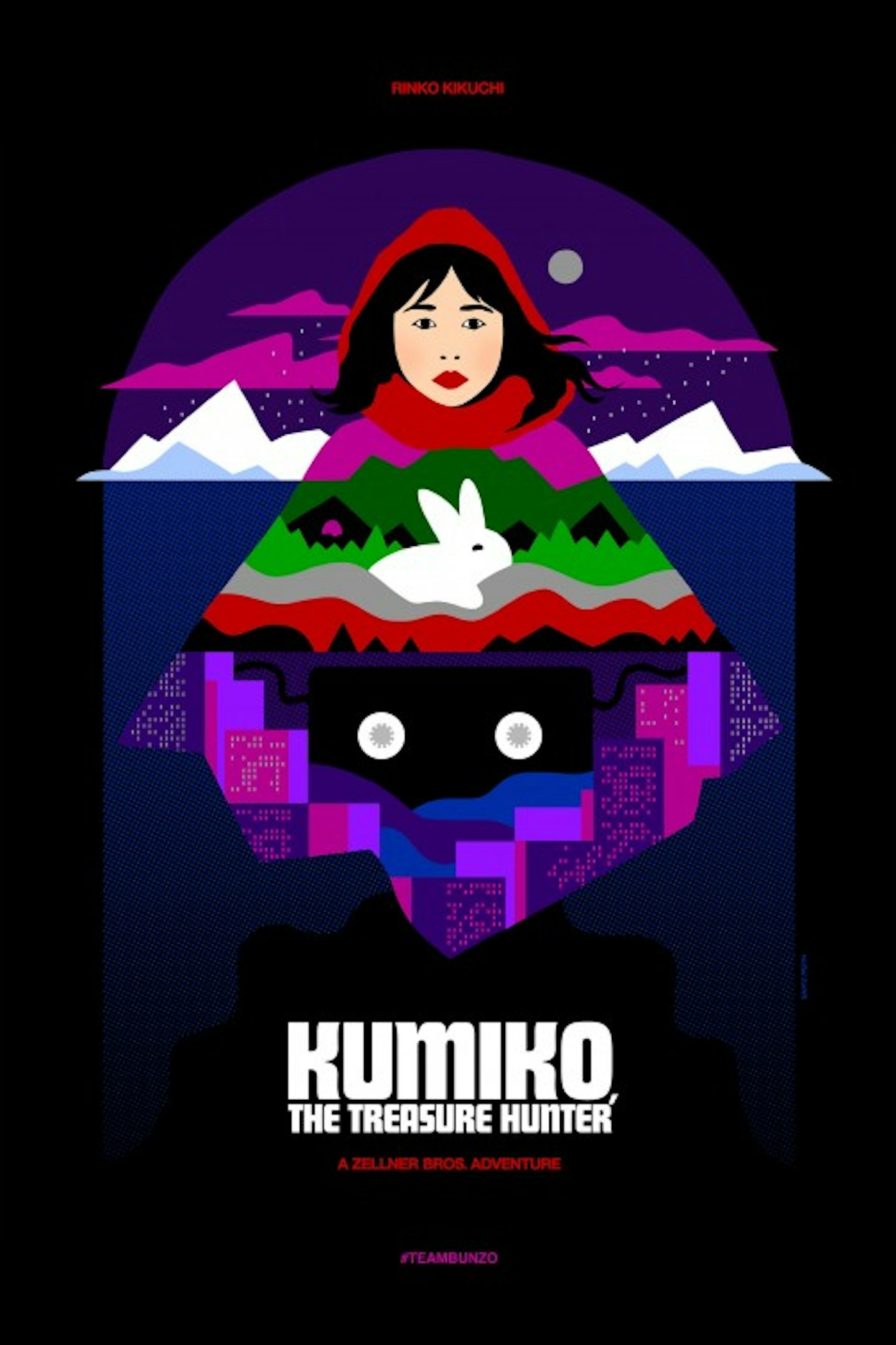
A bleak, complex tragedy can often make for a fun, colourful poster. Designer Sam Smith (no, not that one) highlights the eccentricity of Rinko Kikuchi’s treasure hunter with a bright palette and sharp lines.
LA Slasher
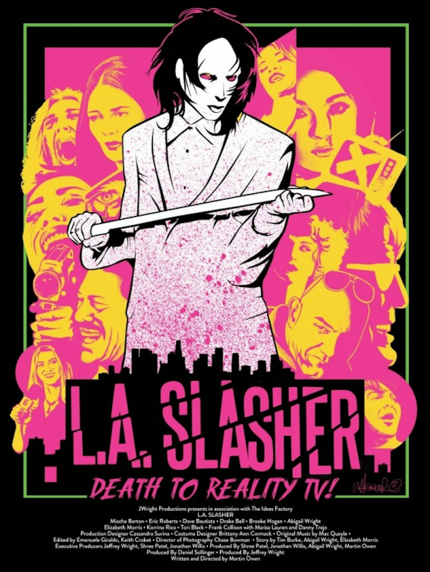
Look at that blood-like splatter! That pink-and-yellow colour scheme! That defiant tagline! That gleaming white samurai sword! Frankly, if you don’t immediately want to seek out this movie, you deserve to be slashed. Ignore the 0% rating on Rotten Tomatoes.
Love
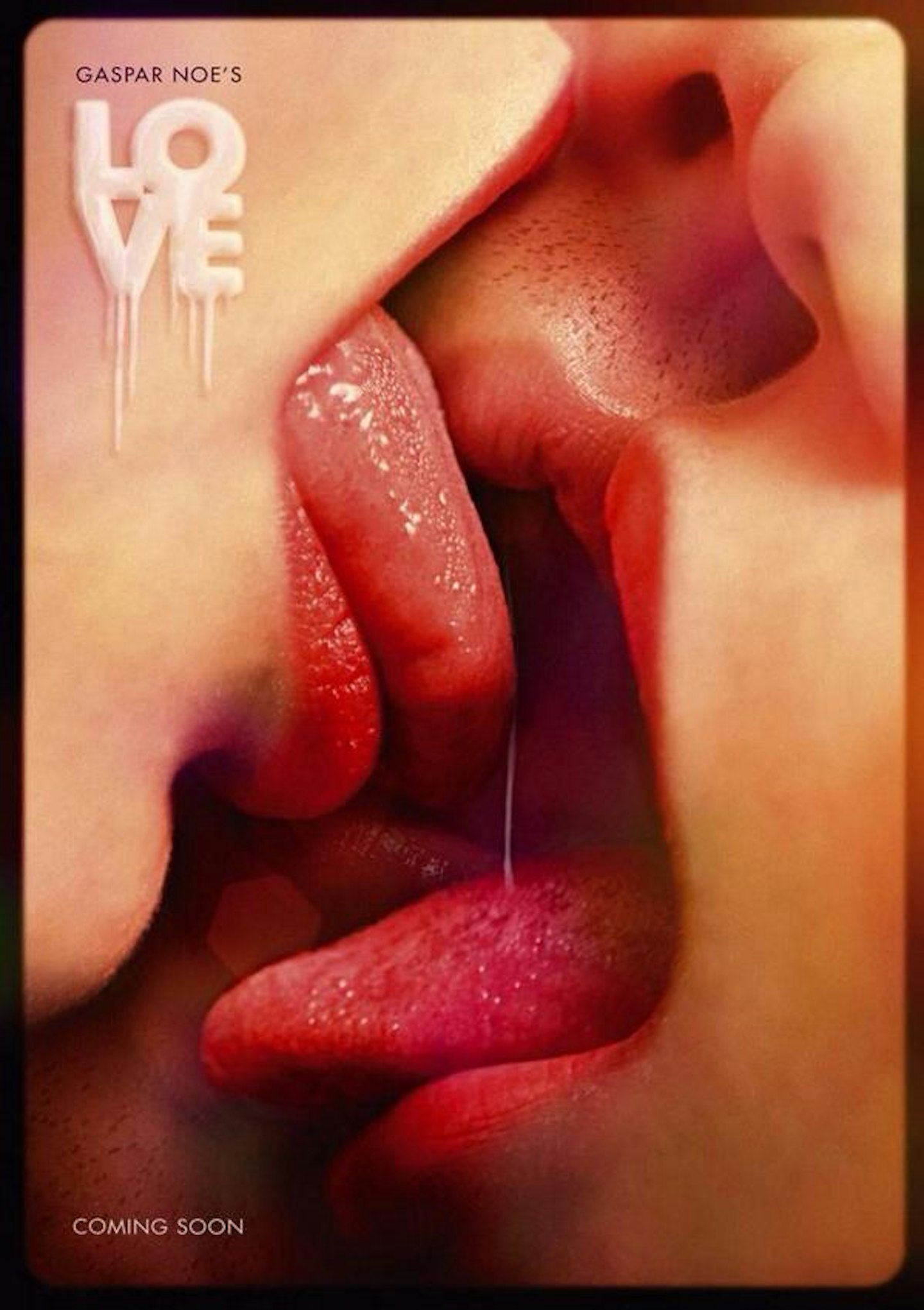
Created especially for the poster, this saucy image – depicting a three-way snog – shows only a fraction of the gallons of bodily fluid exchanged during Gasper Noé’s ludicrously explicit bonkathon.
Macbeth
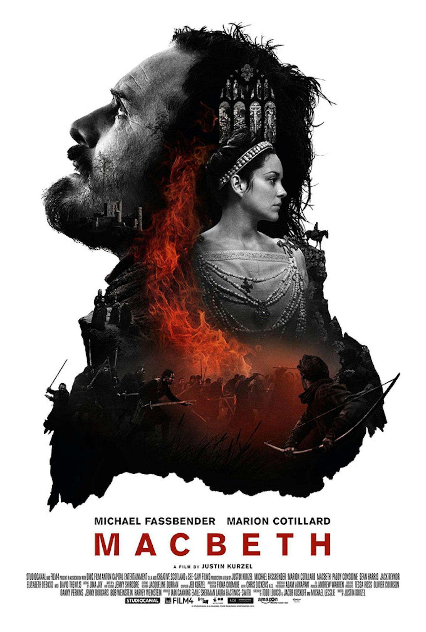
It made sense that one of the best-looking films of the year could be accompanied by one its most handsome posters. The squeeze-everything-into-the-silhouette-of-a-character’s-head poster trope has rarely been used with such success.
Maze Runner: The Scorch Trials
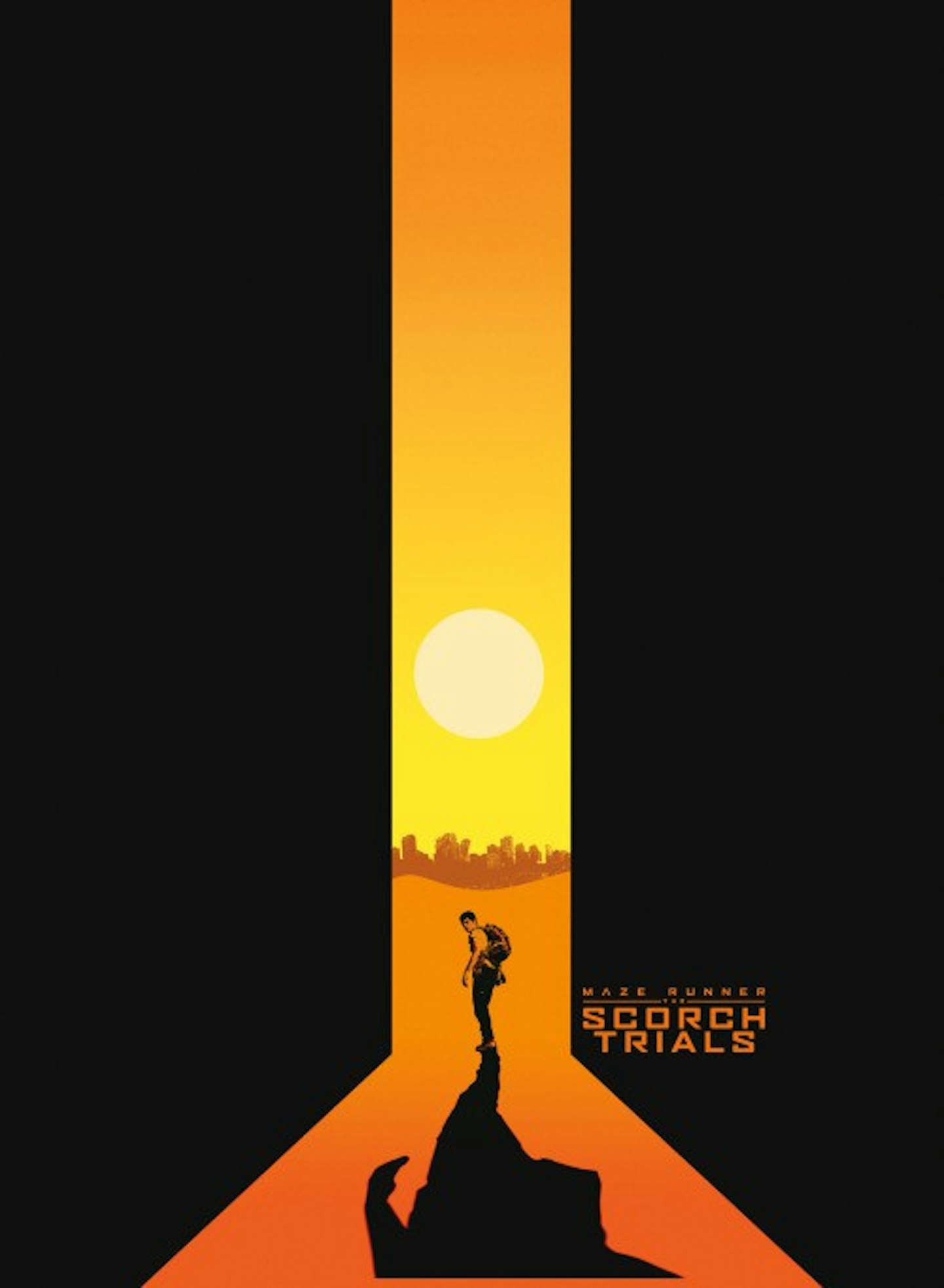
Orange is an infamously popular colour among poster-designing marketing teams, but we’ll allow this smart effort for The Scorch Trials, which simultaneously nods to the vast doors of the original maze, and the sandy trials ahead, in one neat conglomeration of symmetry and apocalypse.
Sicario
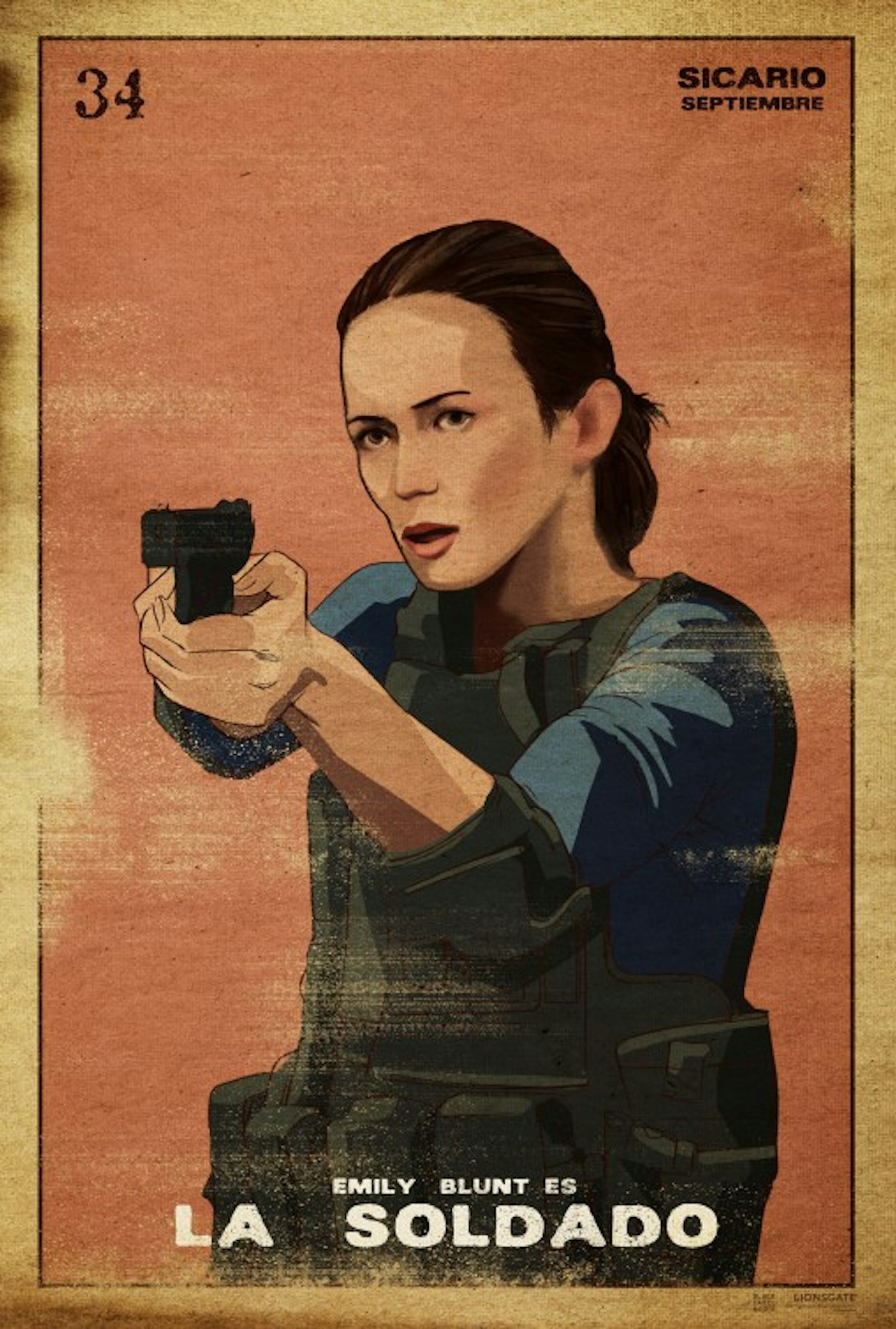
This is one of five stunning designs from L&A Associates, illustrated in the Lotería Card style – a card game popular in Latin America. Es hermoso, ¿no?
Spy
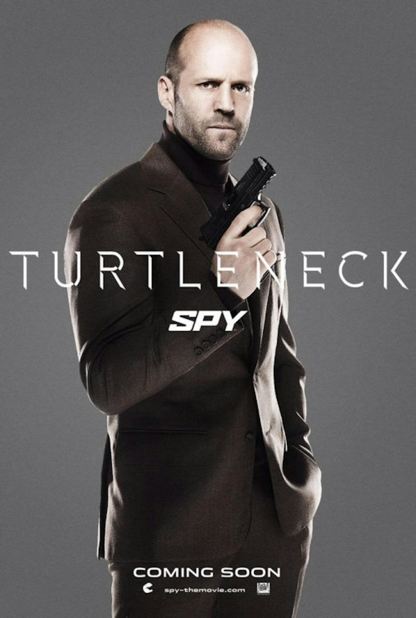
Arguably the year’s funniest poster. Mere hours after James Bond was seen in a turtleneck for the first Spectre poster, Jason Statham responded in kind for Spy. Thankfully, Statham's arm was fully reattached by this stage.
Tangerine
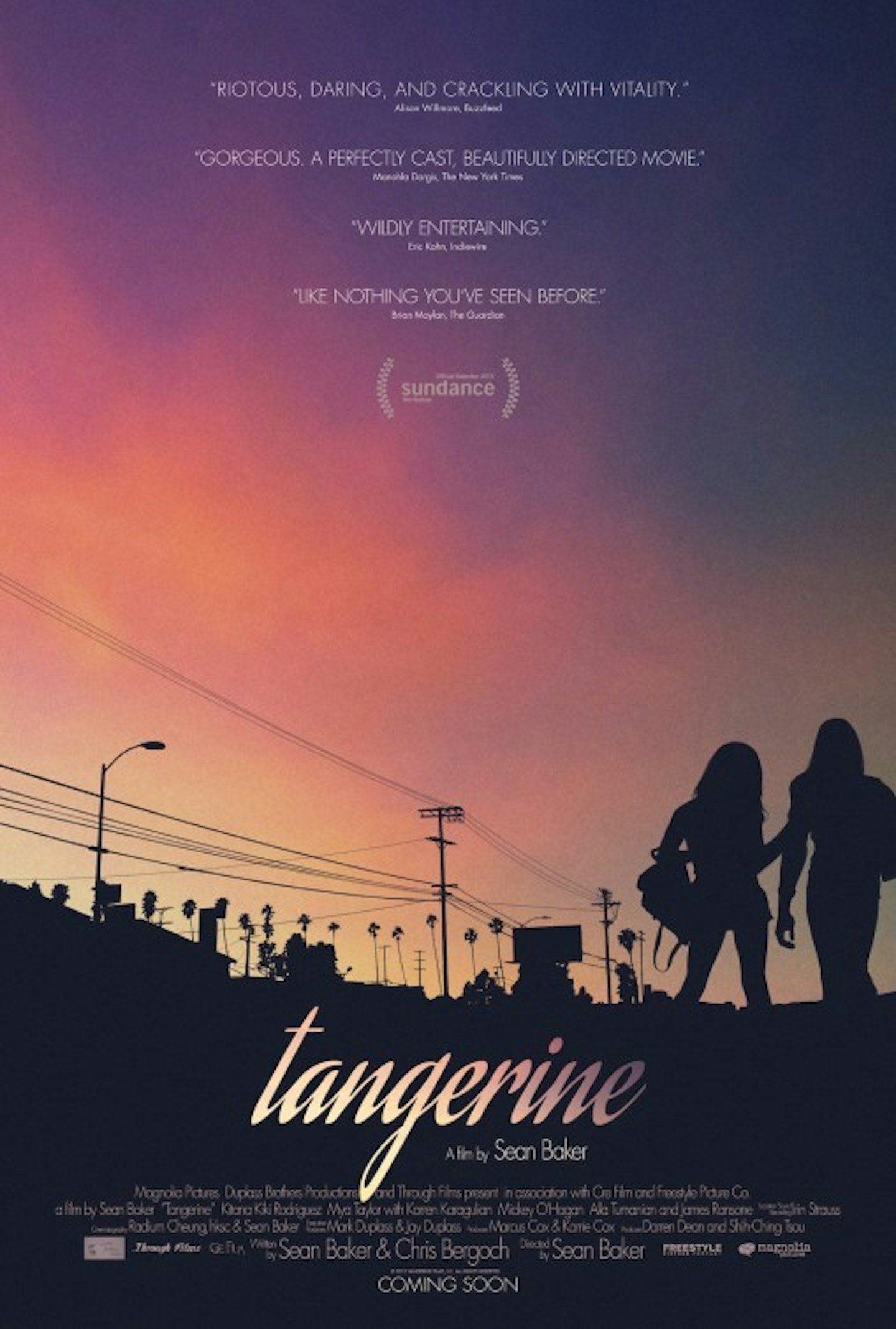
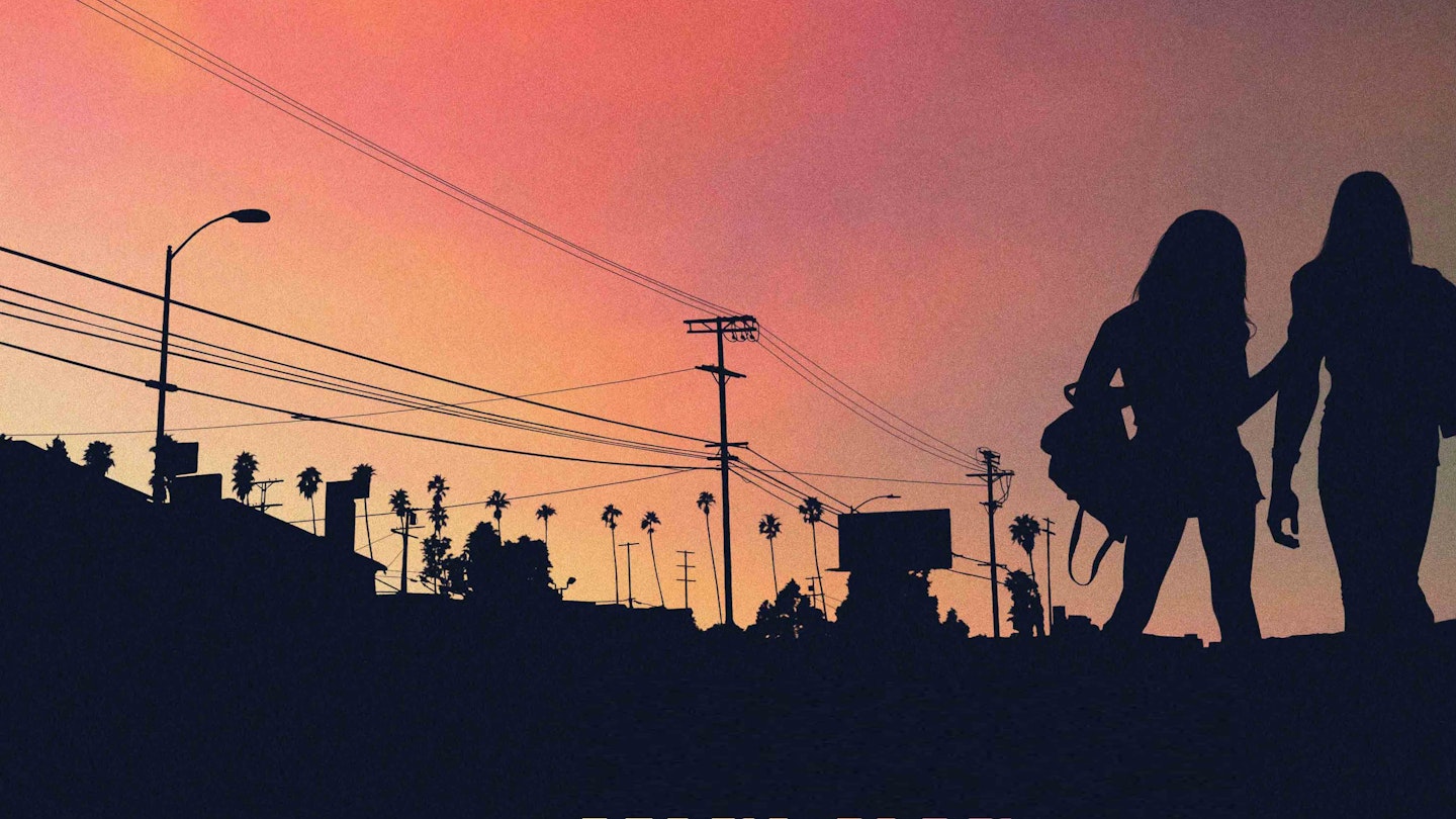
The calm serenity of this poster belies the wild, always-in-motion action of the year's best trangender revenge comedy thriller, in which an eternal LA sunset forever scorches the sky. Evokes the fairytale-like template of the movie, without ever revealing just how insane it gets.
