Platforms: PS4, Xbox One, Switch
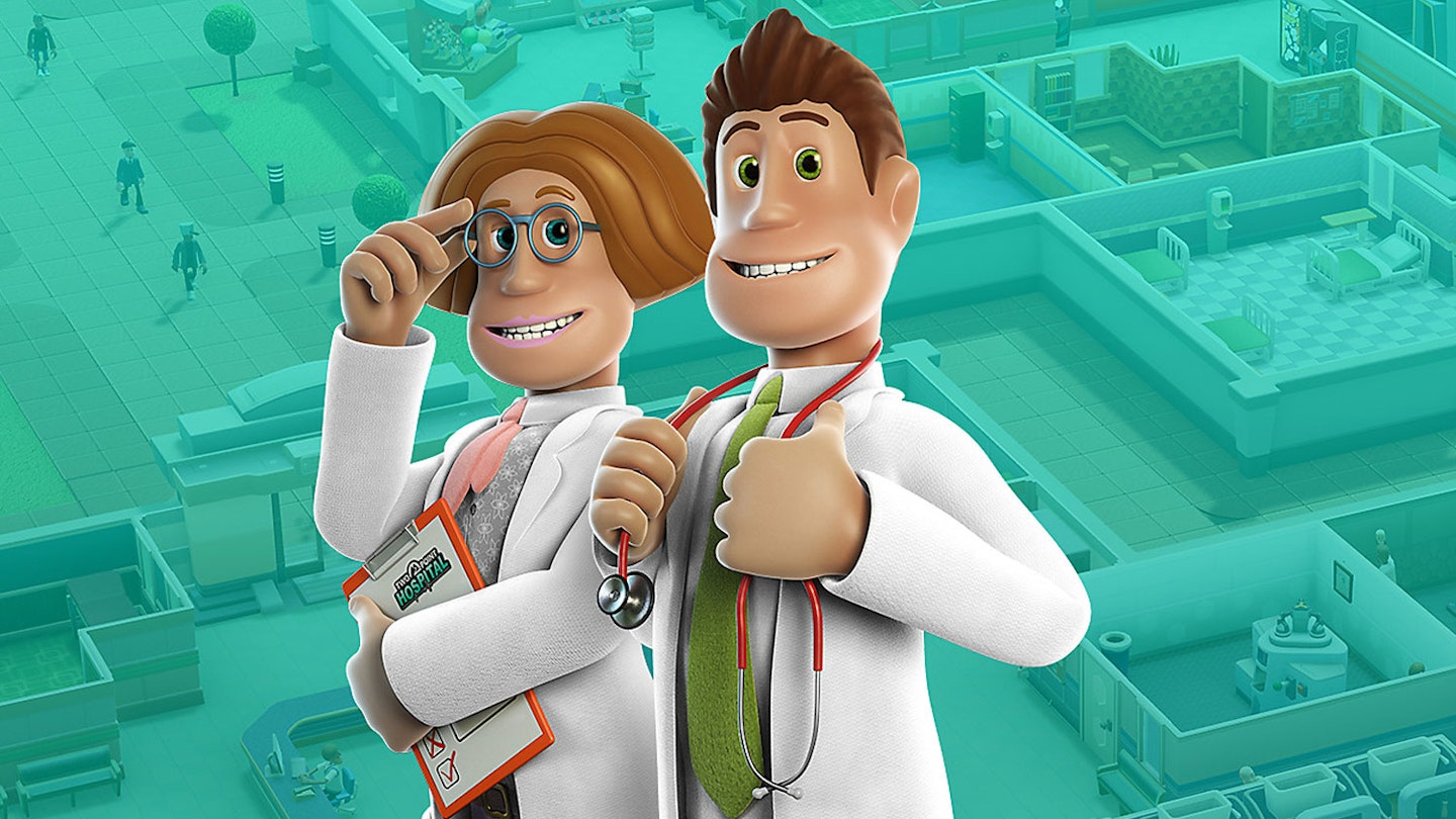
Almost two years after its PC debut, Two Point Hospital – spiritual successor to classic medical management sim Theme Hospital – arrives on console. Largely, the prognosis is good – the gameplay loop of building ever-more complex hospitals to cure increasingly outlandish medical afflictions is as satisfying as ever, while controls map intuitively to a controller. A tap of the top shoulder buttons (eg. L1 and R1 on PS4) rotates objects 90° at a time, allowing you to drop reception desks, snack machines, or strange medical equipment into place quickly, while building rooms for specialist healthcare workers to operate from is a simple button-press-and-drag. It's as smooth and precise as it's likely possible to get when mapping mouse and keyboard inputs to a joypad, making a fairly complex game a breeze.

Complex is the key word there – Two Point Hospital may tend towards tickling your funny bone with diseases such as "jest infection" (patients have become unwilling clowns, of course) but there are so many moving parts to even the simpler, early hospitals that it's easy to become overwhelmed. You'll need enough doctors to keep each speciality staffed while also giving them time to rest in staff rooms – or in later levels, train them up from students – but patient waiting times also need to be kept down by having enough facilities, and then enough support staff to keep the hospital clean and working, all while treatments need to be monitored. Phew.
If you can't keep all those plates spinning, it'll negatively affect your hospital's reputation, and therefore its financial income. Thankfully, you can at least slow down time, allowing you to focus your attention where it's most needed, but for anyone not used to management sims, the learning curve is steep.
Sadly, Two Point Hospital falls victim to an illness that plagues many PC-to-console ports – tiny font-itis. This often crippling disease is caused by poor optimisation, with developers seemingly forgetting that people playing on a PS4 are more likely to be sitting on the other side of a room from their screen than PC players, and so need clearer, more distinct text. That's something the console edition struggles to deliver – while words are readable from an average living room's distance, icons barely stand out, making controls a bit of a guess. As your hospitals become increasingly complex and you're having to rapidly assess the merits of new staff hires or read emails updating you on progress, staring at the screen can lead to some real-world eye strain. Confoundingly, there are no options to scale text according to preference, which would seem to be an obvious fix.
Ultimately, that's Two Point Hospital’s killer affliction – it's as addictive a hospital sim as ever, cleverly ported to console controls, and as close to a true sequel as Theme Hospital will ever get. However, if you have to sit practically in front of the TV screen to make out the fine details, you may as well stick with the PC version.
